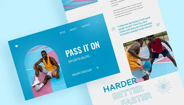
In today’s digital age, the design and layout of your blog can make or break its success. Think of it as the digital storefront of your brand. Just as you’d be hesitant to enter a disorganized or outdated physical store, readers can be deterred by a poorly designed blog. So, let’s dive into why a well-thought-out blog design is crucial and how the world of blog design has evolved over time.
The Undeniable Importance of Blog Design And Layout
You’ve probably heard the saying, “Don’t judge a book by its cover.” But let’s be honest, in the online world, first impressions count. A staggering 94% of first impressions relate to your site’s web design. So, if your blog doesn’t captivate within the first few seconds, you might lose a potential regular reader or customer.
Moreover, a well-designed blog isn’t just about aesthetics. It’s about functionality. It’s ensuring that your readers can navigate your content easily, find what they’re looking for, and have a pleasant reading experience. This directly impacts user engagement and retention. If visitors find your blog confusing or hard to navigate, they’re less likely to return or share your content.
A Glimpse Into The Evolution of Blog Design
Blogs have come a long way since their inception. In the early 2000s, most blogs were simple text-based sites with minimal graphics. They were essentially online diaries. But as the internet evolved, so did the expectations of readers.
Around the 2010s, with the rise of platforms like WordPress and Blogger, customization became the name of the game. Blogs started to have distinct personalities, with custom headers, widgets, and more interactive features.
Fast forward to today, and the design possibilities are endless. We’ve seen trends come and go – from the flat design movement, which emphasized simplicity, to the more recent shift towards dark mode, which many find easier on the eyes.
Past Trends Shaping Today’s Preferences
Past design trends have significantly influenced today’s blog layouts. Remember the skeuomorphic designs that tried to imitate real-life objects? While it’s no longer the go-to choice, it taught designers the importance of intuitive interfaces.
Then there was the era of vibrant, almost neon color palettes. While the exact hues have toned down, the emphasis on using color psychology in design remains. For instance, blue, often seen in business blogs, instills a sense of trust.
Parallax scrolling, where the background moves at a slower rate than the foreground, was another trend that took the web by storm. While not as prevalent now, it paved the way for more interactive and dynamic blog designs.
The Ripple Effect on User Experience, Engagement, And Retention
All these design elements and evolutions aren’t just for show. They play a pivotal role in how readers interact with your content. A clutter-free, intuitive design can boost the time readers spend on your blog, increasing the chances of them engaging with your content, be it through comments, shares, or even signing up for a newsletter.
On the flip side, a complicated, hard-to-navigate blog can increase your bounce rate, which is the percentage of visitors who navigate away after viewing only one page. High bounce rates can negatively impact your search engine ranking, making it harder for new readers to discover your content.
Key Components of an Effective Blog Design
Visual Appeal: More Than Just a Pretty Face
When you land on a blog, what’s the first thing you notice? The design, right? A blog’s visual appeal isn’t just about making it look good; it’s about making a lasting first impression. Studies show that it takes about 50 milliseconds (that’s 0.05 seconds!) for users to form an opinion about a website. A visually appealing design can be the difference between a reader staying to explore or leaving immediately. So, invest in a design that resonates with your audience, is clean, and aligns with modern aesthetics.
Usability: The Backbone of User Experience
A beautiful blog that’s hard to navigate? That’s a recipe for a high bounce rate. Usability is all about how easy it is for readers to interact with your blog. Clear navigation menus, a logical content hierarchy, and easily accessible search functions are crucial. Remember, if readers can’t find what they’re looking for swiftly, they’re likely to leave. Prioritize a design that’s not just visually pleasing but also user-centric.
Responsiveness: Catering to The Mobile Audience
Did you know that over half of global website traffic comes from mobile devices? That’s right. If your blog isn’t optimized for mobile viewing, you’re potentially alienating a vast portion of your audience. Responsiveness ensures your blog looks and functions seamlessly, whether viewed on a desktop, tablet, or smartphone. In 2023, a mobile-friendly design isn’t just nice to have; it’s a must-have.
Loading Speed: The Need For Speed in Design
Ever clicked on a blog and found yourself waiting… and waiting for it to load? Frustrating, isn’t it? Slow loading times aren’t just a minor inconvenience. A delay of just a second can lead to a 7% reduction in conversions. Your blog’s design plays a pivotal role in its loading speed. Heavy images, unnecessary plugins, and clunky code can slow things down. Opt for a streamlined design, compress images, and regularly audit your site to ensure lightning-fast load times.
Branding: Consistency is Key
Your blog is an extension of your brand. Whether you’re a solo entrepreneur or a large corporation, consistency in design elements – from color palettes to typography – reinforces brand identity. It ensures that readers have a unified experience, whether they’re interacting with your blog, social media profiles, or any other branded content. A consistent design not only looks professional but also fosters trust and credibility with your audience.
Top Blog Design Trends For 2023
Minimalist Design: Less is More
Example: Help Scout
Benefits:
- Clean and uncluttered, offering a distraction-free reading experience.
- Faster loading times due to fewer elements and streamlined graphics.
- Highlights content, making it the focal point.
Drawbacks:
- Can be perceived as too simplistic or lacking personality.
- Risk of looking similar to many other minimalist sites.
Storytelling Layouts: Engaging Narratives
Example: Microsoft Stories
Benefits:
- Engages readers with a narrative flow, making content more memorable.
- Encourages longer site visits as readers get immersed in the story.
- Offers a unique user experience compared to traditional blog layouts.
Drawbacks:
- Can be resource-intensive to create and maintain.
- Might not be suitable for all types of content or industries.
Dynamic Grid Layouts: Breaking The Mold
Examples: Pando, Design Milk
Benefits:
- Visually engaging, offering a mosaic of content snippets.
- Allows for a diverse range of content types to be displayed.
- Adaptable and responsive across devices.
Drawbacks:
- Can be overwhelming if not executed correctly.
- Might pose challenges in content hierarchy and prioritization.
Rich Media Integration: Beyond Text
Examples: Fubiz, Web Designer Depot
Benefits:
- Enhances engagement with interactive elements like videos, GIFs, and animations.
- Offers a multi-sensory experience, catering to diverse audience preferences.
- Can convey complex ideas more effectively than text alone.
Drawbacks:
- Might slow down page loading times if not optimized.
- Risk of overshadowing the core content.
Magazine-Style Layouts: Curated And Classy
Benefits:
- Organized and structured, making navigation intuitive.
- Appeals to readers familiar with traditional print layouts.
- Allows for effective content categorization and segmentation.
Drawbacks:
- Can be rigid and less adaptable to diverse content types.
- Might require frequent updates to maintain a fresh look.
Immersive Full-Screen Imagery: Visual First
Example: Tesco Food Love Stories
Benefits:
- Captures attention instantly with striking visuals.
- Enhances storytelling by setting mood and context.
- Optimized for mobile viewing with large, touch-friendly elements.
Drawbacks:
- Requires high-quality images to be effective.
- Might overshadow textual content if not balanced.
Integrated Content Hubs: All in One Place
Example: HubSpot Blog
Benefits:
- Centralizes content, offering a one-stop-shop for readers.
- Enhances user engagement by offering diverse content types.
- Encourages deeper exploration and longer site visits.
Drawbacks:
- Can be challenging to maintain and update regularly.
- Risk of overwhelming readers with too much content.
In 2023, the landscape of blog design is as dynamic as ever, with a focus on user experience, engagement, and adaptability. Whether you’re drawn to the simplicity of minimalist designs or the rich engagement of media-rich layouts, it’s essential to choose a design that aligns with your content, brand, and audience preferences. Remember, a blog’s design is more than just aesthetics; it’s a tool to convey your message effectively and resonate with your readers.
Common Mistakes in Blog Design
Overloading With Ads And Pop-Ups
While monetizing your blog is essential, bombarding your readers with excessive ads and pop-ups can be off-putting.
Solution: Limit the number of ads and ensure pop-ups are timed appropriately, preferably after the reader has spent some time on your blog.
Neglecting Mobile Optimization
With over 50% of web traffic coming from mobile devices, ignoring mobile optimization can alienate a significant portion of your audience.
Solution: Adopt a responsive design and regularly test your blog on various devices to ensure a seamless experience.
Poor Typography Choices
Using hard-to-read fonts or cluttered text can strain the reader’s eyes and reduce readability.
Solution: Stick to 2-3 legible fonts and ensure there’s ample white space to make the content breathable.
Ignoring Page Load Times
A delay of even a second can deter readers and increase bounce rates.
Solution: Optimize images, minimize code, and consider using a Content Delivery Network (CDN) to speed up load times.
Inconsistent Design Elements
Mismatched colors, varying font sizes, or a lack of uniformity can confuse readers and appear unprofessional.
Solution: Create a design guideline for your blog and stick to it. Consistency reinforces brand identity and trust.
Not Prioritizing User Navigation
If readers can’t find what they’re looking for easily, they’re likely to leave.
Solution: Implement a clear, intuitive navigation menu and consider adding a search bar for ease of access.
Overcrowded Sidebars
Cramming too many widgets or irrelevant information in the sidebar can distract from the main content.
Solution: Prioritize essential sidebar elements, such as recent posts, categories, or a newsletter sign-up, and declutter regularly.
Lack of Content Hierarchy
Presenting all content with equal emphasis can overwhelm readers.
Solution: Use headings, subheadings, and bullet points to structure content and guide readers through your posts.
Ignoring Feedback
Not addressing user feedback or complaints can lead to recurring design issues.
Solution: Regularly gather feedback, be it through comments, surveys, or analytics, and make necessary adjustments.
Not Updating Design Elements
Using outdated design elements can make your blog appear stagnant and out of touch.
Solution: Stay updated with the latest design trends and periodically refresh your blog’s look to keep it modern and engaging.
Navigating the world of blog design can be challenging, but being aware of common pitfalls is half the battle. By addressing these issues head-on and prioritizing your readers’ experience, you’re well on your way to creating a blog that’s not only visually appealing but also user-friendly and effective.
Tools & Resources For Blog Design
WordPress
Arguably the most popular blogging platform, WordPress offers a plethora of themes and plugins to customize your blog’s design. Whether you’re a beginner or a seasoned developer, WordPress caters to all.
Wix
A user-friendly website builder, Wix provides drag-and-drop functionality, making it easy for those without coding experience to design a professional-looking blog.
Squarespace
Known for its sleek templates, Squarespace is a go-to for those seeking minimalist and modern blog designs. Its intuitive interface ensures a smooth design process.
Adobe XD
For those looking to design their blog from scratch, Adobe XD offers a platform to prototype and design web interfaces, ensuring a unique look tailored to your brand.
Canva
Beyond just blog graphics, Canva offers templates for web design, ensuring cohesive visuals across your blog. Its drag-and-drop functionality is perfect for those without a design background.
Elementor
A WordPress plugin, Elementor allows for live, front-end page building. With its vast array of widgets, you can design your blog without touching a line of code.
Google Fonts
Typography plays a pivotal role in design. Google Fonts offers a vast collection of free fonts, ensuring your blog’s text is both readable and aesthetically pleasing.
Resources For Further Learning And Inspiration
- Awwwards: A platform that recognizes the talent of the best web designers and developers. Browsing through their winners can provide a wealth of design inspiration.
- Udemy: With courses on everything from basic web design to advanced UX principles, Udemy is a treasure trove for those looking to upskill.
- Dribbble: A community of designers showcasing their work, Dribbble is a hub of creativity. It’s perfect for drawing inspiration and spotting emerging design trends.
- Smashing Magazine: An online magazine for web designers and developers, Smashing Magazine offers articles, books, and workshops on the latest in web design.
- Behance: Adobe’s platform for showcasing and discovering creative work. It’s a space where designers from around the world share their portfolios, offering a diverse range of styles and ideas.
- Web Design Ledger: A publication written by web designers for web designers, Web Design Ledger covers the latest in design trends, tools, and resources.
Equipped with the right tools and resources, designing a standout blog becomes a more attainable goal. Whether you’re starting from scratch or looking to revamp an existing blog, these recommendations will set you on the right path. Remember, a well-designed blog not only captivates but also enhances user experience, ensuring your content shines.


