Are you ready to take your Canva designs to the next level? Unlock your creativity with the best Canva fonts that will make your designs truly stunning.
In this article, we’ll show you how to use fonts in Canva and help you find the perfect ones for your projects.
Plus, we’ll reveal 25 amazing free fonts available on Canva.
And if that’s not enough, we’ll even teach you how to upload your own custom font.
Get ready to unleash your design genius!
How to Use Fonts in Canva
To use fonts in Canva, simply select a font from the drop-down menu or change the fonts in pre-made design templates. Font pairing is important for creating visually appealing Canva designs. Experiment with different combinations to find what works best for your project.
Typography plays a crucial role in enhancing your Canva graphics. Consider using bold and eye-catching fonts for headlines, and more subtle ones for body text. Customizing font styles and sizes is easy in Canva, allowing you to create unique designs that fit your aesthetic.
Explore Canva’s font effects and text animations to add an extra touch of creativity to your designs. Additionally, incorporating decorative fonts can add a whimsical or elegant element to your Canva designs.
Have fun experimenting with different fonts and finding ways to make your graphics stand out!
How to Find Fonts in Canva
Start by exploring the font libraries in Canva to discover a wide range of options for your designs. When it comes to creating stunning designs in Canva, font pairing tips are essential.
By carefully selecting complementary fonts, you can enhance the overall visual appeal of your creations. Typography plays a crucial role in conveying the message and mood of your design, so consider the impact of font size and style on your Canva projects.
Don’t be afraid to get creative with fonts in Canva – customize them to add a unique touch to your designs. Additionally, take advantage of Canva’s font effects and special characters to make your designs stand out even more.
With these tips and tools at your disposal, you’ll be able to unlock your creativity and create visually captivating designs using Canva’s extensive font library.
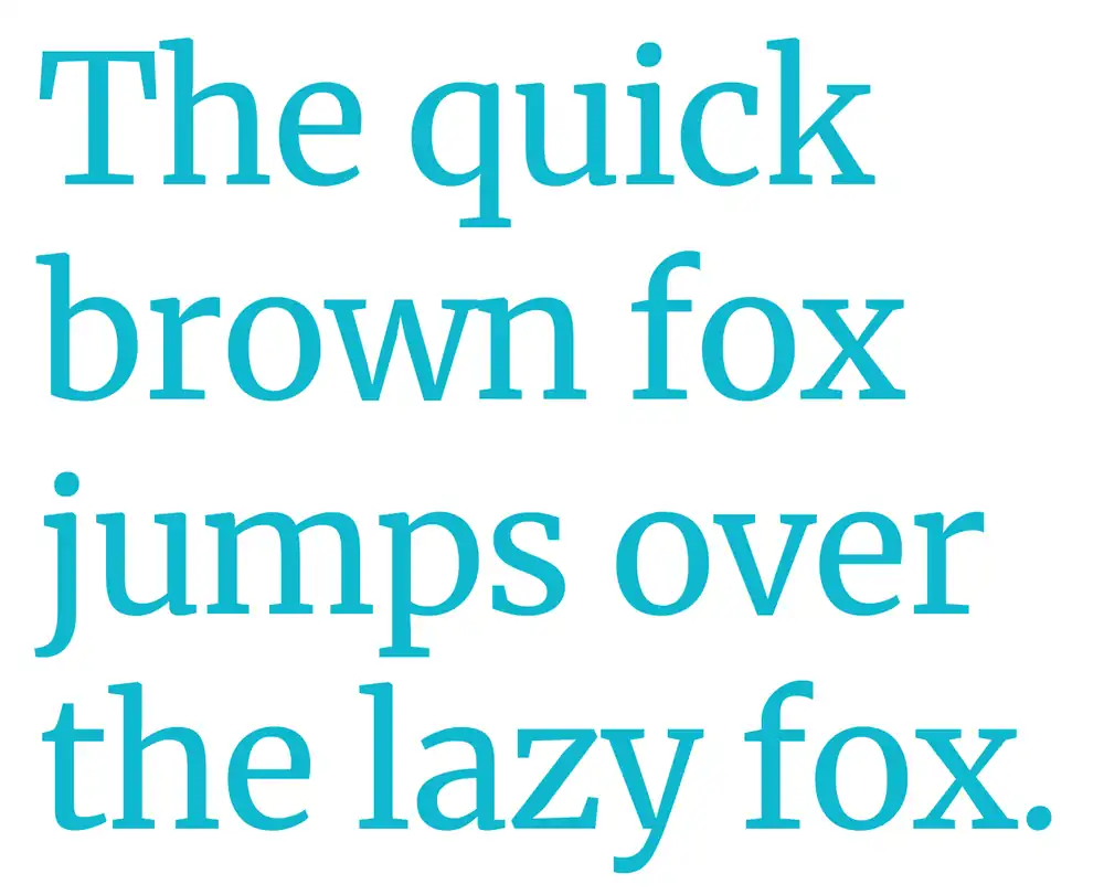
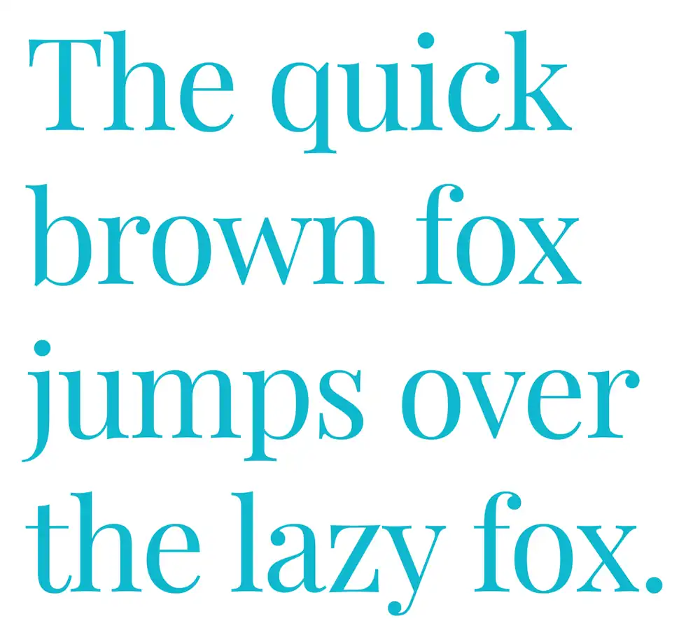
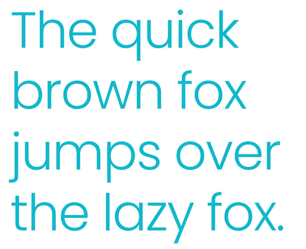
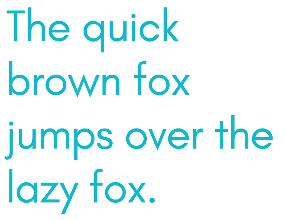
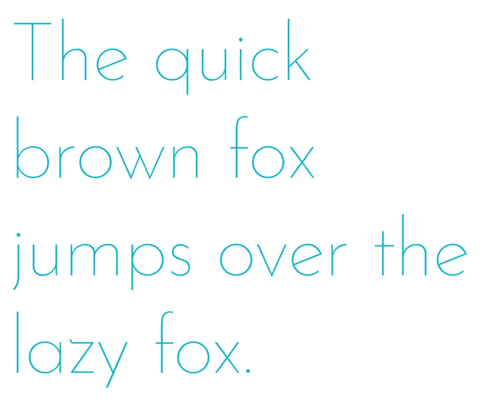
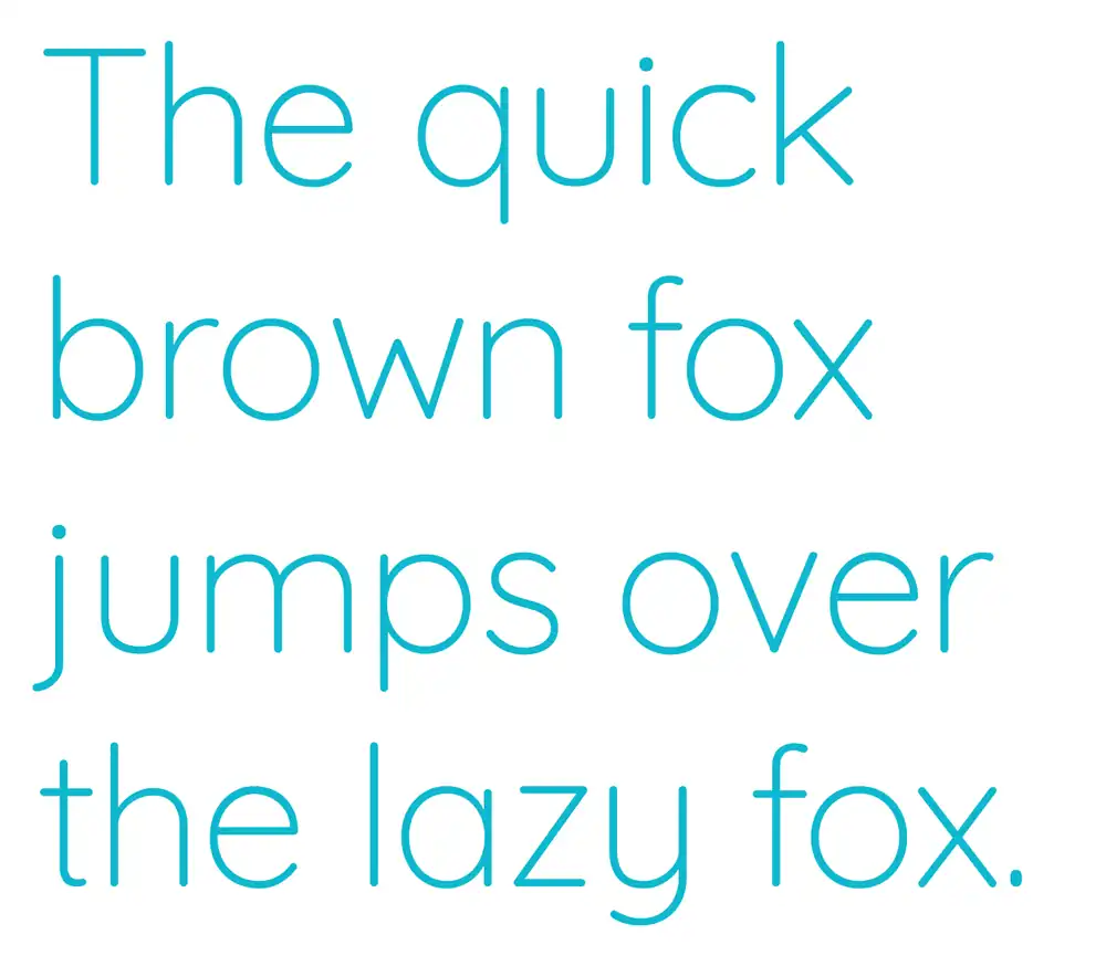
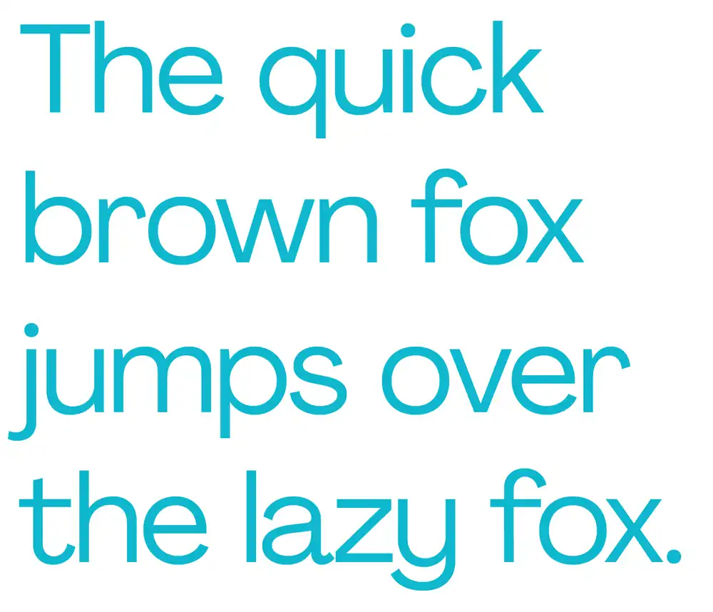
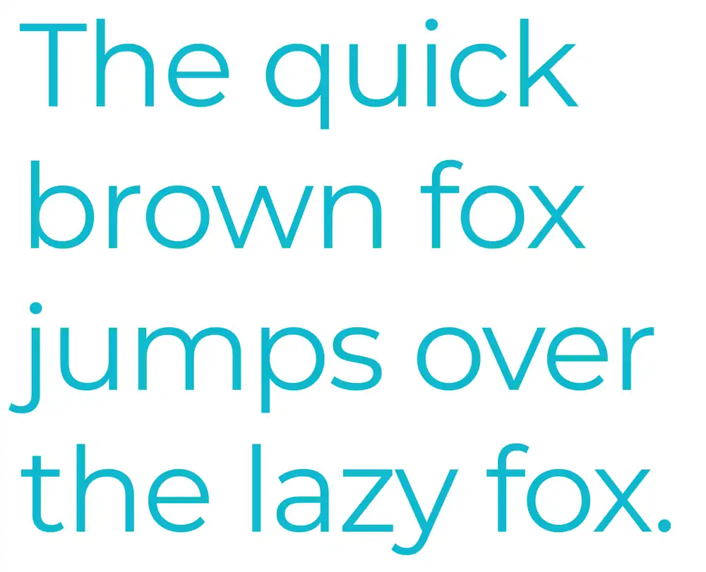
25 Best Free Fonts on Canva
1. DM Serif Display
DM Serif Display’s sleek and contemporary design makes it an excellent choice for adding a touch of elegance to any project.
If you want to use DM Serif Display in Canva, simply go to the font menu and search for ‘DM Serif Display’. It should be available among the font options provided by Canva.
When designing with DM Serif Display, keep in mind that its bold and stylish look works well for headings and titles. Pair it with a clean and simple sans-serif font for body text to create contrast.
If you’re looking for alternatives to DM Serif Display, some similar fonts include Playfair Display, Lora, and Cormorant Garamond. Experiment with different combinations to find the perfect match for your design!
2. Vidaloka
To add a touch of whimsy and playfulness to your designs, Vidaloka is the perfect font for you! This unique serif font has a very playful look that works well for both modern and vintage-inspired designs.
Here are some tips on how to make the most of Vidaloka in your design projects:
- Pair Vidaloka with other fonts: Experiment with combining Vidaloka with sans-serif or script fonts to create interesting and dynamic typography.
- Creating a vintage-inspired design with Vidaloka: Use Vidaloka as the main font in your design and pair it with retro colors, textures, and illustrations to achieve a nostalgic feel.
- Using Vidaloka for logo design: Consider using Vidaloka as the focal point of your logo, as its quirky yet elegant style can help make your brand stand out.
- Incorporating Vidaloka in social media graphics: Use this font in your social media posts to add personality and charm to your visuals.
- Tips for using Vidaloka in web design: Ensure legibility by using appropriate font sizes and spacing. Also, consider combining it with easy-to-read sans-serif fonts for body text.
3. The Seasons
Now that you’ve learned about the elegant Vidaloka font, let’s explore another exciting option for your designs: The Seasons font.
With its earthy and rustic vibe, this serif font is perfect for nature- or season-themed projects.
When it comes to seasonal designs, color palettes play a crucial role in capturing the essence of each season. Whether it’s the vibrant hues of spring, the warm tones of summer, the cozy shades of autumn, or the cool colors of winter, The Seasons font can bring these palettes to life.
Not only does this font lend itself well to visual elements like fashion trends and home decor ideas for each season, but it also adds personality to seasonal activities and hobbies. From pumpkin carving in autumn to snowboarding in winter, The Seasons font can convey the excitement of these pastimes.
And let’s not forget about seasonal recipes and food trends! Use The Seasons font to showcase delicious dishes that are popular during different times of the year.
So get creative with The Seasons font and unlock your design potential!
4. Cardo
Cardo is a serif font that exudes elegance and timelessness, making it an excellent choice for designs with a classic or vintage feel. Its sophisticated look adds a touch of beauty to any project.
If you’re looking to create vintage-inspired designs using the Cardo font, you’re in luck. This font’s graceful curves and delicate serifs capture the essence of old-world charm perfectly.
Additionally, Cardo is perfect for creating professional presentations that require a more formal and refined appearance. Its clean lines and balanced proportions convey professionalism and competence.
For elegant wedding invitations, Cardo is an ideal choice. It brings a sense of romance and sophistication to the design, setting the tone for a truly memorable event.
When it comes to classic book covers, Cardo shines once again with its timeless appeal. The font’s traditional look adds authenticity to any literary masterpiece.
Furthermore, if you want to enhance your brand identity with elegance, using Cardo will do just that. Its graceful letterforms communicate sophistication and trustworthiness effortlessly, ensuring that your brand stands out from the competition in all the right ways.
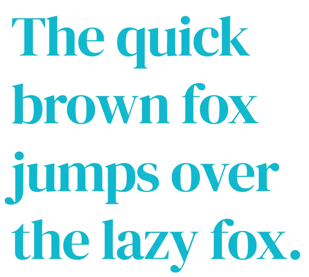
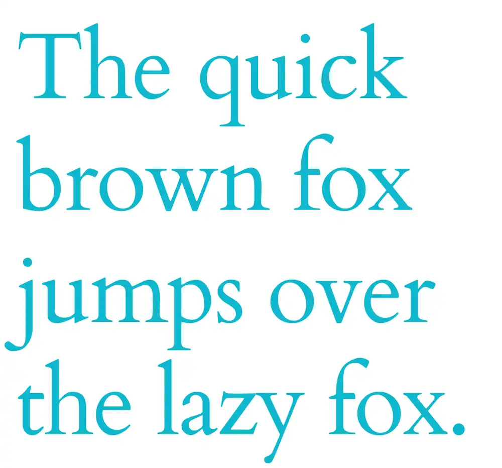
5. Lora
Lora’s delicate and pretty look makes it a perfect font choice for designs that require a feminine or romantic feel. Here are some unique features and tips to consider when using Lora in your designs:
- Unique Features: Lora is a serif font that combines elegance with readability. It has slightly rounded edges, giving it a soft and gentle appearance.
- Pairing Suggestions: You can pair Lora with other serif fonts like Playfair Display for an elegant combination or with sans-serif fonts like Montserrat for a modern twist. Experimenting with different combinations will help you find the perfect match for your design.
- Designing Tips: When using Lora, pay attention to its size and spacing to ensure readability. Use it in headings or titles to make them stand out, while pairing it with a more legible font for body text.
If you’re looking for alternative options, similar fonts to Lora include Cormorant Garamond and Cardo, which also have a feminine touch but offer their own unique characteristics.
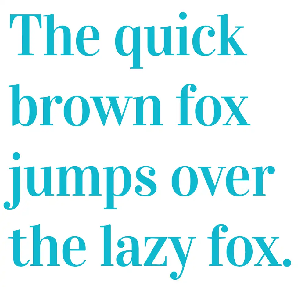
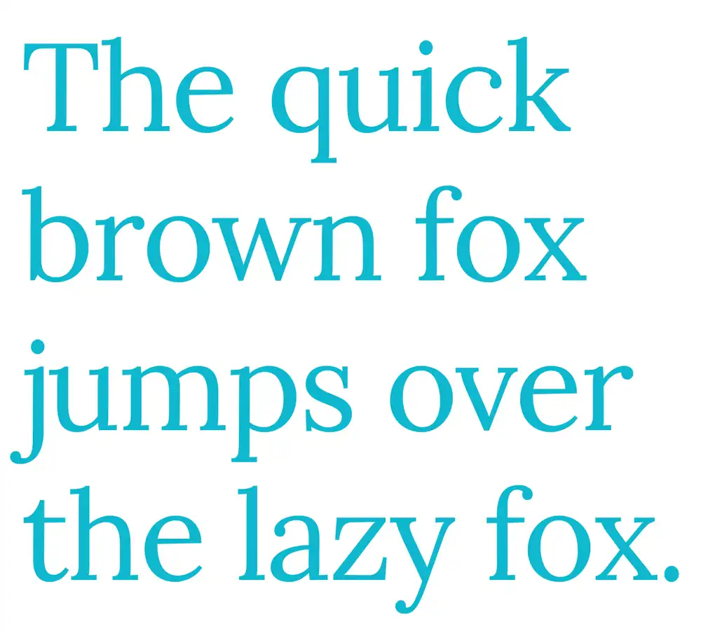
6. Libre Baskerville
Libre Baskerville is a versatile font that adds a touch of modern style to any design. When using Libre Baskerville in Canva, there are some typography tips you should keep in mind.
Firstly, make sure to adjust the letter spacing and line height for optimal readability. This will ensure that your text looks clean and professional.
Additionally, consider pairing Libre Baskerville with other fonts to create interesting visual contrasts. For example, combining it with a sans-serif font can add a contemporary twist to your design. However, be mindful of maintaining consistency and balance throughout your project.
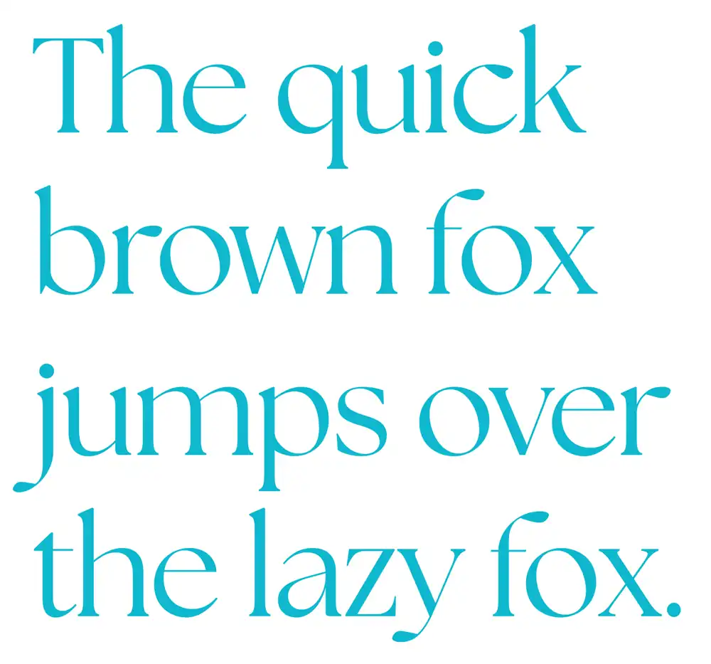
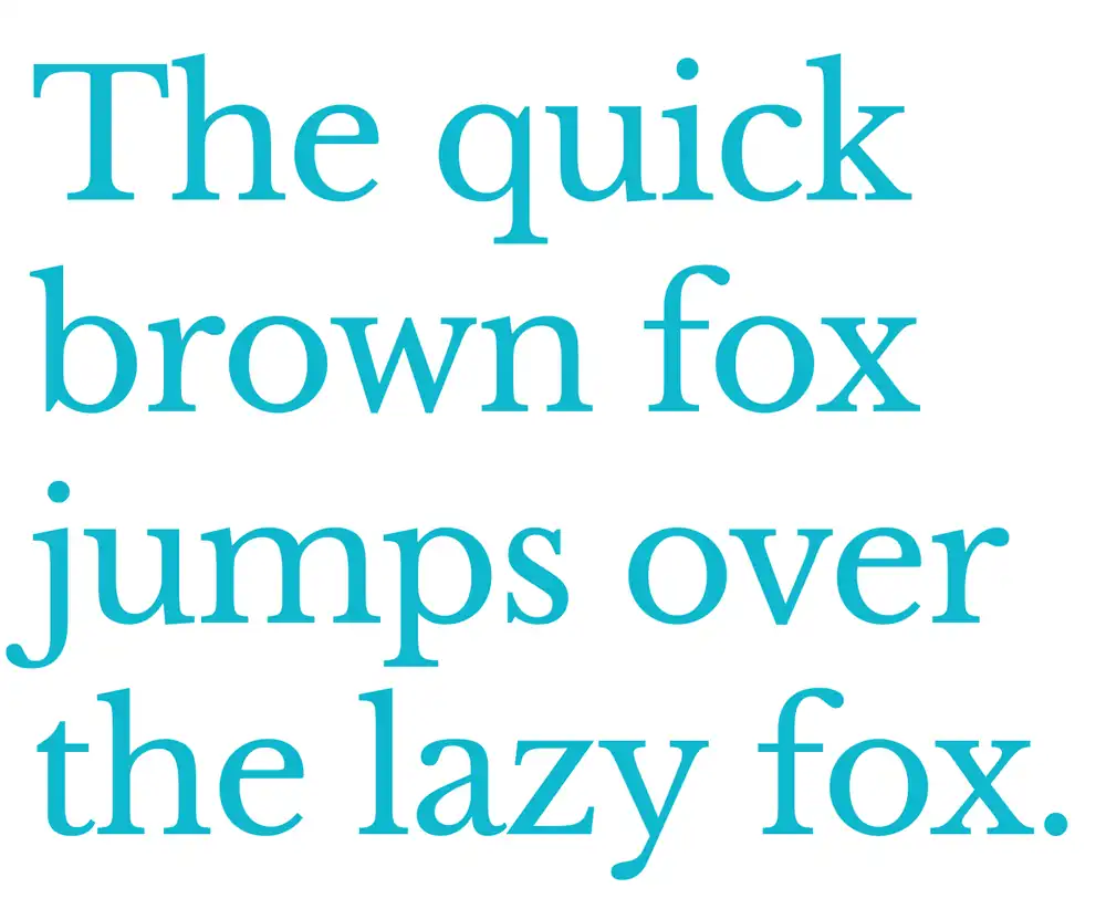
7. Noto Serif Display
Now that you’ve learned about Libre Baskerville, let’s dive into the unique features of Noto Serif Display. This font is known for its modern and stylish look, perfect for adding flair to your designs.
Here are some key points to keep in mind when working with Noto Serif Display:
- Clean and elegant serifs
- Bold and striking letterforms
- Versatile uppercase and lowercase characters
- Wide range of weights and styles
Tips for pairing Noto Serif Display with other fonts:
- Pair it with a clean sans-serif font for a modern contrast.
- Use a decorative script font for an elegant touch.
- Combine it with a playful display font to add personality.
Creative ways to incorporate Noto Serif Display in graphic design:
- Design eye-catching headlines or titles using larger sizes.
- Utilize the different weights and styles for emphasis or hierarchy.
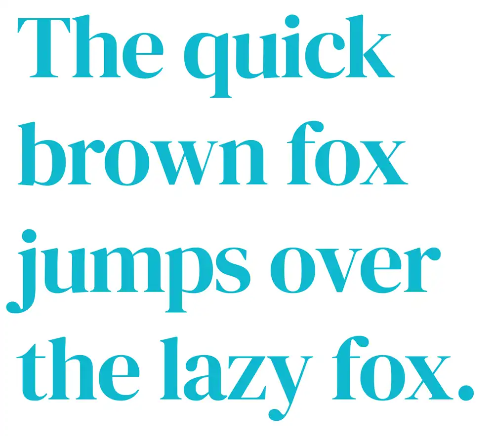
8. Merriweather
If you’re looking for a font that exudes a relaxed and approachable vibe, Merriweather is an excellent choice. This serif font is perfect for designs that require a more casual feel, such as flyers or posters.
When it comes to pairing Merriweather with other fonts, it works well with sans-serif fonts like Open Sans or Montserrat to create a balanced and harmonious look.
If you’re looking for an alternative to Merriweather, you can try Playfair Display or Lora, which have similar characteristics but offer their own unique charm.
Some examples of how Merriweather can be used include headings and body text in website design, creating a cohesive and inviting user experience.
To make the most of this font, consider using it in larger sizes for headlines and smaller sizes for body text to maintain readability.
9. Playfair Display
Playfair Display is a serif font that adds a touch of elegance and sophistication to any design project. With its classic and timeless look, it’s the perfect choice for creating stunning designs with an elegant typography.
Here are three ways you can maximize the impact of Playfair Display in your designs:
- Pairing Playfair Display with other fonts: Combine this font with sans-serif or script fonts to create a balanced and visually appealing composition.
- Creating vintage inspired designs with Playfair Display: Use this font to evoke a sense of nostalgia and charm in your designs, perfect for projects that require a vintage aesthetic.
- Using Playfair Display for professional branding: The clean lines and refined details of this font make it ideal for creating logos, business cards, and other branding materials that exude professionalism.
To optimize Playfair Display for digital and print designs, remember to adjust the letter spacing as needed, choose appropriate sizes for readability, and ensure proper kerning between letters.
10. Poppins Light
Poppins Light is a versatile sans serif font that adds a playful and child-like feel to design projects. If you’re looking for some playful design ideas, Poppins Light is the perfect choice. It can bring a sense of fun and excitement to your designs, making them visually appealing and engaging.
When it comes to font pairing tips, Poppins Light works well with other sans serif fonts or even script fonts for contrast. If you’re looking for alternatives to Poppins Light, you might consider using Raleway or Montserrat as they also have a similar playful vibe.
Poppins Light is also great for social media graphics, adding a touch of whimsy to your posts. And don’t forget about using it in logo design – it can make your brand look friendly and approachable while still maintaining professionalism.
11. Glacial Indifference
Now that you’ve explored the elegance of Poppins Light, let’s dive into another fantastic font option for your Canva designs: Glacial Indifference.
This sans serif font is perfect for creating sleek and modern designs with a minimalist touch.
One great aspect of Glacial Indifference is its versatility when combined with other fonts. You can pair it with serif or script fonts to create a striking contrast and add depth to your design. By using Glacial Indifference in combination with other fonts, you can truly make your designs stand out.
The psychology behind Glacial Indifference lies in its clean and streamlined appearance. It exudes a sense of professionalism, trustworthiness, and even sophistication. This makes it an excellent choice for branding purposes, as it can help establish a strong visual identity.
So go ahead and explore the possibilities that Glacial Indifference offers in your Canva designs. Create stunning visuals that convey your message effectively while capturing attention with their minimalist charm.
12. Josefin Sans Thin
If you’re looking for a font that embodies modernity and simplicity, Josefin Sans Thin is a great choice. This sans serif font lends itself well to various design projects, particularly those with a minimalist or contemporary aesthetic.
When it comes to font pairing, Josefin Sans Thin can be combined with other clean and elegant typefaces to create visually pleasing compositions. To further enhance your design, consider using the best color combinations that complement the style of Josefin Sans Thin.
Whether you’re designing logos or promotional materials, incorporating this font in Canva templates can help you achieve a professional look effortlessly. Don’t forget to customize your designs with effects such as shadows or gradients to add depth and visual interest.
With its versatility and sleek appearance, Josefin Sans Thin is sure to elevate your creative endeavors.
13. Quicksand Light
Quicksand Light is commonly used for designs with a modern or minimalist feel. Its clean and streamlined look makes it perfect for logos and branding projects. This sans serif font offers versatility and elegance to your designs.
Here are some key points to consider when using Quicksand Light:
- Font pairing: Quicksand Light can be paired with other fonts, such as a bold serif or script font, to create contrast and visual interest in your design.
- Typography trends: Quicksand Light aligns well with current typography trends, as its simplicity and readability make it suitable for various design styles.
- Font customization: Quicksand Light allows you to customize the weight, size, and spacing of the letters, giving you more control over the overall aesthetics of your design.
- Font psychology: The clean lines of Quicksand Light evoke a sense of professionalism and sophistication, making it an excellent choice for businesses seeking a sleek and contemporary image.
- Font accessibility: With its clear legibility even at smaller sizes, Quicksand Light ensures that your message is easily readable across different devices and platforms.
14. Agrandir
When choosing a font for your professional design projects, Agrandir offers a sleek and refined appearance that will elevate the overall look and feel. This sans serif font is perfect for creating stunning designs that will capture attention and unlock your creativity.
Agrandir’s clean lines and modern aesthetics make it an ideal choice for various applications, whether you’re designing a logo, website, or social media graphics on Canva. With its versatility and sophisticated charm, Agrandir can add a touch of elegance to any project while maintaining readability and professionalism.
15. Montserrat
Montserrat’s clean and streamlined look makes it a popular choice for modern and minimalist designs. Whether you’re creating a logo or working on branding, this sans serif font adds a sleek touch to any project.
The versatility of Montserrat allows it to be used in various settings, from websites to print materials. Looking for something with a classic feel? Try pairing Montserrat with fonts like Josefin Sans Bold or Oswald to create an elegant and timeless design.
For a bolder statement, consider combining Montserrat with Bebas Neue or League Spartan, which will add emphasis and strength to your text. With its simplicity and flexibility, Montserrat is sure to elevate your designs and capture attention.
16. Raleway
Now that you’ve learned about Montserrat, let’s move on to another amazing font option: Raleway. This font is perfect for giving your designs a professional and serious touch. But how do you pair Raleway with other fonts to create stunning combinations? Don’t worry, I’ve got you covered!
When it comes to pairing Raleway with other fonts, some great alternatives include Roboto, Open Sans, and Lato. These fonts complement Raleway’s sleek and refined appearance beautifully. Plus, they’re all readily available for use.
Whether you’re working on branding materials or designing a website, Raleway can be an excellent choice. Its clean lines and modern look make it suitable for creating a polished and sophisticated brand image.
So go ahead and experiment with different font combinations using Raleway – the possibilities are endless!
17. AdBhashitha
AdBhashitha is a versatile font that adds flair to any design. Its clean and modern look makes it a great choice for various projects. Here are some ways you can use the AdBhashitha font to enhance your designs:
- AdBhashitha font pairing: Pairing AdBhashitha with a bold serif font like Playfair Display creates an interesting contrast and adds visual interest to your designs.
- AdBhashitha font in website design, social media graphics, and logo design: Use AdBhashitha in headings or titles on your website to grab attention. It also works well in social media graphics, giving them a professional and stylish look. Lastly, incorporating the AdBhashitha font in logo design can help create a unique and memorable brand identity.
18. Montserrat Classic
You’ll love the clean and streamlined look of Montserrat Classic, perfect for giving your designs a modern and minimalist feel.
Typography trends in modern design often lean towards sans serif fonts like Montserrat Classic.
The versatility of this font is impressive, as it can be used in various design projects such as logos, branding, or even website design.
Incorporating Montserrat Classic into your website will give it a sleek and professional appearance.
Additionally, when it comes to professional presentations, Montserrat Classic shines with its elegance and clarity.
In comparison to other popular sans serif fonts, Montserrat Classic stands out with its unique style and readability.
19. Josefin Sans Bold
If you’re going for a professional and refined look in your designs, Josefin Sans Bold is an excellent font choice. This font offers a sleek and polished appearance that can elevate any project.
When it comes to pairing options, Josefin Sans Bold works well with both serif and sans serif fonts. It adds a touch of sophistication when used in logo design, making your brand stand out from the competition.
To make the most of this font, it’s important to follow some best practices. Keep the letter spacing balanced and consistent, ensuring readability at different sizes. Additionally, consider exploring creative typography techniques such as using different weights or styles within the same font family.
If you’re looking for alternative sans serif fonts with similar characteristics to Josefin Sans Bold, you might also consider Raleway or Lato.
20. Oswald
Oswald is a popular font choice for creating professional and serious designs due to its sleek and refined appearance. If you’re using Canva for your design projects, here are some typography tips for using Oswald effectively:
- Pair Oswald with a complementary serif font like Times New Roman to add contrast and balance to your design.
- Use Oswald in headings or titles to make them stand out and grab attention.
- Experiment with different weights of Oswald (such as bold or light) to create hierarchy within your design.
- Consider the overall mood or theme of your project when choosing whether to use regular or condensed versions of Oswald.
21. Bebas Neue
When using Bebas Neue, don’t forget to experiment with different sizes and weights to create emphasis in your designs. This versatile sans serif font can be styled in various ways to suit your creative vision.
Whether you’re comparing it to other fonts or incorporating it into different design projects, Bebas Neue is sure to make a bold statement. Its clean lines and strong presence make it perfect for branding purposes, allowing your company’s identity to shine through.
Additionally, Bebas Neue works well in web design, providing a modern and professional look that captures attention. So go ahead and explore the potential of Bebas Neue – its flexibility and impact will surely elevate your designs.
22. League Spartan
You’ll love the sleek and modern look of League Spartan for your next design project. This font is perfect for keeping up with the typography trends in modern design. With its clean lines and streamlined appearance, it adds a touch of sophistication to any layout.
The impact of font choice on user experience cannot be underestimated, and League Spartan ensures that your audience will have a pleasant reading experience. The psychology of fonts plays a significant role in how people perceive information, and this sans serif font gives off an air of professionalism and trustworthiness.
Additionally, exploring the versatility of sans serif fonts allows you to create designs that are both elegant and contemporary. To make your designs truly eye-catching, try using font pairing techniques that complement each other while creating contrast at the same time.
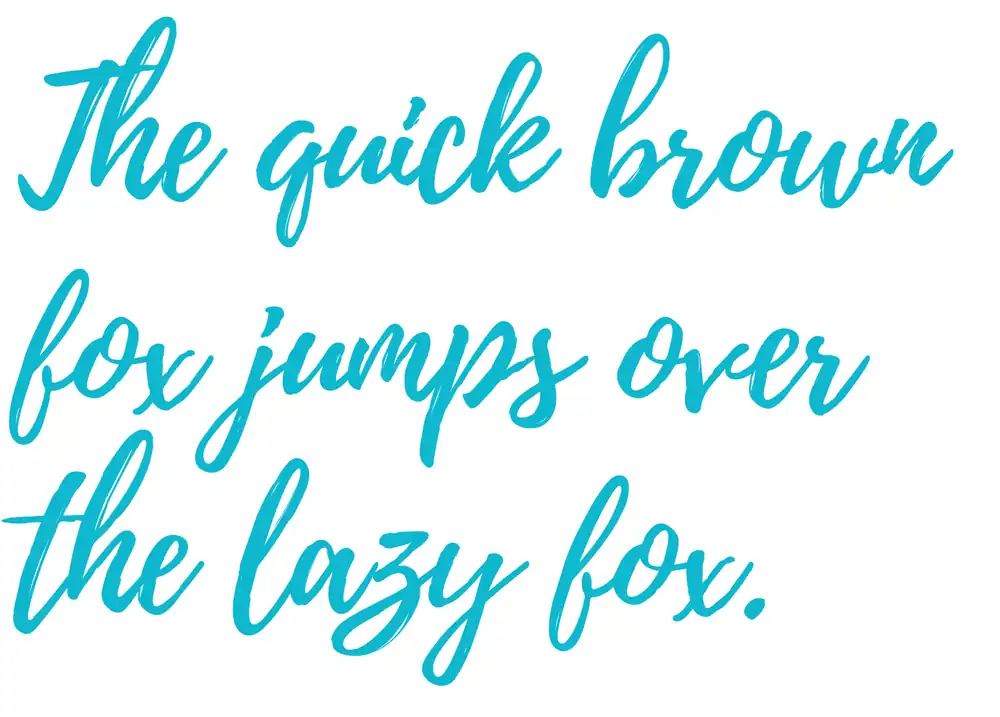
23. Brittany
Now that you’ve learned about League Spartan, let’s move on to Brittany. This script font is a great choice for adding personality to your designs. When it comes to font pairing, Brittany works well with clean and simple serif or sans-serif fonts. You can experiment with different combinations to find the perfect match for your design.
Font size plays a crucial role in creating visual hierarchy. With Brittany, you can use larger sizes for headings or titles to make them stand out, while smaller sizes are ideal for body text or captions.
When it comes to font color, Brittany looks stunning in deep blues, rich burgundy tones, or even classic black. These colors enhance its elegant and sophisticated look.
To add more flair to your designs, try experimenting with different font styles and effects like bold or italic variations. These subtle changes can make a big impact on the overall aesthetic of your design.
24. Playlist Script
If you’re looking to add a touch of fun and excitement to your graphics, Playlist Script is the perfect choice for you. This script font can elevate your design and make it stand out from the crowd.
Here are some tips on how to make the most of Playlist Script in your graphic design:
- Pair it with other fonts: Experiment with combining Playlist Script with different serif or sans-serif fonts to create a visually appealing contrast.
- Get creative: Use Playlist Script in unique ways, such as creating hand-lettered quotes or incorporating it into illustrations to add a personal touch.
- Social media graphics: Make your social media posts eye-catching by using Playlist Script for headlines or call-to-action phrases.
When comparing Playlist Script to other script fonts, you’ll find that its playful and energetic vibe sets it apart. However, be mindful of these common mistakes when using Playlist Script:
- Avoid overcrowding: Give enough space around each letter so that the script’s intricate details can shine.
- Don’t overuse it: Reserve the use of Playlist Script for key elements rather than overwhelming your design with too much script text.
25. Sacramento
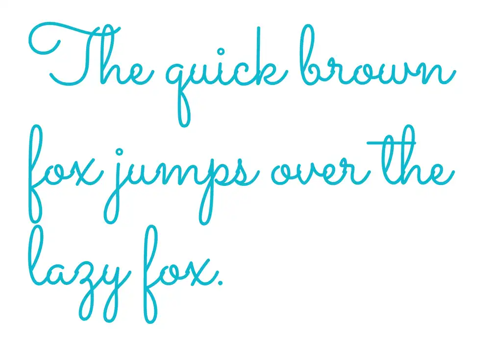
When using Sacramento, you’ll notice its playful and whimsical look that adds a fun touch to your designs. This font exudes handwritten elegance, making it perfect for creating personalized designs with a creative typography twist.
Whether you’re designing whimsical invitations or playful birthday cards, Sacramento will bring an element of charm and joy to your projects. Its script style gives your designs a unique and handcrafted feel, adding that extra bit of personality to make them stand out.
With Sacramento, you have the freedom to experiment with different colors and layouts, allowing you to create truly stunning and eye-catching designs that will capture attention and leave a lasting impression on your audience.
So go ahead and let your creativity run wild with this delightful font!
Can you upload a font to Canva?
You can upload a font to Canva by simply clicking on your Brand Kit and selecting the option to upload a font. Canva offers the flexibility to customize fonts in various ways, allowing you to create stunning designs tailored to your style.
When using Canva’s typography tools, consider these tips for font pairing: choose fonts that complement each other in terms of style and mood, mix serif and sans-serif fonts for contrast, and maintain consistency throughout your design.
Typography plays a crucial role in enhancing your designs in Canva, so stay up-to-date with popular font trends like bold and modern typefaces or elegant script fonts.
If you encounter any font issues while using Canva, try troubleshooting by ensuring that the uploaded font is supported file format (ITF, TFF or WOFF) and restart the application if necessary.
How to Upload a Font to Canva
To upload a font to Canva, simply select the option to upload a font from your Brand Kit and follow the prompts. Once you have uploaded the font, it will be available at the top of the font list when adding text to your designs.
Canva offers various font customization options, allowing you to adjust the size, color, spacing, and more.
Using custom fonts in Canva has its pros and cons. On one hand, it can help make your designs unique and stand out. On the other hand, using too many custom fonts may make your design look cluttered or inconsistent.
To choose the right font for your Canva designs, consider factors such as readability, brand identity, and target audience. Creating a cohesive font palette involves selecting complementary fonts that work well together and reflect your brand’s style.
Additionally, Canva provides advanced typography features like drop caps and text effects for further enhancement of your designs.