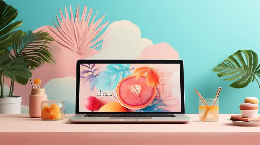
Are you tired of your website looking dull and uninspiring? Well, it’s time to give it a makeover!
In this article, we’ll show you the best color palette for your website. Why settle for boring when you can have vibrant and eye-catching?
We’ve rounded up the top 30 website color schemes that will make your site stand out from the crowd.
So get ready to revamp your online presence and captivate your audience with these stunning colors!
Why Are Website Color Schemes Important
When it comes to website color schemes, choosing the right colors can have a significant impact on your online success. By selecting colors that resonate with your target audience and evoke positive emotions, you can boost conversions and increase sales.
Additionally, a well-thought-out color scheme helps establish your brand identity and make your website easily recognizable among competitors, while also helping to retain visitors by creating a visually appealing and cohesive browsing experience.
Boost Conversions
Using the right color palette can help boost conversions on your website. Conversion optimization is crucial for any online business, and color plays a significant role in influencing user behavior. By understanding color psychology and implementing it into your website design, you can create an engaging user experience that encourages visitors to take action.
Consider using warm colors like red or orange for your call to action buttons as they evoke feelings of urgency and excitement. A/B testing different color combinations will allow you to determine which palette resonates best with your target audience, leading to higher conversion rates.
Don’t underestimate the power of well-designed call to action buttons in driving conversions – choose the right colors and watch your website’s performance soar!
Establish Brand Identity
When it comes to establishing your brand identity, choosing the right color palette for your website is crucial. The colors you use will contribute greatly to how your brand is perceived by your audience.
An expert tip to keep in mind is to select colors that align with your brand values and evoke the desired emotions in your target market.
Retain Visitors
It’s important to create an appealing color palette to keep visitors engaged on your website. By carefully selecting the right colors, you can increase engagement and improve user experience.
An attractive color scheme enhances website design and encourages repeat visits. When visitors find a visually pleasing website, they are more likely to stay longer and explore further. This can lead to increased conversions and improved brand perception.
Additionally, optimizing your color palette can also have a positive impact on website performance. By choosing colors that load quickly and don’t distract from the content, you can ensure a smooth browsing experience for your visitors.
So take the time to choose a well-thought-out color scheme that aligns with your brand identity and goals – it will pay off in terms of visitor retention and overall success of your website.
Top 30 Website Color Schemes
When it comes to website color schemes, there are several options you can consider.
1. White and Black
To create a sleek and modern website, consider using a white and black color palette. This minimalist design choice offers high contrast, giving your site a clean and modern look. The timeless color scheme of white and black exudes sophistication and elegance.
Here are five reasons why this combination is perfect for your website:
- High Contrast: The stark contrast between white and black enhances readability and draws attention to important elements on your site.
- Minimalist Design: The simplicity of the white and black palette creates a minimalist aesthetic that is visually appealing.
- Clean and Modern: White and black colors give your website a fresh, contemporary feel that resonates with users.
- Timeless Color Scheme: This classic combination never goes out of style, ensuring that your website will remain relevant for years to come.
- Versatility: White and black can be easily paired with other colors to create dynamic accents or highlight specific areas.
2. Dark Green, Ivory, and Yellow
Now that you’ve learned about the power of white and black in web design, let’s explore another captivating color palette: dark green, ivory, and yellow.
Dark green is known for its calming and soothing effects on the mind. It can evoke feelings of tranquility and balance, making it an excellent choice for websites that focus on nature or wellness.
Ivory, on the other hand, brings a sense of elegance and sophistication to web design. Its soft and creamy tones create a welcoming atmosphere for users.
When combined with yellow accents, this color scheme exudes positivity and energy, perfect for brands aiming to convey warmth and vibrancy.
Incorporating dark green into your website layout alongside ivory elements will create a visually appealing aesthetic while harnessing the psychological benefits associated with these colors.
3. Bright Green and Hot Pink
Combining bright green and hot pink in your design can create a bold and vibrant aesthetic. This color combination is not only visually striking but also has psychological implications that can enhance your website design.
According to color psychology, bright green represents growth, freshness, and vitality, while hot pink symbolizes passion, energy, and excitement. By incorporating these colors into your website, you can create an engaging user experience that captures attention and evokes positive emotions.
Additionally, this color combination aligns with current website color trends, as it embraces the use of bold and contrasting colors to make a statement. Understanding color theory and experimenting with different color combinations is crucial for creating visually appealing websites that stand out from the competition.
So go ahead and infuse your website design with the powerful combination of bright green and hot pink!
4. Dark Grey and Yellow-Green
When using dark grey and yellow-green in your design, you can create a modern and fresh aesthetic. Dark grey is often associated with sophistication and elegance, while yellow-green brings a sense of energy and vitality. This color combination has psychological effects that can enhance the user experience on your website. According to color psychology, dark grey conveys stability and authority, instilling trust in your visitors. On the other hand, yellow-green symbolizes growth and optimism, creating a positive and welcoming atmosphere. Incorporating these colors into your website design aligns with current trends in web design aesthetics. By utilizing this color palette effectively, you can evoke specific emotions in your users and leave a lasting impression on them.
5. Blue Shades and White
Using blue shades and white in your design can create a clean and calming aesthetic. This combination is a popular choice for website design trends due to its versatility and soothing effect on users. Incorporating this calming color palette into your website can evoke feelings of tranquility and relaxation, making it more appealing to visitors.
Here are some reasons why the blue shades and white color scheme is a great choice for your website:
- Color Psychology: Blue is often associated with calmness, trust, and reliability, while white represents purity and simplicity.
- Monochromatic Color Scheme: The use of different shades of blue combined with white creates a harmonious monochromatic color scheme that is visually pleasing.
6. White and Lime Green
Now, let’s talk about the color psychology behind using white and lime green in website design.
When it comes to creating an eye-catching and harmonious website, this color combination can work wonders. Lime green has a refreshing and energetic effect on viewers, making them feel excited and engaged with your content. Pairing it with a clean white background enhances its vibrancy and creates a sense of balance.
The psychological effects of lime green include promoting feelings of growth, freshness, and positivity. It is often associated with nature and renewal. When combined with white, it creates a visually appealing contrast that draws attention to important elements on your website.
Using these colors in your palette allows for versatility in highlighting key information while maintaining a clean and modern look. So why not give the white and lime green combination a try? Your website will surely stand out while providing users with an enjoyable experience.
7. Beige and Dark Grey
Beige and dark grey create a sophisticated and elegant color combination that adds a touch of warmth to your website design. This subtle yet impactful palette appeals to the principles of color psychology by evoking feelings of comfort, stability, and professionalism.
When used strategically, these colors can enhance the visual hierarchy of your website, guiding users’ attention to important elements such as call-to-action buttons or navigation menus. Moreover, beige and dark grey provide high contrast levels that improve website accessibility for individuals with visual impairments.
Their neutral tones also lend themselves well to minimalist design, creating a clean and modern aesthetic. Embrace the power of this timeless color duo in your website’s palette to elevate its overall appeal and user experience.
- Beige and dark grey evoke feelings of comfort and stability.
- These colors enhance the visual hierarchy on your website.
- They improve website accessibility for visually impaired users.
8. Black and Neon Blue
Black and neon blue provide a striking color combination that adds a bold and vibrant element to your design. By incorporating this palette into your website, you can boost website traffic and create a modern aesthetic that catches the eye of your visitors.
The contrast between black and neon blue helps enhance user experience by making important elements stand out, improving overall navigation. This visually appealing color scheme also increases brand visibility as it leaves a lasting impression on your audience.
With black as the base color, it provides a sense of sophistication and elegance, while the neon blue adds an exciting pop of energy. So why not take advantage of this dynamic duo to improve your website’s appearance and make it more memorable?
Give it a try today!
9. Orange Shades and Blue
Using orange shades and blue in your design can create a captivating and energetic aesthetic that captures the attention of your audience. The combination of vibrant orange and various shades of blue brings a powerful impact to website design.
Here are some key points to consider:
- Vibrant orange: Explore the boldness and vibrancy of using bright orange shades, which can evoke feelings of excitement and enthusiasm.
- Blue psychology: Understand the psychological effects of incorporating different shades of blue into your color palette. Lighter blues can create a sense of calmness, while darker blues convey trust and reliability.
- Orange and blue harmony: Discover the visual appeal achieved by combining orange shades with blue. The warm tones of orange complement the coolness of blue, creating a harmonious balance in your design.
Analyzing color symbolism is important when considering how orange and blue will impact user experience on your website. Finally, don’t forget to consider color accessibility to ensure that all users can fully engage with your site’s design.
10. Pale Pink and Navy Blue
Now let’s explore another color palette that can add visual appeal to your website: pale pink and navy blue.
These colors have different meanings in color psychology and can be used strategically in your branding strategies.
Pale pink is often associated with femininity, romance, and sweetness. It can evoke feelings of calmness and tenderness, making it a great choice for websites related to beauty, fashion, or wellness.
On the other hand, navy blue symbolizes stability, trustworthiness, and professionalism. It gives a sense of authority and sophistication to your website.
By combining these two colors in your website design, you create a balance between warmth and reliability. This combination is versatile and suits various industries including finance, technology, or even personal blogs.
Remember to consider color symbolism and incorporate it into your website design tips to enhance your branding strategies effectively.
11. Pastel Purple and Neutral Accents
The combination of pastel purple and neutral accents can create a soothing and elegant aesthetic for your website design. Pastel purple, with its calming properties, is known to evoke feelings of tranquility and creativity. By incorporating this color into your website’s design, you can enhance the user experience and promote a sense of relaxation. Neutral accents such as white or light gray can provide a clean and modern look, allowing the pastel purple to take center stage. This color palette not only appeals visually but also has psychological benefits, creating a positive emotional response in your audience. Furthermore, by consistently using these colors throughout your website, you can establish brand recognition and create a cohesive visual identity that leaves a lasting impression on visitors.
12. Navy Blue and Electric Blue
To create a bold and energetic vibe on your site, consider incorporating navy blue and electric blue into your design. These colors are not only visually appealing but also in line with current website design trends.
Navy blue represents trustworthiness and reliability, making it an excellent choice for businesses that want to establish credibility. Electric blue, on the other hand, exudes energy and excitement, perfect for brands targeting a younger audience or those in the creative industry.
When using these vibrant blues in your website design, pay attention to contrast and readability. Ensure that text is easily readable against the chosen background color to maintain accessibility for all users. Additionally, consider the symbolism associated with these colors in different cultures. While navy blue may be seen as professional in Western societies, it can have different connotations elsewhere.
Incorporate navy blue and electric blue strategically into your website to create a visually striking experience while keeping in mind color psychology, contrast and readability, color symbolism, and color accessibility.
13. Color Gradient, White, and Dark Blue
Consider incorporating a color gradient with shades of white and dark blue into your design for a modern and sophisticated look. A color gradient not only adds visual interest to your website but also conveys certain emotions and messages to your audience.
The importance of color gradients in website design cannot be underestimated, as it creates a visually appealing flow that guides users through different sections of your site. When it comes to website color psychology, dark blue is often associated with trustworthiness and professionalism, making it an excellent choice for corporate websites or financial institutions. On the other hand, white symbolizes purity, simplicity, and cleanliness, which can create a sense of calmness and elegance.
By carefully selecting a color palette that incorporates these elements, you can effectively communicate your brand’s values while creating an aesthetically pleasing user experience.
- Color gradients add visual interest
- Dark blue conveys trustworthiness
- White symbolizes purity and simplicity
- Color palette selection communicates brand values
- Creating an aesthetically pleasing user experience
14. Beige, Orange, and White Accent

Incorporate a beige, orange, and white accent into your design to add warmth and vibrancy. By using these colors strategically, you can create a visually appealing website that not only catches the eye but also boosts website traffic. Color psychology plays a crucial role in attracting and engaging users, so it’s essential to select complementary colors that evoke the desired emotions. Beige brings a sense of calmness and neutrality, while orange adds energy and enthusiasm. When combined with white, these colors create a cohesive design that is both inviting and professional. To further understand the impact of color combinations, take a look at this table:
Using color contrasts effectively can make certain elements stand out while maintaining harmony throughout your website. So go ahead and incorporate these vibrant accents into your design for an eye-catching result!
15. White and Blue-Grey
Now that we’ve discussed the beige, orange, and white accent color palette, let’s explore another popular combination for website design: white and blue-grey. This color scheme offers a clean and modern look that can boost website conversions.
- Color psychology: White symbolizes purity and simplicity, while blue-grey evokes feelings of trustworthiness and professionalism.
- Website design trends: White backgrounds with blue-grey accents are currently trending in the web design industry.
- Color harmony: White and blue-grey create a harmonious balance that is visually appealing to users.
16. Bright Red and White
The bright red and white color combination creates a bold and eye-catching visual impact. When it comes to boosting engagement on your website, color psychology plays a crucial role.
Red is associated with energy, passion, and excitement, while white symbolizes purity and simplicity. This dynamic duo not only captures attention but also conveys a strong message to users. Incorporating this color scheme into your website design aligns with current trends in web design, ensuring that your site looks modern and up-to-date.
Furthermore, the contrast between the vibrant red and clean white helps establish a strong visual hierarchy, guiding users’ attention to important elements such as call-to-action buttons or key information.
17. Classic Blue, Turquoise, and Gold
The classic blue, turquoise, and gold color combination creates a sense of elegance and sophistication on your website. Incorporating this classic blue palette with a striking turquoise color scheme and subtle gold accents will immediately capture the attention of your visitors. Here’s why you should consider using this color combination:
- Classic Blue: This timeless hue exudes trustworthiness, reliability, and stability. It instills a sense of calmness and confidence within your audience.
- Turquoise Color Scheme: Adding pops of vibrant turquoise can evoke feelings of freshness, creativity, and innovation. It adds a modern touch to your website design.
- Gold Accents: Incorporating delicate gold accents brings a touch of luxury and opulence to your site. It conveys prestige and sophistication.
18. Yellow and Blue
Using a yellow and blue color combination can create a vibrant and energetic atmosphere on your site. Color psychology plays a crucial role in website design, as it has the power to evoke emotions and influence user experience. By incorporating these colors into your branding strategy, you can make a visual impact that leaves a lasting impression on your visitors. Yellow is often associated with happiness, optimism, and creativity, while blue represents trust, reliability, and calmness. Together, they create a harmonious balance that grabs attention and enhances the overall aesthetics of your website. To give you an idea of how this color combination can be used effectively, here’s an example table showcasing different shades of yellow and blue:
Experimenting with these colors will not only breathe life into your website but also improve user engagement by providing a visually stimulating experience.
19. Dark Royal Blue and Gold
Dark royal blue and gold make an elegant and regal color combination for your site. The contrast between the deep blue and shimmering gold creates a visually appealing experience for your visitors.
Incorporating this color palette into your website design can enhance the elegance and sophistication of your brand. Imagine a dark royal blue background, with golden accents highlighting important elements on the page. The combination exudes luxury and professionalism, instantly capturing attention. It also adds a touch of class to your branding, making it memorable and distinctive.
Whether you’re creating a website for a high-end fashion brand or an upscale restaurant, dark royal blue and gold will elevate the visual appeal of your site, leaving a lasting impression on visitors.
20. Blue, Beige, and Coral Red
Imagine how blue, beige, and coral red can create a vibrant and energetic color scheme for your site.
Color psychology plays a significant role in user experience, as different colors evoke various emotions and reactions. Blue, known for its calming effect, can create a sense of trustworthiness and professionalism.
Beige, with its neutral tone, provides balance and simplicity while complementing other colors.
Coral red adds a pop of excitement and passion to the overall design. By using these colors strategically, you can establish visual hierarchy on your website by guiding users’ attention to important elements.
Additionally, color symbolism should be considered to ensure that the chosen palette aligns with your brand identity and message.
Achieving color harmony is essential for creating an aesthetically pleasing website that engages users effectively.
21. Red and Yellow
When it comes to creating an eye-catching and energetic design for your site, red and yellow can add a bold and vibrant touch. These colors have a strong emotional impact on viewers due to their association with energy, passion, and happiness. In color psychology, red is often associated with excitement and urgency, while yellow symbolizes optimism and creativity. The cultural associations of these colors further enhance their impact – red may evoke feelings of luck or celebration in some cultures, while yellow is often associated with joy and positivity. When used strategically in your website’s visual hierarchy, such as in headers or call-to-action buttons, red and yellow can help grab attention and guide users through your content effectively.
Incorporating these colors into your website’s design will not only make it visually appealing but also create a positive emotional connection with your audience.
22. White and Purple
The combination of white and purple can create a sense of elegance and sophistication in your website’s design. White symbolizes purity, simplicity, and cleanliness, making it an ideal choice for creating a minimalist and modern look.
Purple, on the other hand, represents luxury, creativity, and royalty. By incorporating purple accents or using it as the primary color in your website design, you can evoke feelings of uniqueness and exclusivity.
When it comes to website design, color psychology plays a crucial role in shaping user experience. Considering accessibility is important to ensure that all users can easily navigate your site. The contrast between white and purple provides good readability for those with visual impairments.
Furthermore, this color combination can also help strengthen your brand identity by conveying a sense of professionalism and high-quality services or products.
23. Beige and Red
Beige and red can create a warm and inviting atmosphere in your website’s design. Color psychology plays a crucial role in website branding, as different colors evoke different emotions and associations.
Beige, with its neutral tone, signifies warmth and comfort, making it perfect for creating a cozy user experience.
Red, on the other hand, is bold and vibrant, symbolizing passion and energy. When used strategically in your website’s design elements such as buttons or headings, red can create visual impact and grab users’ attention. Additionally, red is often associated with urgency and excitement, making it ideal for call-to-action buttons or limited-time offers.
24. Blue Shades, White, and Red-Violet
Blue shades, white, and red-violet can create a harmonious and calming color combination for your website’s design. According to color psychology, blue is associated with trust, reliability, and calmness. White symbolizes purity and simplicity while red-violet represents creativity and luxury. Combining these colors in your website design will not only visually appeal to your audience but also convey a deeper meaning. The use of contrasting colors like blue shades against a white background can make important elements stand out and increase readability. Additionally, this color palette aligns with current website design trends that prioritize clean and minimalistic aesthetics. So why not give your website a refreshing look by embracing the power of color harmony?
25. Teal and White
Teal and white create a modern and clean color combination that can enhance the visual appeal of your design. When it comes to website color schemes, teal and white are a popular choice for their versatility and sophistication.
The soothing teal hue adds a sense of calmness, while the crisp white brings in a touch of elegance. This combination is perfect for creating a professional and polished look for your website. Whether you’re designing a personal blog or an online store, incorporating teal and white into your website design will give it a fresh and contemporary feel.
Teal and white branding can also help establish a cohesive visual identity across all aspects of your business. So if you’re looking for some teal and white website inspiration, consider this timeless color scheme for its aesthetics that never go out of style.
26. Light and Reddish Orange
If you’re looking to add a pop of warmth and vibrancy to your design, incorporating light and reddish orange can create an eye-catching color combination. This color palette is not only visually appealing but also has psychological effects that can enhance the user experience on your website.
Here are five reasons why using light and reddish orange in your website design can be a great branding strategy:
- Color psychology: Light and reddish orange evoke feelings of energy, enthusiasm, and warmth.
- Visual appeal: The contrast between the lightness and richness of these colors creates a visually striking effect.
- User experience: Warm colors like reddish orange can create a welcoming atmosphere and encourage users to stay longer on your site.
- Branding strategy: Using this color combination consistently throughout your website builds brand recognition and reinforces your brand identity.
- Versatility: Light and reddish orange can be easily paired with other colors to create different moods or highlight specific elements.
Incorporating light and reddish orange into your website design is an effective way to engage users, convey emotions, enhance visual appeal, strengthen branding efforts, and create a memorable user experience.
27. White, Purple, and Orange
Using a combination of white, purple, and orange in your design can create a visually appealing and dynamic color scheme. White represents purity and simplicity, while purple symbolizes creativity and luxury. Orange adds energy and enthusiasm to the mix. This color palette can boost website traffic by capturing attention and creating a positive user experience. According to color psychology, these colors evoke feelings of calmness, inspiration, and excitement. The visual appeal of this color combination is enhanced by its ability to create contrast and harmony at the same time. To illustrate this further, here is a table showcasing the different shades of white, purple, and orange that can be used in your design:
28. Yellow, Brown, and Purple
The combination of yellow, brown, and purple can create a warm and inviting color scheme for your design. Color psychology plays a crucial role in website design as it impacts the user experience. According to color theory, yellow represents optimism and positivity, while brown signifies stability and reliability. Purple is associated with creativity and luxury.
Incorporating these colors strategically can enhance the visual impact of your website.
Yellow can be used as an accent color to draw attention to important elements or call-to-action buttons. Brown can be used as a background color to create a sense of grounding and balance. Purple can be used sparingly for headings or highlights to add a touch of elegance.
29. Deep Purple, Orange, Red, and Pink
To create a visually striking design, incorporate deep purple, orange, red, and pink into your color scheme. These vibrant colors are perfect for boosting engagement and attracting attention on your website.
Deep purple adds a touch of sophistication and mystery, while orange brings energy and warmth. Red is known to evoke strong emotions like passion and excitement, making it ideal for catching the viewer’s eye. Pink adds a softness and femininity to the overall look.
30. Brown and Beige

Brown and beige are versatile neutral colors that can add warmth and sophistication to any design. When it comes to color psychology, warm tones like brown and beige evoke feelings of comfort, stability, and reliability. These earthy hues are perfect for creating a sense of natural beauty in visual aesthetics. In website design, incorporating brown and beige can create a calming and inviting atmosphere for visitors.
Frequently Asked Questions
How Can I Choose the Right Color Palette for My Website if I Have No Design Experience?
If you lack design experience, fear not! Start by exploring color psychology and theory. Consider contrasting colors for readability and accessibility. Finally, incorporate your brand’s identity into the palette to create a visually appealing website.
Are There Any Color Schemes That Are Proven to Be More Effective for Specific Types of Websites, Such as E-Commerce or Blogs?
There are color schemes proven to be more effective for specific types of websites. Impacting user engagement, color psychology plays a role in design. Color palettes influence brand perception and contrasting colors are used for effective call-to-action buttons. Monochromatic schemes are explored.
Can Using Too Many Colors in My Website’s Color Palette Negatively Affect the User Experience?
Using too many colors in your website’s color palette can negatively impact the user experience. Consider the impact of color saturation and the role of color psychology in creating a cohesive palette that incorporates contrasting colors for visual hierarchy while also incorporating current trends.
Are There Any Color Combinations That Should Be Avoided Due to Cultural or Psychological Implications?
Avoid color combinations with negative cultural or psychological implications. Consider how colors can impact brand identity and user engagement. Choose contrasting colors strategically for effective website design that visually engages users.
How Can I Ensure That the Color Palette I Choose for My Website Is Accessible for Users With Color Blindness or Visual Impairments?
To ensure your website’s color palette is accessible for users with color blindness or visual impairments, consider these tips: use tools to test color accessibility, follow WCAG guidelines, incorporate color contrast ratios, and study successful websites with accessible palettes.