In the digital age, where emails serve as a primary mode of communication for both personal and professional purposes, the design and readability of your content can make or break your message. Fonts, often overlooked, play a pivotal role in how your email is perceived. They can set the tone, evoke emotions, and even influence the credibility of your content.
As we step into 2023, it’s essential to stay updated with the latest trends and best practices in email font design. Whether you’re a marketer aiming to boost your campaign’s success or simply looking to refine your personal emails, this guide is tailored for you. Dive in to discover fonts that not only enhance aesthetics but also elevate the effectiveness of your emails.
Why Fonts Matter?
In the realm of email campaigns, the choice of font is more than just a design decision; it’s a strategic one. The right font can amplify your message, ensuring it resonates with the reader, while the wrong one can muddle the intent and even deter engagement. Every font carries with it a unique personality and tone, which, when aligned with the content, can significantly enhance the effectiveness of the communication.
Moreover, fonts play a crucial role in setting the mood of an email. Just as a well-tailored suit can make a lasting impression in a business meeting, a carefully chosen font can evoke specific emotions in the reader, be it trust, excitement, or urgency. Beyond mood, the credibility of an email is often judged at a glance, and fonts are a silent yet potent factor in this assessment. An email raising funds for a serious cause, for instance, would lose its gravitas if written in a playful font. In contrast, a well-chosen, professional font can bolster the authenticity of the message, encouraging readers to take action.
4 Email Font Families
Serif
When one thinks of tradition, formality, and a touch of timelessness, Serif fonts come to mind. Characterized by the decorative strokes at the end of each letter, these fonts exude a sense of reliability and authority. A prime example of the gravitas that Serif fonts can bring is the Georgio Armani logo, which effortlessly blends sophistication with a classic appeal.
Sans Serif
Stepping into the modern era, Sans Serif fonts strip away the decorative flairs, presenting a clean and unembellished look. These fonts are the embodiment of simplicity and clarity, making them a favorite for contemporary designs. The Google logo, with its straightforward and uncluttered design, is a testament to the modernity and efficiency that Sans Serif fonts represent.
Script
Transporting us to a world of elegance and artistry, Script fonts are reminiscent of cursive handwriting and are deeply rooted in calligraphy. They capture the essence of classic 17th-century formal writing, making them perfect for occasions that call for a touch of class and sophistication. The Kellogg’s logo, with its flowing and graceful letters, showcases the timeless beauty that Script fonts can bring to a design.
Decorative
For those moments when brands wish to break the mold and showcase their creative flair, Decorative fonts come into play. These fonts are not just letters; they are artistic expressions, each with a unique and unconventional design. The Fanta logo, with its playful and vibrant style, encapsulates the fun and imaginative spirit that Decorative fonts can infuse into a brand’s identity.
Email Font Categories
System Fonts
At the core of every computer system lies a set of fonts that come pre-installed, known as System Fonts. These fonts are the bedrock of consistency in the digital world. Whether you’re viewing an email on a Mac in New York or a PC in Tokyo, System Fonts ensure that the content appears uniform and as intended across all devices and email providers. Their reliability stems from their universal presence on devices, making them a safe choice for email designers who prioritize consistent readability.
Web Fonts
Venturing into the realm of customization and creativity, we encounter Web Fonts. Unlike their system counterparts, Web Fonts are fetched from web servers each time an email or webpage is loaded. This dynamic nature allows for a broader range of font styles and designs, giving brands the flexibility to truly capture their unique identity. However, this versatility comes with a caveat. Since Web Fonts rely on external servers and specific support from browsers or email clients, there’s a chance they might not display consistently for every user. Designers leveraging Web Fonts often employ fallback strategies, ensuring that if the chosen font doesn’t load, a default System Font will take its place, preserving the email’s readability.
10 Best Fonts For Email Design
Arial
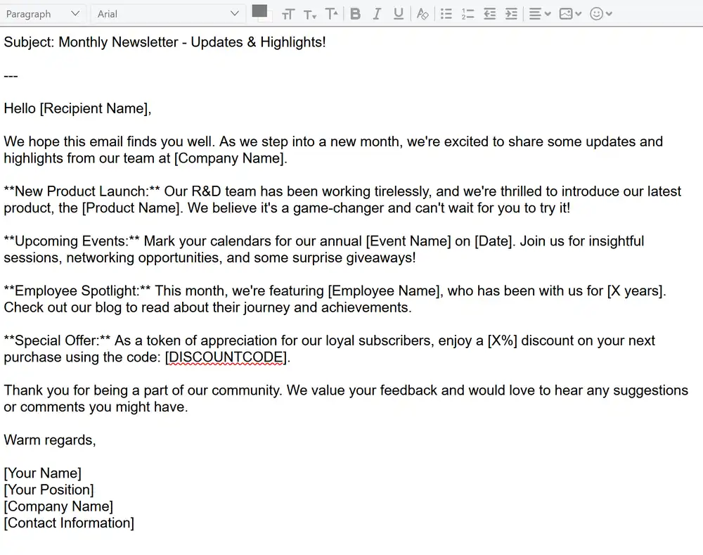
A stalwart in the font world, Arial is a sans-serif typeface known for its versatility and simplicity. Its clean lines and neutral design make it easily readable, ensuring that email content is both clear and professional.
Verdana
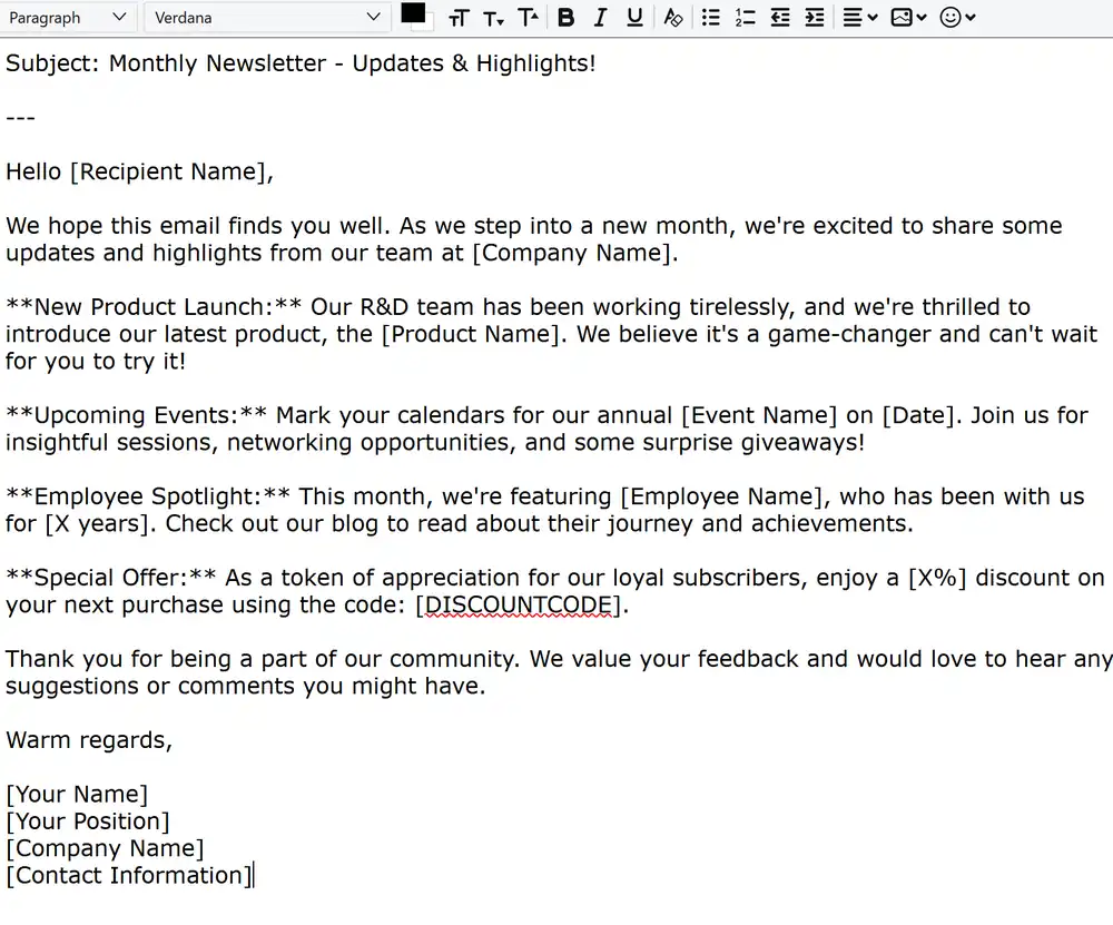
Designed with screen displays in mind, Verdana stands out with its spacious lettering. This sans-serif font, with its ample space between letters, ensures that email content remains legible, especially when viewed on digital screens.
Georgia
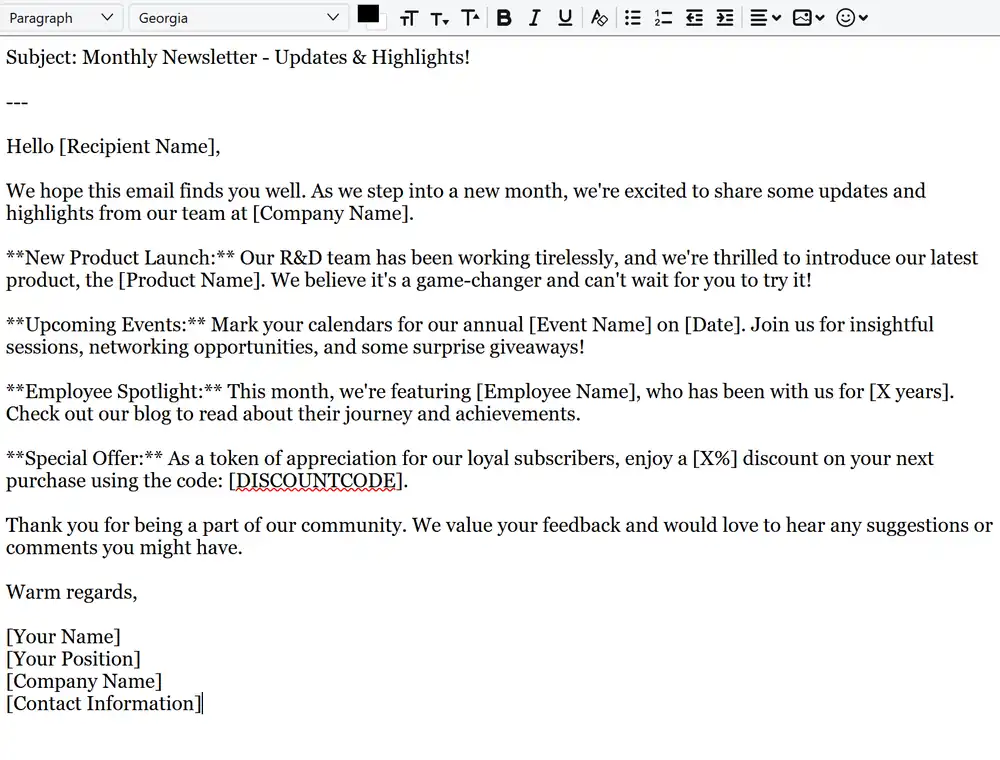
A serif font introduced by Microsoft, Georgia exudes an air of formality and authority. Often found in newspapers and magazines, its well-defined serifs and character spacing make it a top choice for longer email content that requires a touch of sophistication.
Helvetica
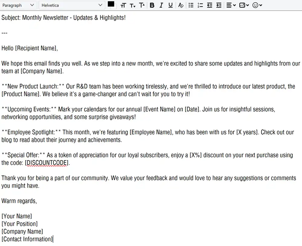
Bold and modern, Helvetica is a sans-serif font that has become synonymous with contemporary design. Its strong presence makes it perfect for headings and logos, though its compact lettering might pose challenges for lengthy email bodies.
Tahoma
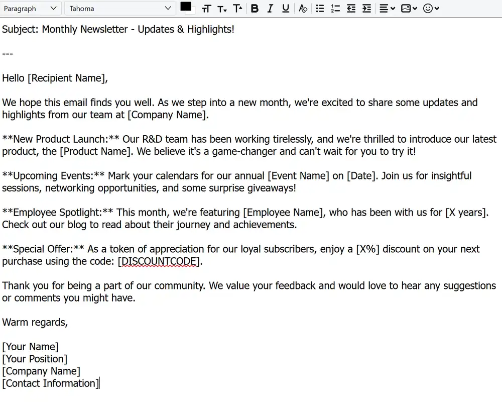
Developed specifically for on-screen displays, Tahoma is a sans-serif font that strikes a balance between readability and aesthetics. Its uniform letter lengths, both in uppercase and lowercase, contribute to a clean and consistent appearance in emails.
Times New Roman
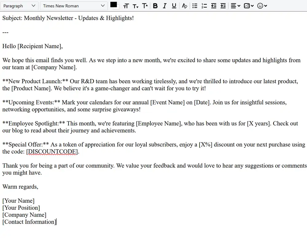
A timeless classic, Times New Roman is a serif font that has graced countless pages since its inception. Known for its authoritative and traditional aura, it’s best suited for headings or content that seeks to command attention.
Open Sans
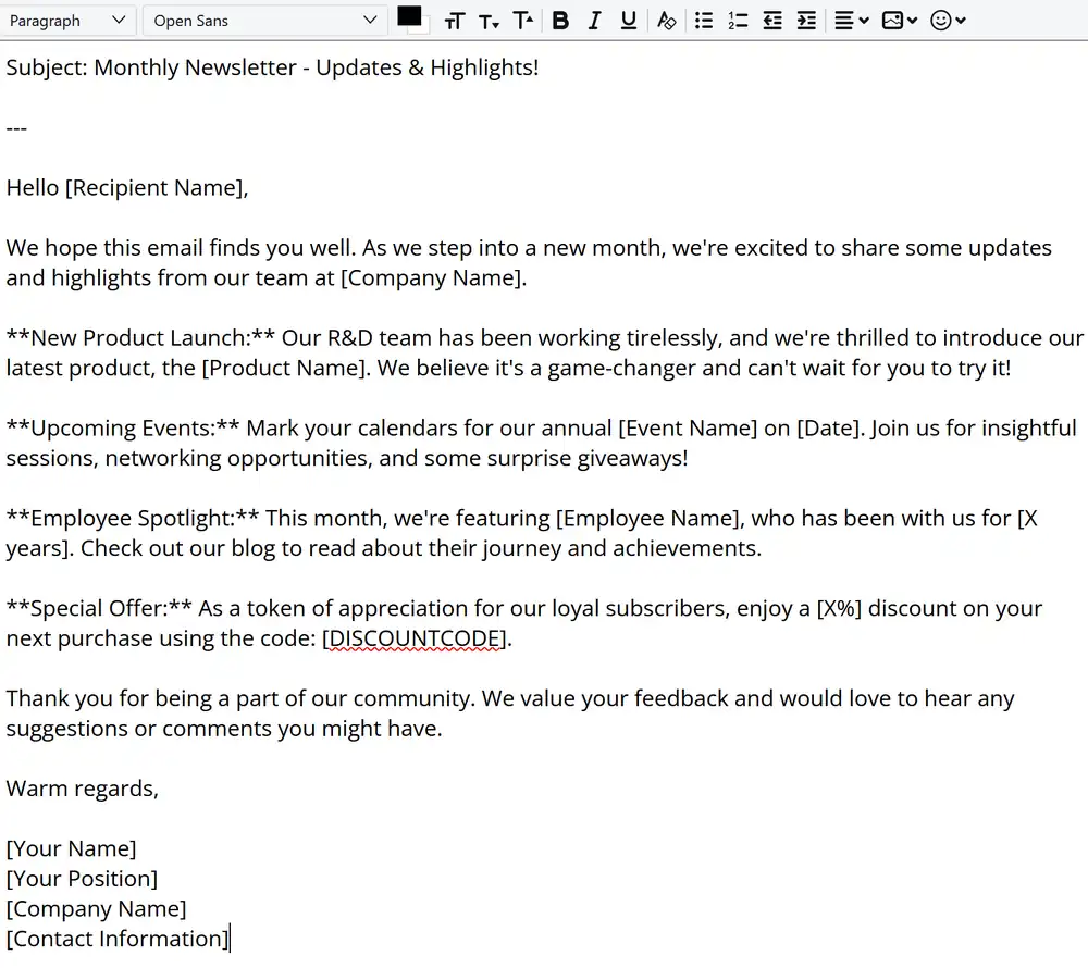
A modern sans-serif font, Open Sans has surged in popularity in the digital realm. Designed specifically for on-screen use, its friendly and minimalistic design ensures that email content is both inviting and easy to read.
Roboto
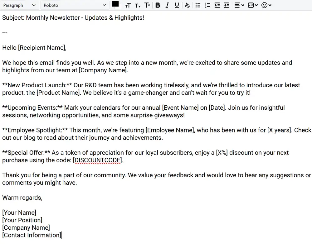
As one of the most popular Google fonts, Roboto, a sans-serif typeface, is characterized by its high legibility. Its well-rounded letters and optimal spacing make it a versatile choice for both headings and body text in emails.
Raleway
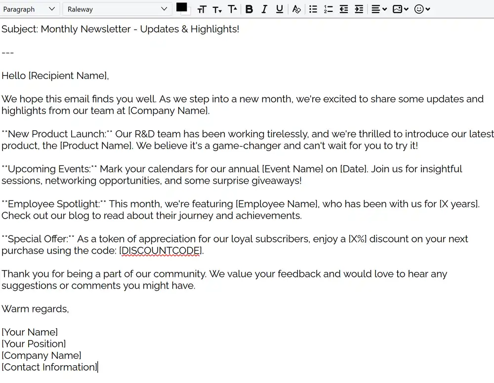
A web-hosted sans-serif font, Raleway offers a range of styles, from the delicate Thin 100 to the robust Black 900. Its slender letters give it an elegant demeanor, making it a chic choice for brands aiming for a refined email appearance.
Lato
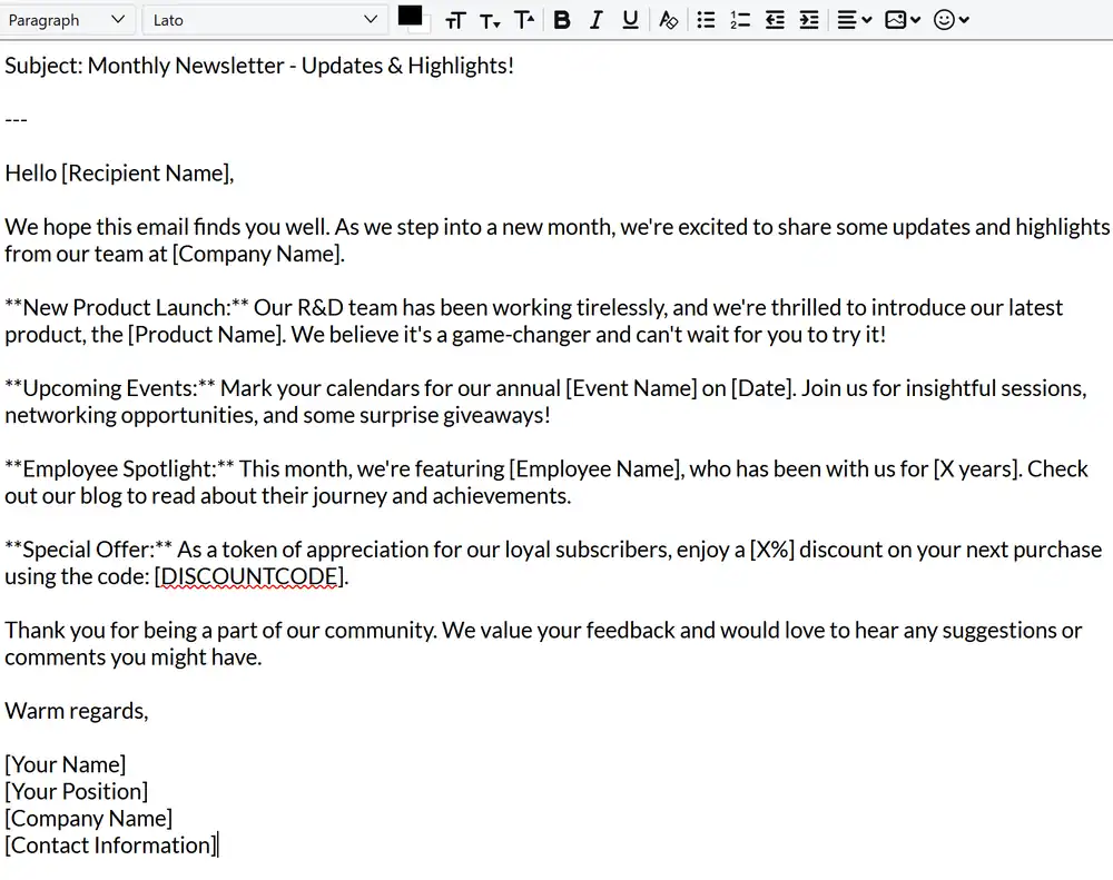
Rounding off our list is Lato, a sans-serif font known for its warmth and friendliness. Its well-rounded letters and natural design make it ideal for longer email passages, ensuring that content remains approachable and engaging to readers.
3 Worst Fonts for Email Design
Comic Sans MS
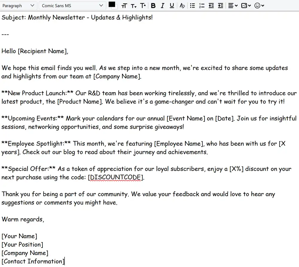
Often the subject of design debates, Comic Sans MS is a sans-serif font that was originally designed for comic book-style speech bubbles. While it might have its place in informal settings or children’s content, its casual and playful nature often feels out of place in professional emails. Using Comic Sans MS can inadvertently diminish the seriousness of the message and may even lead readers to question the credibility of the sender.
Curlz
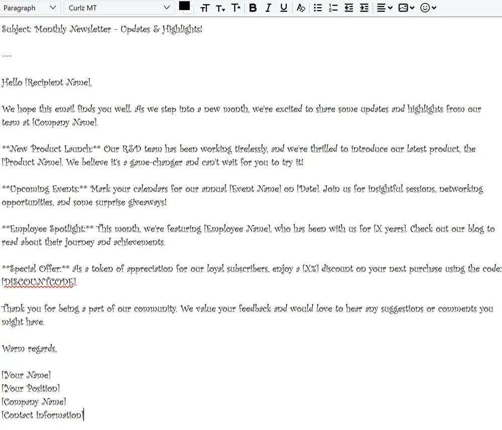
With its whimsical and decorative design, Curlz is a font that’s hard to miss. While it might be suitable for party invitations or themed events, its ornate style can be distracting in an email setting. The intricate design of Curlz can make longer texts difficult to read, and its overly decorative nature might overshadow the actual content of the email, making it a less-than-ideal choice for most professional communications.
Trajan
Inspired by Roman inscriptions, Trajan is a serif font that exudes a sense of antiquity and grandeur. While it can be majestic in the right context, such as movie posters or historical documents, its all-uppercase design can come across as overpowering in emails. The lack of lowercase letters can hinder readability, and its regal demeanor might not align with the tone of many modern email communications. In the realm of email design, Trajan’s majestic aura might feel more like a relic of the past than a contemporary choice.
Email Fonts Best Practices
Limiting The Number of Fonts Used
In the world of email design, less is often more. Using too many fonts can create visual chaos and distract from the message. It’s recommended to stick to one or two complementary fonts – one for headings and another for the body – to maintain a cohesive and professional look.
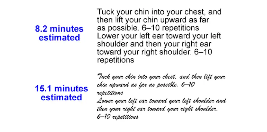
Appropriate Font Size For Headings And Body
Size matters when it comes to readability. Headings should be prominent enough to grab attention, typically ranging from 18 to 30 pixels. For body text, a size of 14 to 16 pixels is often ideal, ensuring that the content is easily readable across various devices.
Font Alignment Recommendations
Left-aligned text is a universal standard for emails, as it’s the most natural alignment for readers in languages that read left-to-right. Centered text can be used sparingly for emphasis, but it’s best to avoid justifying text, as it can create irregular spacing between words.
Font Color Considerations
While it’s tempting to play with a palette of colors, it’s crucial to prioritize readability. Dark text on a light background is a tried-and-true combination. If using colored fonts, ensure there’s sufficient contrast with the background and avoid neon or overly bright hues that strain the eyes.
Usage of Web Fonts
Web fonts offer a plethora of design options, but it’s essential to have fallback fonts in place. Not all email clients support web fonts, so having a default system font ensures that your message remains intact even if the preferred font doesn’t load.
Importance of Line Spacing
Proper line spacing, often between 1.4 to 1.6 times the font size, enhances readability. It ensures that the text doesn’t feel cramped and allows the reader’s eyes to flow smoothly from one line to the next.
Font Choice For Call to Action (CTA) Buttons
CTAs are pivotal in email campaigns, guiding readers towards the desired action. The font used should be bold and clear, standing out but still aligning with the email’s overall design. Sans-serif fonts are often preferred for their clean appearance.
The Significance of A/B Testing in Email Design
Just as marketers test headlines or images, fonts should also undergo A/B testing. Different fonts can evoke varied responses, and testing allows designers to determine which one resonates best with the target audience, optimizing engagement and conversion rates.
How to Choose The Best Fonts For Email?
Matching The Font to The Message And Brand Persona
The font you choose should be a reflection of both the message you’re conveying and the identity of your brand. A luxury brand might opt for a sophisticated serif font to exude elegance, while a tech startup might lean towards a modern sans-serif to showcase innovation. It’s essential to ensure that the font embodies the brand’s values and complements the tone of the email. For instance, a serious financial update would seem out of place in a playful font, just as a festive holiday promotion might feel too rigid in a formal typeface.
Examples of When to Use Specific Fonts
Context is key when selecting fonts. For a newsletter discussing vintage art, a classic serif font like Times New Roman might be apt, capturing the historical essence. On the other hand, a promotional email for a cutting-edge tech product would benefit from a sleek sans-serif like Roboto, emphasizing modernity. If you’re sending out wedding invitations via email, a script font like Raleway could add a touch of elegance and romance. Meanwhile, for a fun and vibrant summer sale announcement, a decorative font might be just the ticket to grab attention and convey excitement. Always remember, the font should enhance the message, not overshadow it.
Frequently Asked Questions
Why is font choice important in emails?
Font choice affects readability, mood, and the perceived professionalism of the email. It can influence engagement and response rates.
Are web fonts a good choice for emails?
Web fonts offer diverse design options, but not all email clients support them. It’s essential to have fallback fonts in place.
How many fonts should I use in an email?
It’s recommended to use one or two complementary fonts to maintain a cohesive and professional look.
Is it okay to use decorative fonts in emails?
While decorative fonts can be eye-catching, they should be used sparingly and appropriately, ensuring the content remains readable.
How do I ensure my email font is readable on all devices?
Stick to standard, web-safe fonts, use appropriate font sizes (14-16 pixels for body text), and always test your email on multiple devices.
What font size is recommended for email headings and body?
Headings typically range from 18 to 30 pixels, while the body text is best at 14 to 16 pixels.
How does font color impact email readability?
Font color should contrast well with the background. Dark text on a light background is a standard choice for optimal readability.