Are you tired of using the same old boring fonts on your website?
Well, we’ve got some good news for you. In this article, we’re going to show you the best font for your website that will make it stand out from the crowd.
Say goodbye to dull and hello to eye-catching. You’ll learn how to add these web-safe fonts in WordPress and why it’s important to use them.
Get ready to make a statement with your website’s font!
What is a Web-Safe Font
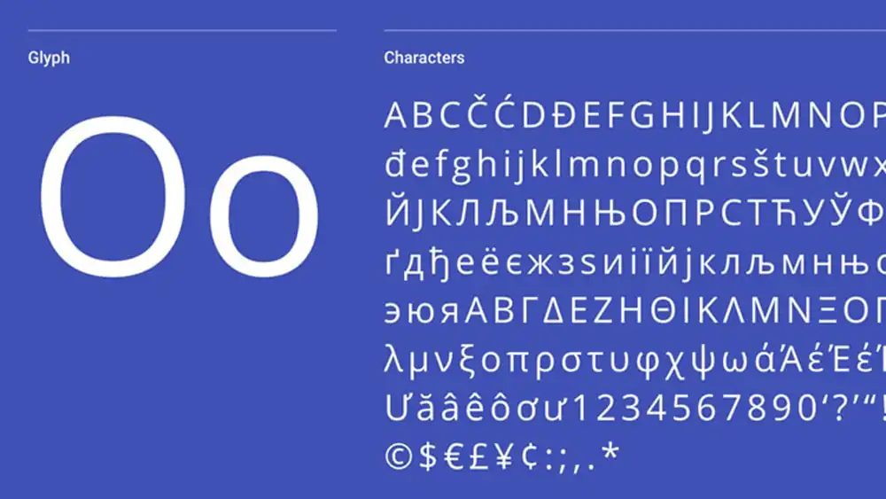
If you want to make sure your website looks consistent across different devices and browsers, you should use a web-safe font. The importance of using web safe fonts cannot be overstated. These fonts are pre-installed on most operating systems, ensuring that they will render correctly no matter where your website is accessed from. Alternative fonts for web design may not have the same level of compatibility, which can lead to inconsistent and unprofessional-looking typography on certain devices or browsers.
Choosing the right web safe font for your website is crucial. Consider factors such as readability, style, and compatibility with your overall design aesthetic. It’s also important to explore the impact of font choices on user experience. Fonts play a significant role in how users perceive and interact with your website.
When comparing web safe fonts to custom fonts, there are pros and cons to consider. Web safe fonts offer greater cross-platform compatibility but may lack the uniqueness and personalization that custom fonts provide. Custom fonts allow you to create a more distinct brand identity but might not display consistently across all devices.
What Are The Categories of HTML Fonts
Cursive
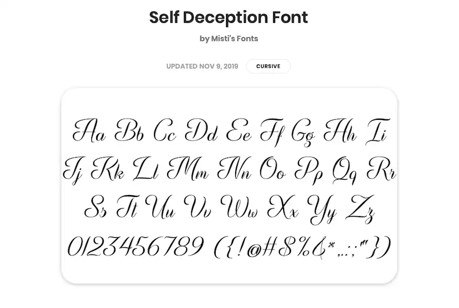
The cursive font is ideal for headers and taglines on a website. Its history can be traced back to the ancient Romans, who developed a style of writing known as ‘cursus.’
Over time, cursive fonts have evolved and become popular in various artistic fields, including calligraphy and design.
In modern times, cursive fonts are commonly used in logo design to convey elegance, sophistication, or creativity. They can add a touch of personality to a brand’s visual identity. However, it’s important to consider the impact of cursive fonts on readability. While they may look beautiful and stylish, they can sometimes be difficult to read when used in large blocks of text.
One interesting comparison is between handwriting and digital cursive fonts. Handwriting allows for more variation and personalization, while digital cursive fonts provide consistency and precision. Ultimately, the choice between the two depends on the desired aesthetic and purpose of the text.
Fantasy
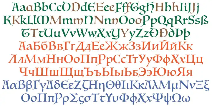
One popular use for fantasy fonts is in the titles of books and movies. However, these unique typefaces also have a significant role to play in website design.
Incorporating fantasy fonts into your website can add an element of magic and whimsy, capturing the attention of visitors and immersing them in your brand’s story.
When choosing the perfect fantasy font for your website, consider factors such as legibility, compatibility with different devices, and how well it aligns with your brand’s personality.
Look to websites like Pottermore and Narnia.com for inspiration on effectively using fantasy fonts to create a captivating user experience.
The psychology behind using fantasy fonts lies in their ability to evoke emotions of wonder, excitement, and adventure.
To achieve a cohesive website design, combine fantasy fonts with other typography elements such as contrasting sans-serif or serif font styles and appropriate spacing between letters and lines.
Serif
When choosing a serif font for your website, consider factors such as legibility and how well it aligns with your brand’s personality. Serif fonts have a rich history, dating back to the early days of printing. They are known for their elegance and formality, making them an excellent choice for websites that want to convey professionalism.
Using serif fonts in web design has its pros and cons. On one hand, they enhance readability and help readers quickly skim through written content. On the other hand, they may not be suitable for every type of website or brand.
Examples of famous websites that use serif fonts include The New York Times, Vogue, and Medium. These sites utilize serif fonts to create a sense of sophistication and credibility.
To choose the right serif font for your website, consider factors such as your brand’s personality, target audience, and overall aesthetic. It’s important to strike a balance between legibility and visual appeal.
The impact of serif fonts on user experience and readability is significant. When used appropriately, they can enhance the overall user experience by making content easier to read and understand.
Sans-serif
Choosing a sans-serif font for your website can give it a modern and minimalistic look. Typography trends in modern web design often favor clean and simple fonts that are easy to read on screens of all sizes. The impact of font choice on user experience cannot be underestimated. Sans-serif fonts are known for their legibility, making them an excellent choice for website content. When combining multiple sans-serif fonts, it’s important to follow best practices to ensure visual harmony and consistency. Exploring the psychology of fonts in website design can help you understand how different typefaces evoke specific emotions or convey certain messages. To select the right sans-serif font for your brand identity, consider factors such as readability, tone, and compatibility with your overall design aesthetic.
Remember that selecting the right font is crucial in creating a positive user experience and communicating your brand effectively.
Monospace

If you want to convey a sense of uniformity and consistency in your text, consider using a monospace font.
Monospace fonts have several benefits when it comes to coding. Firstly, they make it easier to align code vertically, which improves readability and organization. Additionally, the equal width of each character helps prevent syntax errors caused by misalignments.
Many popular websites effectively use monospace fonts for their code snippets and terminal-like interfaces. Examples include GitHub and Stack Overflow.
When choosing a monospace font for your website, consider factors such as legibility, aesthetics, and cross-platform compatibility. Comparing monospace fonts with other font categories like serif or sans-serif is essential to find the best fit for your design needs.
To optimize readability and legibility with monospace fonts on your website, ensure sufficient line spacing and choose appropriate font sizes for different screen resolutions.
20 Best Web-Safe HTML Fonts
When choosing the best web-safe HTML fonts for your website, you have several options to consider.
1. Arial
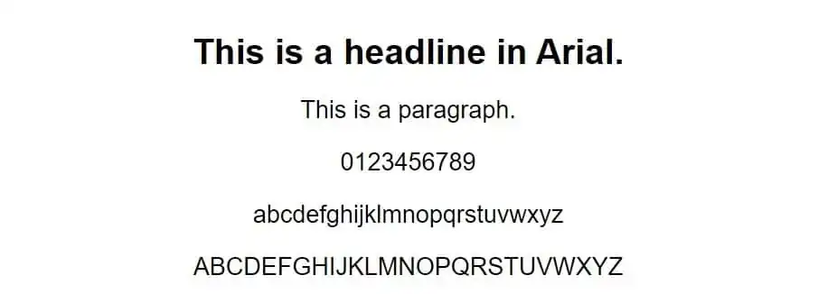
You’ll love the versatility and contemporary feel of Arial, a popular font for websites. Arial has had a significant impact on website design since its introduction as a web safe font. Its clean and minimal look makes it highly readable, especially when scaled to any size.
When compared to other popular sans serif fonts like Helvetica and Verdana, Arial stands out for its simplicity and legibility on screens.
To use Arial effectively in web design, consider these tips:
- Ensure that the font size is large enough for easy reading
- Use bold or italics sparingly for emphasis
- Pair Arial with complementary fonts to create visual interest
- Experiment with different weights and letter spacing to achieve desired effects
- Explore the versatility of Arial in different website genres, from corporate websites to creative portfolios.
2. Arial Narrow
Arial Narrow, with its sleek and condensed design, is an excellent choice for creating a minimalistic aesthetic on websites. The advantages of using Arial Narrow in web design are numerous.
Firstly, the narrow letters and condensed spacing give a clean and modern look to your website. Secondly, this font pairs well with bolder sans-serif typefaces like Verdana or Geneva, creating a balanced and harmonious visual experience for your readers.
However, there are common mistakes to avoid when using Arial Narrow on websites. Avoid using it for large blocks of text as it can be challenging to read in long paragraphs. Instead, use it sparingly for headings or short phrases to maintain readability.
Some best practices for optimizing readability include increasing font size slightly and adjusting line height to provide enough breathing space between lines.
Examples of websites that effectively utilize Arial Narrow as their primary font include minimalist portfolio sites or fashion blogs that aim for a sleek and contemporary style.
3. Times
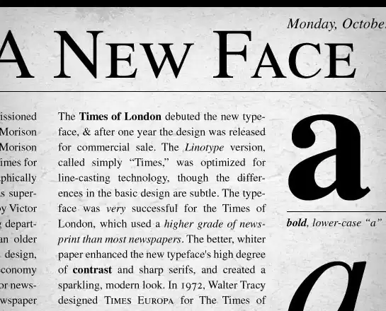
Times is a versatile font that can be used in a variety of media, from books to commercial publishing projects. When it comes to using Times as a web font, its legibility and condensed style make it an excellent choice.
Compared to other serif fonts, Times stands out with its visible contrast, making it easier for readers to navigate through your website content. Whether you’re using Times in different font sizes or on mobile devices, this font maintains its readability and professionalism.
It’s especially well-suited for websites with long blocks of text like newsrooms and blogs. Incorporating Times into your website design will create a familiar and formal atmosphere that enhances the overall user experience.
4. Times New Roman
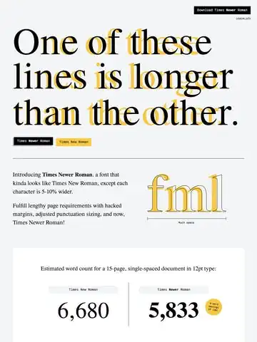
When using Times New Roman, it’s important to consider its versatility and legibility in printed media and HTML. In modern web design, typography trends have shown that Times New Roman can have a significant impact. Its classic and professional look adds a touch of elegance to your website.
To enhance readability, there are tips you can follow when optimizing the use of Times New Roman on websites. For example, using an appropriate font size and line spacing can make the text more comfortable to read. When comparing Times New Roman with other serif fonts, it is often found to be effective in delivering online content due to its familiarity and established reputation.
Additionally, you can customize Times New Roman in creative ways to personalize this classic font for your website, making it stand out from the crowd. Finally, understanding the psychology of fonts is crucial as different fonts evoke different emotions in visitors’ subconscious minds.
5. Helvetica
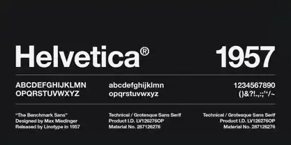
Now that you have learned about Times New Roman, let’s talk about another popular font for websites: Helvetica.
Helvetica is widely used in various contexts and has become a favorite among many designers. It offers a clean and modern look, making it suitable for different uses such as logos, headings, and body text.
When comparing Helvetica with other popular fonts like Arial or Verdana, you’ll notice that Helvetica has a more refined and elegant appearance. However, using Helvetica effectively in web design can be challenging because it may not always render well on all devices or browsers. To overcome this issue, make sure to test the font across different platforms.
If you’re looking for alternatives to Helvetica for web typography, some options include Arial, Roboto, Open Sans, and Lato. These fonts offer similar characteristics and readability while providing more flexibility in terms of compatibility with different devices and browsers. Remember to choose a font that aligns with your website’s overall style and enhances the user experience.
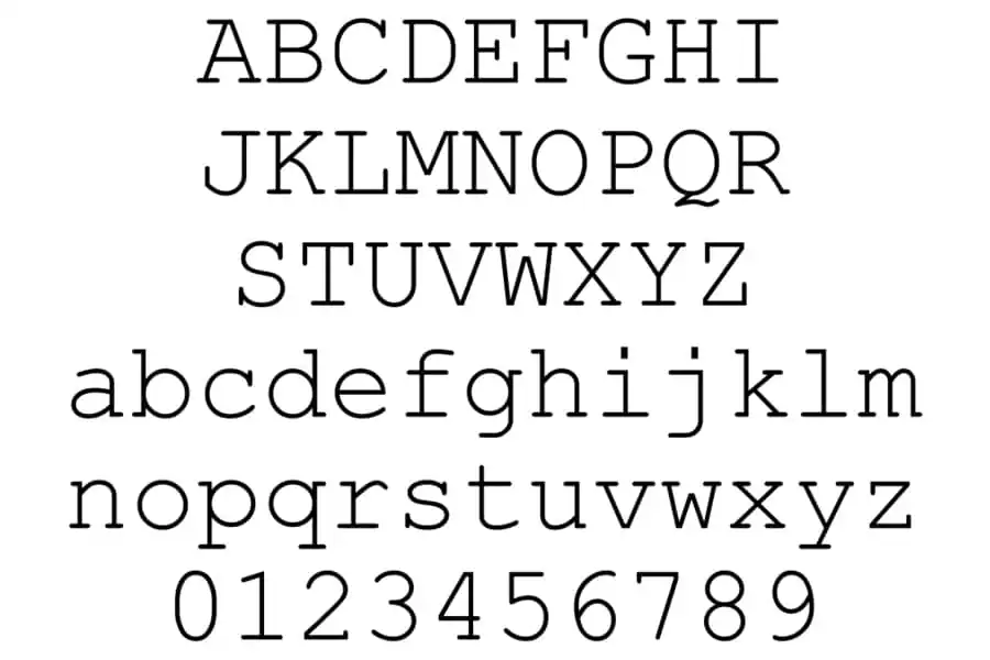
6. Courier
Courier is a popular font choice for movie screenplays and headers. It is widely used in the film industry due to its association with traditional typewriters, giving scripts a classic and nostalgic feel. When using Courier on your website, it’s important to consider its pros and cons.
One of the major advantages of Courier is its readability, especially at smaller sizes. The fixed-width characters make it easy for readers to distinguish between different letters and symbols. Additionally, Courier offers a sense of authenticity and professionalism that can enhance the overall design aesthetic.
However, there are also some drawbacks to using Courier. Since it is a decorative font, it may not be suitable for long paragraphs or body text as it can become difficult to read over time.
If you’re looking for alternatives to Courier, some popular options include Consolas and Monaco which are both monospaced fonts that offer similar aesthetics.
In terms of customization options, Courier allows for limited modifications such as adjusting letter spacing or line height. However, keep in mind that excessive customization may compromise the authenticity that makes this font unique.
7. Courier New
You can enhance the nostalgic design of your website by using Courier New, a thinner and more legible alternative to the traditional Courier font.
Font readability is crucial for creating a positive user experience and engagement on your website. When compared to other typewriter fonts, such as American Typewriter and Consolas, Courier New stands out for its clarity and legibility.
It has evolved from the original Courier font, which was created in 1955 for IBM typewriters. Over time, it has become widely used in electronic devices due to its clean and professional appearance.
When choosing the right font for your website, consider factors such as readability, compatibility across devices, and alignment with your brand identity. Remember that fonts have a significant impact on how users perceive your website and its content. So make sure to choose wisely!
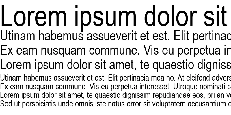
8. Verdana

Verdana is an excellent choice for improving readability on low-resolution screens and small sizes. Its wide spacing between characters makes it easy to read even in challenging conditions.
When comparing Verdana with Arial, it’s important to consider the impact of font choice on website usability. Studies have shown that fonts can greatly affect user experience, so choosing the right one is crucial.
To optimize Verdana for better readability on different devices, you can adjust the font size and line height accordingly. Additionally, understanding the psychology of font selection is key to enhancing user experience with Verdana.
9. Candara
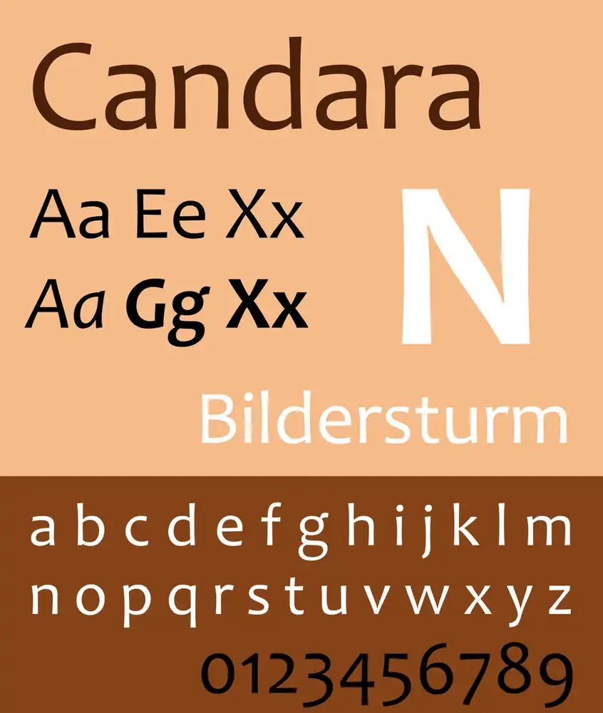
Candara, with its contemporary look and generous spacing between characters, is a suitable font choice for informal typographic settings like blog post titles and taglines on websites.
In the ever-evolving world of web design, typography trends play a crucial role in creating an impactful user experience. The impact of font choice on user experience cannot be underestimated. It can enhance readability, convey emotions, and even influence the perception of a brand.
When exploring alternative web fonts for unique branding, Candara stands out as a versatile option that combines readability with a modern aesthetic. However, selecting the right font pairing for your website is equally important. Consider contrasting styles to create visual interest while maintaining legibility.
Remember that different fonts have psychological associations that can influence website visitors’ feelings and perceptions. So choose wisely to make a lasting impression on your audience.
10. Geneva
Geneva is known for its clean and modern aesthetic, making it a popular choice for both display and body text. When it comes to typography trends in web design, Geneva’s consistent length, width, and spacing give websites a sleek and professional look.
The impact of font choice on user experience cannot be understated – Geneva’s bold colors and slim strokes ensure legibility in any size, enhancing the overall user experience.
Best practices for pairing fonts in web design suggest that Geneva can be paired with other sans-serif fonts to create a harmonious visual hierarchy. Additionally, the psychology of fonts in website branding shows that Geneva exudes reliability and professionalism.
To optimize font loading speed on websites using Geneva, consider using font subsets or using browser caching techniques to minimize load times.
11. Calibri
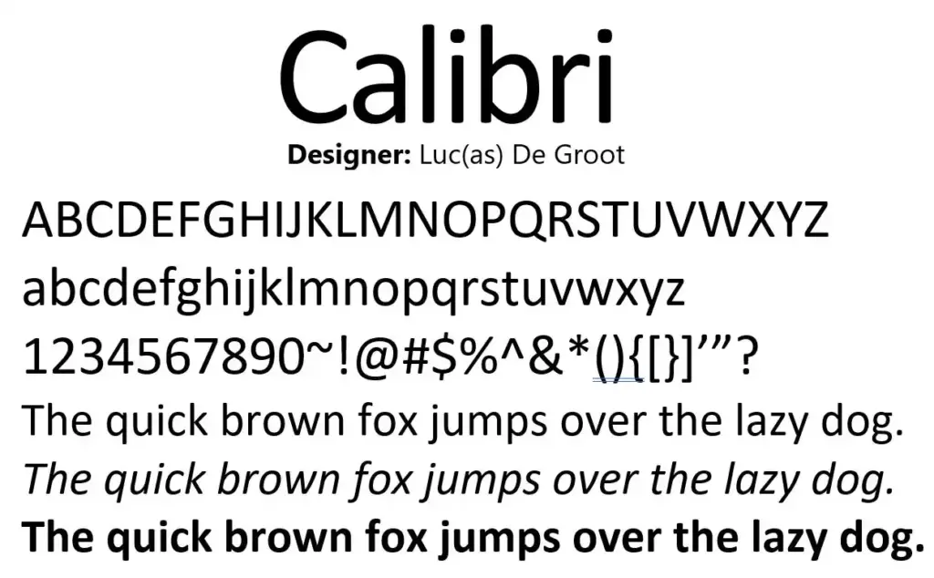
Calibri is a versatile and widely used font due to its clean design and high legibility. When it comes to website design, the choice between Calibri and Arial often arises. Both fonts have their own strengths, but ultimately it depends on the specific needs of your website.
The impact of font choice on user experience and readability cannot be underestimated. The right font can enhance readability, convey a certain mood or emotion, and create a cohesive visual identity for your brand.
Exploring the versatility of Calibri font in different website designs is essential. It works well for various types of websites such as corporate, creative, or personal blogs. Its modern and warm appearance adds a touch of sophistication to any design.
To optimize Calibri font for mobile and responsive web design, consider using appropriate line heights, font sizes, and letter spacing. This will ensure that your content remains readable across different devices.
Finally, understanding the psychology of fonts is crucial in creating an effective website. Different fonts evoke different emotions and can influence how visitors perceive your brand. Calibri’s clean lines may convey professionalism or simplicity depending on the context.
12. Optima
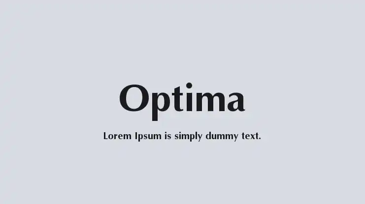
Optima is a stylish and elegant font that can be used to convey sophistication in various design projects. When compared to other elegant fonts, Optima stands out with its classical Roman capital letter inspiration and generous spacing.
Here are some key points about Optima:
- The history and evolution of Optima: This font draws inspiration from ancient Roman typography, giving it a timeless appeal.
- Tips for using Optima in web design: Optima is best suited for display usages, such as logos for high-end brands. It is important to define the spacing between characters to enhance readability.
- The psychology behind using Optima in branding: Optima exudes elegance and sophistication, making it an excellent choice for luxury brands that aim to evoke a sense of prestige.
- Optima as a versatile font choice for different industries: From fashion to beauty and beyond, Optima can be adapted to fit various industries and effectively convey their desired image.
13. Cambria
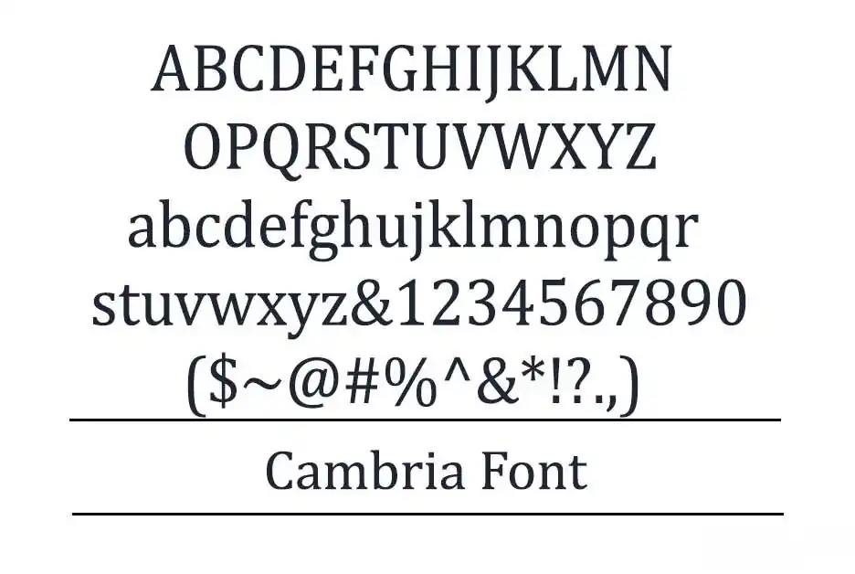
Cambria is a versatile font that can be used for both headers and body text. It offers various font customization options, allowing you to create a unique and visually appealing website design.
One of the benefits of using Cambria for web design is its high legibility, even at small sizes. The horizontal serifs in Cambria emphasize the endings of each stroke, making it easier for users to read the content on your website.
When comparing Cambria to other popular web safe fonts, it stands out due to its even spacing and proportions.
To optimize Cambria for mobile devices, ensure that it scales well and maintains its legibility on smaller screens.
Remember that font choice has a significant impact on user experience, so choosing a font like Cambria can enhance readability and engagement on your website.
14. Garamond
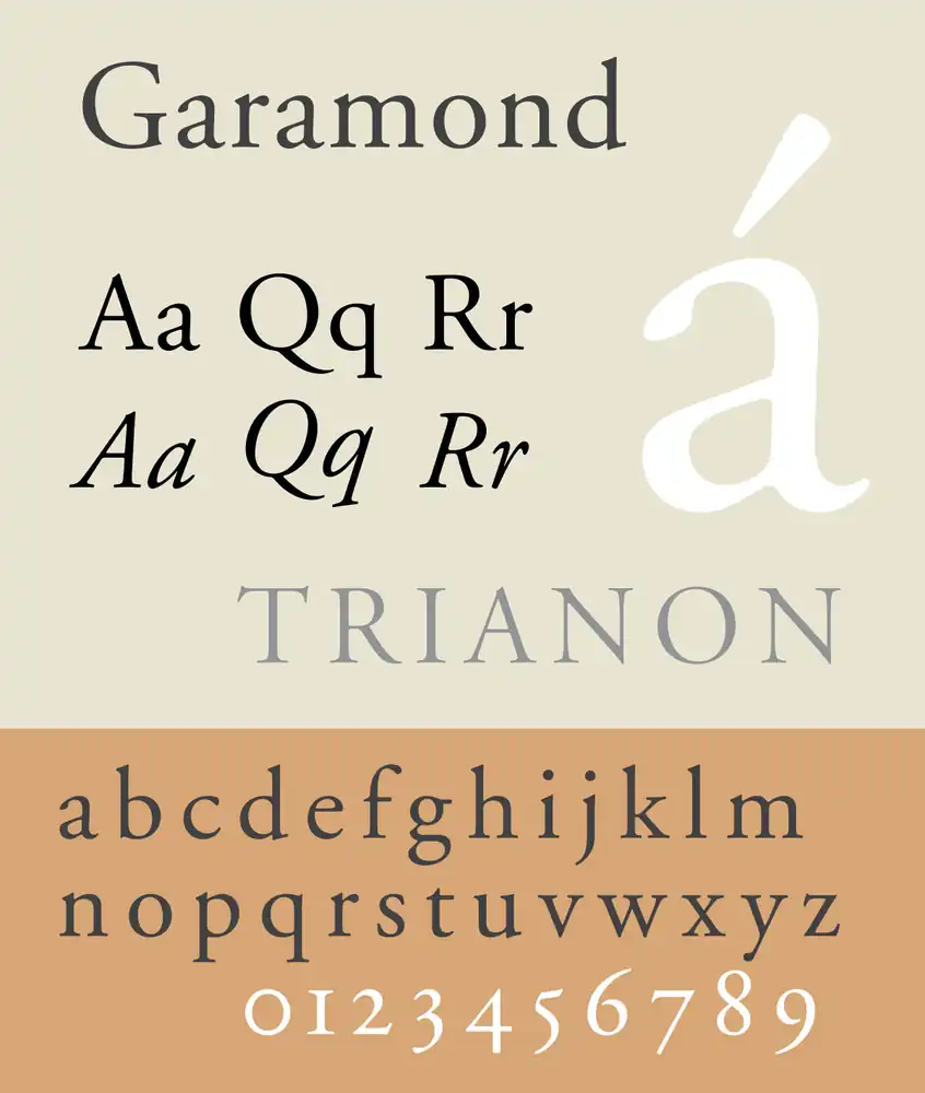
To give your text a classic and elegant look, consider using Garamond for your website. This old-style serif font offers a timeless nuance that can elevate the design of any webpage.
When comparing Garamond to Times New Roman, both being popular serif fonts, you’ll find that Garamond has a more refined and sophisticated feel.
The history and evolution of Garamond typeface dates back to the 16th century when it was created by Claude Garamond in France. Since then, it has undergone various adaptations and revisions, making it one of the most widely recognized typefaces today.
When choosing the right weight and size for your website, it’s important to consider readability and legibility. Opt for lighter weights for body text to maintain clarity, while using bolder weights sparingly for headings or emphasis.
To pair Garamond with other fonts in web design, select complementary sans-serif fonts like Arial or Helvetica to create an appealing contrast. Experiment with different combinations until you achieve a harmonious blend that enhances the overall aesthetic of your website.
15. Perpetua
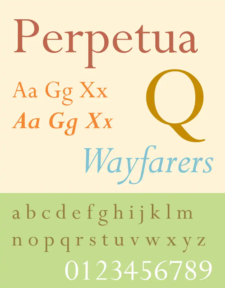
Perpetua, with its formal and elegant design, has been featured in publications by Penguin Classics and the University of Pennsylvania. This timeless font is not only visually appealing but also holds historical significance.
Created by an English sculptor inspired by monuments and memorial lettering, Perpetua captures the essence of classic typography trends. Its graceful curves and balanced proportions make it a popular choice for book design. Whether used for headings or body text, Perpetua lends a sophisticated touch to any literary work. In comparison to other classic fonts like Garamond or Baskerville, Perpetua stands out with its unique character shapes and subtle calligraphic influences.
In addition to its use in print media, Perpetua has found a place in modern web design. Its legibility on screens and versatility across digital platforms make it ideal for websites that seek a refined aesthetic while maintaining readability.
16. Monaco
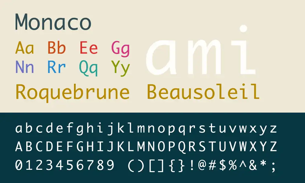
If you’re a programmer or coder, Monaco is a great choice for adding a pixelated and distinctive touch to your text. When it comes to monospaced fonts for coding, there’s often a debate between Monaco and Consolas. Both fonts have their own unique characteristics and advantages. However, if you prefer a more retro and nostalgic feel to your coding experience, Monaco might be the winner for you.
Monospace fonts like Monaco have a long history and have evolved significantly over time. They were originally designed for typewriters but have since become popular in computer programming due to their ability to align characters perfectly in columns.
The impact of monospace fonts on readability and user experience cannot be overlooked. They make it easier to distinguish individual characters and enhance code legibility.
Using the Monaco font can also allow you to create retro-inspired website designs that harken back to the early days of computing.
To effectively use the Monaco font in web development projects, consider using it sparingly as decorative text rather than body content. Pairing it with complementary sans-serif fonts can create an appealing contrast. Additionally, adjusting the letter spacing slightly can further enhance its pixelated aesthetic without sacrificing readability.
17. Didot
Didot’s unique design is characterized by high contrast and increased stress, setting it apart from other fonts.
When it comes to typography trends, Didot is a popular choice due to its neoclassical style with a modern twist.
Font pairing techniques can be used to complement Didot with other fonts that have more readability for body text, creating a harmonious visual experience for users.
The impact of font choices on user experience cannot be underestimated, as the right font can enhance readability and convey the intended message effectively.
Customizing fonts for website branding is another advantage of Didot, as it adds a touch of elegance and sophistication to the overall design.
However, accessibility considerations for web fonts should not be overlooked – ensuring that the font is legible and accessible to all users regardless of their devices or visual impairments is crucial in creating an inclusive user experience.
18. Brush Script
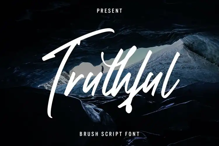
To add a touch of informality and casualness to your design, consider using Brush Script. It features a modern-looking calligraphy style. Here are five ways you can incorporate Brush Script into your designs:
- Brush Script vs. calligraphy fonts: Brush Script offers a more contemporary and relaxed feel compared to traditional calligraphy fonts.
- Brush Script in logo design: Use Brush Script to create a unique and eye-catching logo that captures the essence of your brand.
- Brush Script for wedding invitations: Give your wedding invitations a romantic and elegant touch by using Brush Script for the names of the couple or important details.
- Brush Script in digital art: Add depth and personality to your digital art pieces by incorporating hand-lettered elements with Brush Script.
- Brush Script in social media graphics: Make your social media posts stand out by using Brush Script for quotes or captions, adding a stylish and personal touch.
Incorporating Brush Script into these various design contexts will give your projects an inviting and modern look.
19. Lucida Bright
Lucida Bright is a versatile slab serif typeface that can add a touch of elegance and professionalism to your business reports, documentations, or magazines.
When it comes to choosing the best font for websites, Lucida Bright stands out against Arial. Its unique design and higher contrast make it more visually appealing and easier to read, enhancing user experience and readability.
To effectively incorporate Lucida Bright into your website design, consider using it for headings or titles to create hierarchy and draw attention. Additionally, explore the versatility of Lucida Bright in different website genres such as fashion, lifestyle, or luxury brands, where its elegant and sophisticated appearance can truly shine.
20. Copperplate
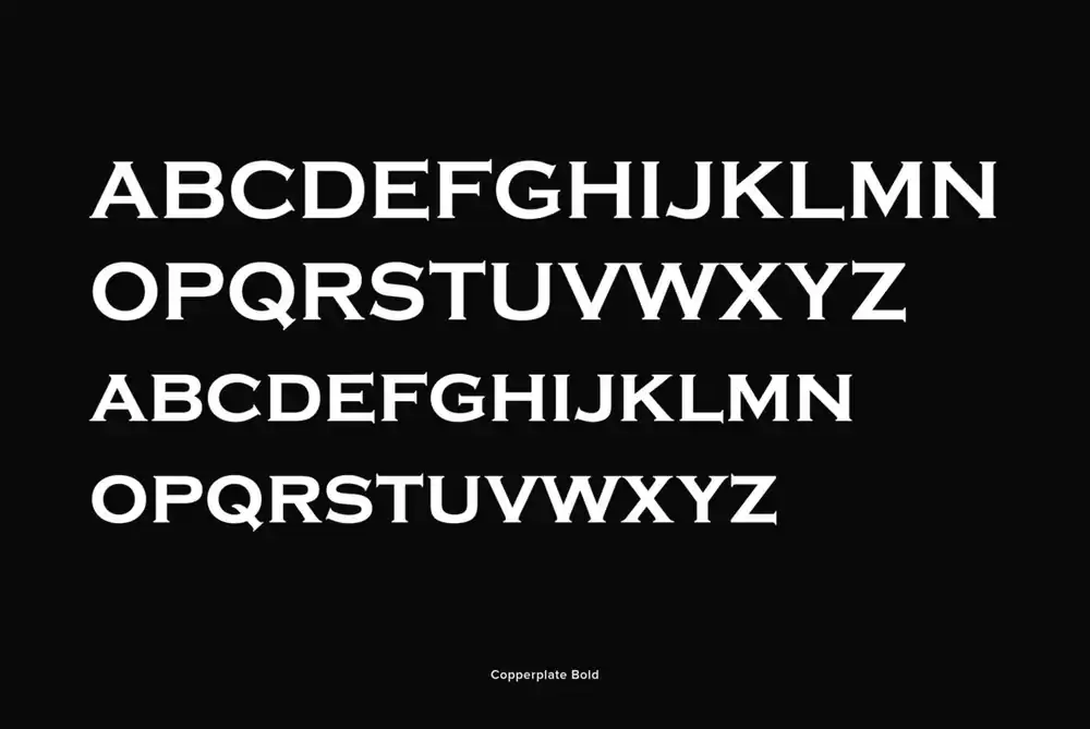
If you want a font with capital letters only, Copperplate may be the perfect choice for your business cards or letterheads.
However, when it comes to using Copperplate font for website headers, there are both pros and cons to consider.
One major advantage of using Copperplate font is its bold and elegant appearance, which can add a touch of sophistication to your website design. Additionally, Copperplate is versatile and works well with various design styles.
Some websites that effectively use Copperplate font include luxury brands, high-end fashion blogs, and upscale restaurants. These industries benefit from the font’s classy and refined aesthetic.
When choosing the right font pairing for Copperplate on a website, it’s essential to find complementary fonts that create a harmonious balance. Sans-serif fonts like Arial or Helvetica often pair well with Copperplate.
To optimize Copperplate font for mobile devices, ensure that the font size is legible on smaller screens. Adjusting line spacing and letter spacing can also improve readability.
Lastly, avoid common mistakes such as using too much Copperplate text or relying solely on uppercase letters. Balance is key when incorporating this font into your website design.
Why Should You Use an HTML Web Font
Using an HTML web font ensures that your chosen font will be consistently rendered across all browsers and devices. This is important because font readability plays a crucial role in the overall user experience of your website. The impact of font choice on user experience cannot be underestimated. A poorly chosen font can make your text difficult to read, leading to frustration and potentially driving visitors away from your site.
When selecting an HTML web font, there are several factors to consider. Firstly, you need to ensure that the font is legible and easy to read in different sizes and weights. Secondly, compatibility with various browsers and devices is essential for consistent rendering. Lastly, it’s important to avoid common mistakes such as using too many different fonts or relying solely on custom fonts that may not load properly on all devices.
One of the benefits of using a custom HTML web font is its ability to enhance branding purposes. By choosing a unique and recognizable font for your website, you can create a cohesive brand identity that sets you apart from competitors.
How to Add HTML Fonts in WordPress
If you want to add HTML fonts manually, you can do so by downloading the font files and uploading them to your website’s server. This method gives you more control over the fonts used on your site, but it requires some technical knowledge.
Alternatively, you can use plugins to add HTML fonts to your WordPress site with ease. These plugins often provide a wide range of font options and allow you to customize the appearance of your text without any coding required.
How to Add HTML Fonts Manually
To add HTML fonts manually, start by selecting and downloading a custom font from a web font provider. There are several advantages of using custom fonts in web design, such as enhancing the visual appeal and uniqueness of your website. However, there are common mistakes to avoid when adding HTML fonts manually, such as using deprecated HTML tags like <font>. Instead, use CSS properties to change font attributes. When choosing the right font for your website, consider factors like readability and compatibility with different browsers. To optimize web fonts for better performance, minimize the file size by converting them into web-friendly formats. Finally, implement best practices for responsive design by ensuring that your web fonts adapt well to different screen sizes and devices.
How to Add HTML Fonts Using Plugins
Start by installing and activating either the Easy Google Fonts or Use Any Font (UAF) plugins to easily add HTML fonts to your WordPress website. These plugins offer a range of features to enhance your font customization experience. Here’s what you need to know:
- Common problems with HTML font plugins: Some common issues users face include compatibility problems with certain themes and conflicts with other plugins.
- Comparing the features of Easy Google Fonts and Use Any Font: Easy Google Fonts offers seamless integration with the Google Fonts directory, while UAF allows you to upload and convert custom fonts into web-safe fonts.
- How to troubleshoot font display issues on WordPress: If you encounter font display issues, try clearing cache, disabling conflicting plugins, or reaching out to the plugin support team for assistance.