Are you searching for the perfect typeface to make your logo design stand out in 2023? Look no further! We’ve got you covered with a curated list of the best fonts that will elevate your branding game.
Whether you’re going for a modern, elegant, or bold look, we’ll show you how to choose the ideal font for maximum impact.
Don’t underestimate the power of typography – it’s time to take your logo design to new heights!
The 4 main types of logo fonts
When it comes to logo design, there are four main types of fonts that you should consider.
Serif logo fonts
To achieve a timeless and sophisticated look for your brand, consider using a serif logo font like Rolex, Prada, and Mercedes-Benz. Serif logo fonts have the power to convey a sense of tradition and sophistication that can elevate your brand’s image.
Here are three ways serif fonts can evoke an emotional response in your audience:
- Timeless elegance: Serif logo fonts exude a classic charm that never goes out of style. They embody the elegance of bygone eras, creating an aura of timelessness and refinement.
- The psychology of serif: Studies have shown that serif fonts can evoke feelings of trust and credibility in logo design. The presence of serifs gives off an air of authority and professionalism, making your brand appear reliable and reputable.
- Contemporary twists: While traditionally associated with tradition, serif fonts can also be given modern interpretations to create a fresh and unique brand identity. By combining traditional elements with contemporary design techniques, you can strike the perfect balance between heritage and innovation.
By customizing serif fonts with personalized touches, you can add a touch of uniqueness to your logo typography while still maintaining its inherent sophistication.
With so many brands vying for attention, standing out from the crowd is crucial for success. Using a serif logo font can help you create a distinctive and memorable brand image that sets you apart from competitors. The timeless elegance and psychological impact of these fonts will leave a lasting impression on your audience, ensuring they remember your brand long after they’ve encountered it.
Sans serif logo fonts
Sans serif logo fonts are popular among modern brands for their clean and minimalist aesthetic. These fonts have a significant impact on brand perception, conveying a sense of simplicity, elegance, and professionalism.
In the fashion industry, popular sans serif logo fonts include Helvetica, Futura, and Gotham. These fonts are chosen to reflect the industry’s emphasis on style and sophistication. Similarly, in the tech startup world, sans serif logo fonts like Proxima Nova and Montserrat are widely used to convey innovation, modernity, and technological advancement.
The psychology behind choosing sans serif logo fonts lies in their ability to communicate clarity and directness. The absence of decorative elements allows the focus to be on the brand name itself. Additionally, these fonts are easily readable across different platforms and screen sizes.
Many successful brands have embraced sans serif logo fonts with great success. For example, Google uses Product Sans to signify its simplicity and user-friendliness. Netflix’s use of Bebas Neue conveys its boldness and contemporary approach.
Script or cursive logo fonts
You may consider using script or cursive logo fonts to add a formal and elegant touch to your brand identity. Here are some key points to keep in mind when it comes to incorporating these fonts into your logo design:
- Importance of font selection in logo design: The font you choose can greatly impact how your brand is perceived. Script fonts can evoke a sense of elegance, sophistication, and femininity.
- Impact of script fonts on brand identity: Script fonts have the power to create a strong visual identity for your brand. They can convey a sense of tradition, luxury, or creativity, depending on the style chosen.
- Factors to consider when choosing cursive logo fonts: Consider the legibility of the font at different sizes, its compatibility with other elements in your logo, and how well it aligns with your brand’s personality and values.
- Examples of successful brands using script fonts in their logos: Brands like Coca-Cola, Instagram, and Tiffany & Co. have successfully incorporated script fonts into their logos to create memorable and iconic brand identities.
- Tips for effectively incorporating cursive fonts in logo design: Keep it simple and ensure readability by using clear letterforms. Experiment with different styles and variations within the script font family to find the perfect balance between elegance and legibility.
Display logo fonts
The Disney font is a popular choice for brands looking to add a touch of magic and fun to their logo. However, there are many other display fonts that can elevate your brand’s identity in different ways.
For luxury brands, the best display fonts often exude elegance and sophistication. These fonts have clean lines and a timeless appeal that resonates with high-end consumers.
On the other hand, tech logos benefit from creative display fonts that reflect innovation and modernity. Playful display fonts work wonders for children’s brands as they capture the whimsy and imagination of young audiences.
Fashion logos call for elegant display fonts that convey style and refinement. Lastly, bold display fonts are perfect for sports brands as they evoke strength, power, and energy.
How many fonts should you use in a logo?
When it comes to combining logo fonts, remember to keep it simple and clean. Stick to using no more than two fonts in your logo for a cohesive and professional look.
How to combine logo fonts
To combine logo fonts effectively, consider the following tips:
- Pair a serif font for the logo text with a sans-serif font for the slogan. This creates a balance between vintage and modern styles, giving your logo design a unique and eye-catching look.
- Explore the impact of color on logo font combinations. Different colors can evoke different emotions and enhance the overall message of your brand.
- Don’t be afraid to use bold and italic variations in your logo font pairings. This can add emphasis or create visual interest.
- Incorporate decorative elements with your logo fonts to make them more visually appealing and memorable.
- Experiment with different font sizes and weights in your logo design to create hierarchy and visual contrast.
Remember to have fun and be creative with your logo font combinations!
How to choose the perfect logo font
When choosing the perfect logo font, there are several key points to consider.
1. Consider your brand personality
Take a moment to evaluate your brand personality before selecting a font for your logo. The importance of font selection cannot be overstated, as it has a significant impact on how your brand is perceived by others.
Different fonts convey different emotions and associations, so it’s crucial to choose one that aligns with your brand identity. Additionally, consider the readability of the font you choose. A font that is difficult to read can hinder the effectiveness of your logo and make it less memorable.
Explore various font styles and variations to find one that captures the essence of your brand while also being visually appealing. Finally, when combining fonts in your logo design, ensure they complement each other and create a cohesive look.
2. Connect with your target market
Now that you have considered your brand personality, it’s time to connect with your target market. Building emotional connections and creating brand recognition are crucial for enhancing brand positioning.
Your logo font plays a significant role in communicating your brand values and appealing to your target audience demographics.
Consider the needs of your audience and choose a font that resonates with them. If you are in consulting or real estate, opt for a traditional serif font to establish trust and experience. For creative industries like design or technology, a modern sans serif font will showcase innovation and cutting-edge expertise.
3. Prioritize legibility
To ensure your brand logo is easily readable, consider using colors that create contrast and increasing the spacing between letters and lines for scripted fonts.
Legibility is key in logo design, as it directly impacts how effectively your brand communicates with its audience.
One common mistake in logo font selection is choosing a font that lacks clarity or is too decorative, making it difficult to read. Opting for a font weight that strikes the right balance between thickness and thinness can greatly improve legibility.
Additionally, the size of the font plays a crucial role in legibility, so be mindful of selecting an appropriate size that allows for easy reading across different mediums.
Lastly, don’t underestimate the importance of font spacing – increasing the space between letters and lines can significantly enhance readability and overall visual appeal of your logo.
4. Think about scalability
Consider how easily your logo can be resized without losing its visual appeal or legibility. The font size plays a crucial role in logo design as it determines the readability of your brand name or tagline.
A font that is too small may become illegible when scaled down for smaller applications, while a font that is too large might overpower the rest of the design. Additionally, the weight of the font affects scalability. Thin fonts may lose their details when reduced in size, while bold fonts may appear heavy and clumsy when enlarged.
It is important to choose a font that reflects your brand values and personality, ensuring consistency across different sizes and mediums.
Don’t rely on color
Using a simple black and white version of your logo is important because not every medium will support color. This ensures that your brand identity remains consistent across different platforms.
When selecting fonts for your logo, it is crucial to consider the impact of typography on your brand’s identity. Fonts have the power to convey professionalism and evoke specific emotions, so choose wisely.
The versatility of black and white logos allows for easy adaptability in various situations where color may not be an option. Additionally, font legibility plays a significant role in logo design as it ensures that your message is clear and easily readable.
Top 36 best logo fonts for iconic branding
When it comes to choosing the perfect font for your logo, you want to strike a balance between classic and modern styles.
Classic and modern logo fonts
The impact of classic logo fonts on brand recognition is undeniable. These fonts evoke a sense of tradition, trustworthiness, and reliability, making them perfect for established brands looking to maintain their reputation.
1. Proxima Nova
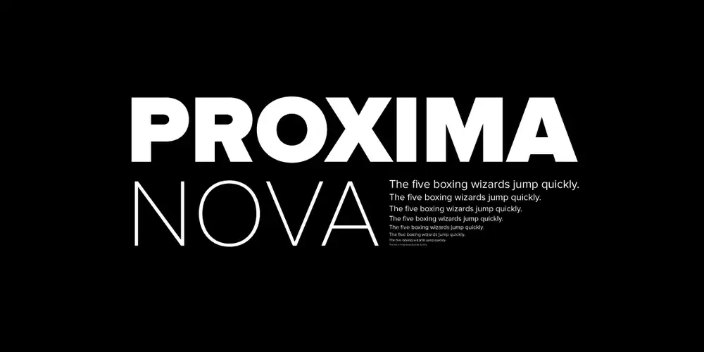
If you want your brand to have a modern and edgy look with an approachable aura, Proxima Nova is the font for you. Font selection plays a crucial role in branding as it sets the tone and personality of your brand.
Proxima Nova offers several advantages when it comes to logo design. Its geometric shapes and clean lines create a sleek and contemporary feel, perfect for capturing attention in today’s fast-paced digital world. With its balanced proportions and extensive range of weights, Proxima Nova can convey both professionalism and friendliness, making it suitable for various industries.
This font’s versatility allows designers to experiment with different styles while still maintaining consistency across different touchpoints. Successful brands like Spotify and Mashable have used Proxima Nova in their logos to communicate a modern, approachable image that resonates well with their target audience.
2. Didot
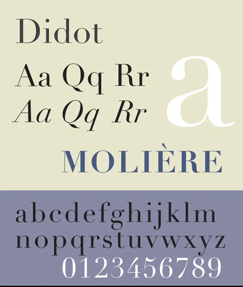
Didot, a serif font popular in the fashion industry, may be challenging to read in long-form digital formats. Despite this drawback, Didot has a rich history and evolution that dates back to the 1800s. It has become synonymous with sophistication and is often used by famous brands in their logos. Vogue magazine and Georgio Armani are just a few examples of companies that have embraced the elegance of Didot font.
Using Didot font for logo design has its pros and cons. On one hand, it exudes a sense of tradition and luxury. On the other hand, its thin strokes can make it difficult to read at smaller sizes or on screens with low resolution.
To effectively use Didot font in logo design, consider these tips: increase letter spacing for better readability; pair it with complementary sans-serif fonts for contrast; and use it sparingly to maintain its impact.
If you’re looking for alternatives to Didot font for a sophisticated and traditional logo design, consider Bodoni or Baskerville. These fonts offer similar elegance while being more legible in digital formats.
3. Bodoni
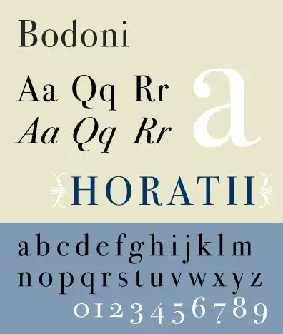
Bodoni, designed by Giambattista Bodoni in 1798, is widely used in the fashion industry and has a stark contrast between thick and thin strokes. This font has a rich history and has evolved over the years to become one of the most iconic serif fonts.
When compared to other serif fonts, Bodoni stands out with its sharp lines and elegant curves.
In modern logo design, Bodoni is often chosen for its timeless appeal and sophisticated look. Its clean lines make it perfect for luxury brands or those looking to create a high-end image. However, it’s important to note that Bodoni may not be suitable for all types of businesses as it can appear too formal or rigid for some industries.
To effectively use Bodoni in logo design, consider pairing it with a complementary sans-serif font for balance. Experiment with different weights and sizes to create visual interest, while keeping legibility in mind. Remember that simplicity is key when using Bodoni; avoid overcrowding your design with excessive elements.
Overall, if you’re looking for a classic yet stylish font for your logo design, Bodoni could be an excellent choice. Just keep these tips in mind and let this timeless typeface elevate your brand’s image.
4. Garamond
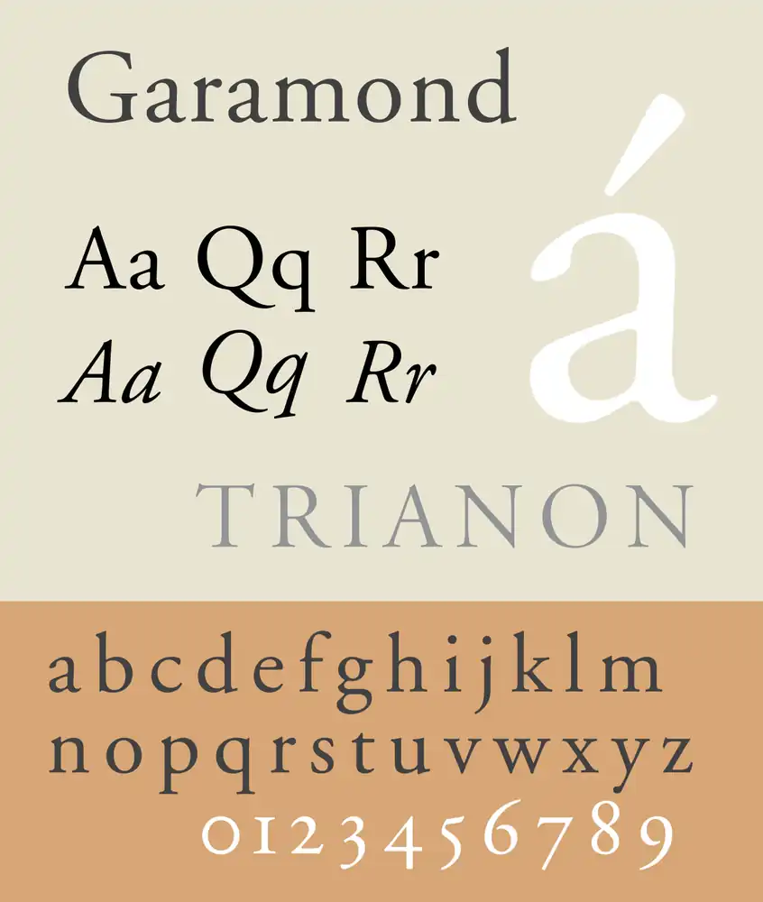
Garamond, known for its readability and legibility, has been embraced by high-end fashion brands like Rolex and Abercrombie and Fitch as their logo font. In the world of typography trends in logo design, the choice of font can have a significant impact on brand identity.
Garamond brings a sense of sophistication and luxury to these fashion brands, aligning with their authoritative image. One of the pros of using Garamond in logo design is its versatility across different industries. It can be adapted to suit various brand personalities while maintaining its elegance.
However, when it comes to comparing Garamond with other popular serif fonts for logo design, each font has its own unique characteristics that may better suit certain brands or industries. Ultimately, the choice between Garamond and other fonts depends on the specific requirements and desired aesthetic of the brand.
5. Helvetica
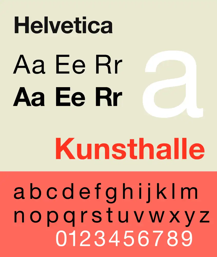
Helvetica, created in 1957 by Max Miedinger, is a widely used sans serif font known for its modern and powerful appearance. Its history dates back to the Swiss design movement of the 1950s, where it was born out of a need for a clean and legible typeface. Helvetica quickly gained popularity and became synonymous with modern design.
The Impact on Modern Design:
- Helvetica revolutionized typography with its simple yet elegant design.
- It has influenced countless designers and continues to be a staple in contemporary graphic design.
Best Use Cases for Helvetica:
- It is ideal for branding projects that require a clean, professional look.
- It works well in both print and digital mediums.
Pairing Helvetica with other fonts can enhance its visual impact:
- Combining it with serif fonts creates an interesting contrast.
- Pairing it with script or handwritten fonts adds personality to the design.
6. Futura
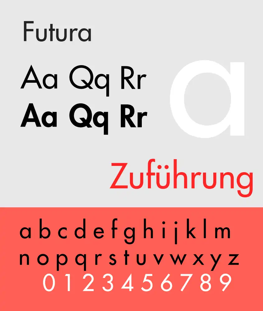
If you’re looking for a sleek and modern typeface, Futura is a great choice that you should consider. It’s no wonder why many fashion brands and companies have embraced this font in their logo design. Futura has become a prominent part of logo design trends because of its clean lines and contemporary appeal.
While Futura is widely used, there are also alternatives available for those who want to stand out from the crowd. Fonts like Avenir, Gotham, and Proxima Nova offer similar characteristics but with their own unique twist.
In fashion branding, Futura has been utilized by renowned brands like Dolce and Gabbana for its sophistication and timeless elegance. Its versatility allows it to be seamlessly integrated into digital assets such as websites or social media graphics, as well as printed materials like business cards or packaging.
When compared to other sans serif fonts, Futura holds its ground with its distinct geometric shapes and balanced letterforms. Its legibility makes it suitable for both body text and headlines across various mediums.
Whether you’re designing for digital or print, incorporating Futura into your assets can give them a touch of modernity while maintaining an air of classic style.
7. Avante Garde
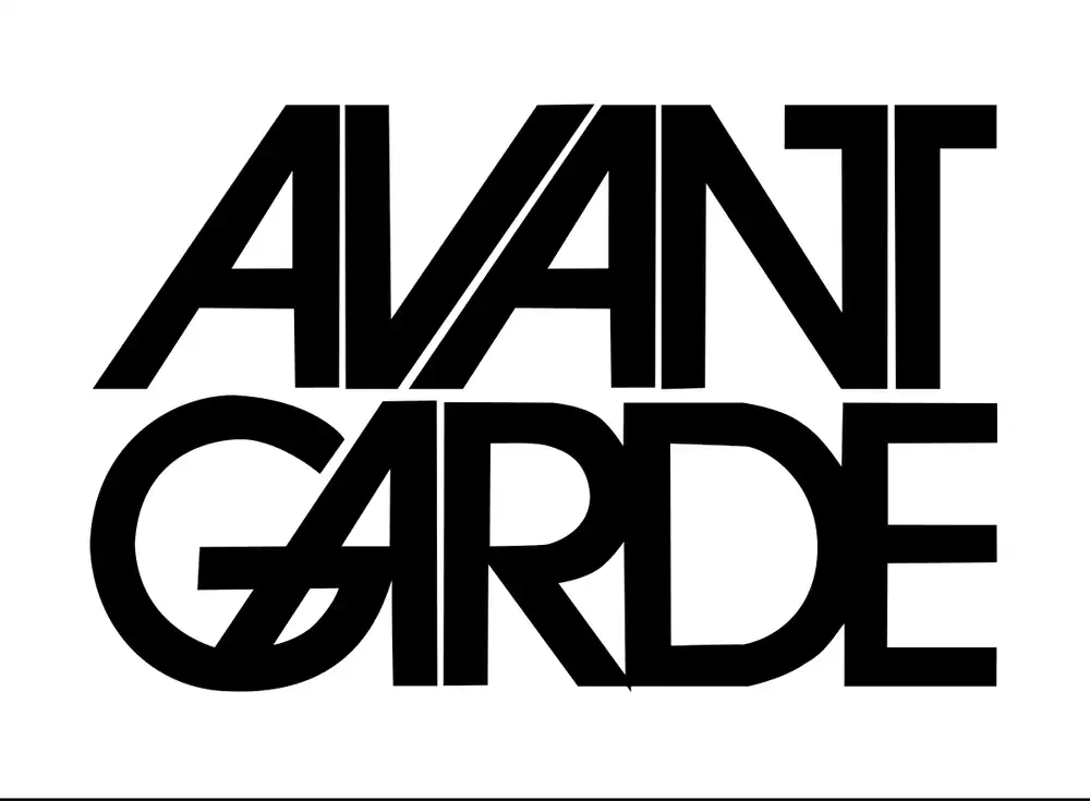
Released in the 1970s, Avante Garde is a versatile geometric sans serif font that is favored by bold brands like Adidas and Remax. Its evolution as a classic typeface has had a significant impact on logo design trends.
When compared to other geometric sans serif fonts, Avante Garde stands out for its unique character and edgy appeal. It has played a crucial role in creating logos that are both contemporary and innovative, breaking traditional boundaries in logo typography.
With its clean lines and modern aesthetic, Avante Garde captures attention and leaves a lasting impression. Brands that choose this font convey a sense of confidence and forward-thinking attitude, making it an ideal choice for those seeking to make a statement with their logo design.
8. Avenir
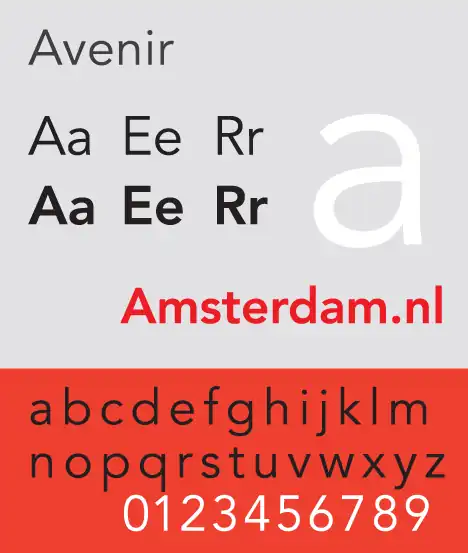
You’ll love the organic rendition of Avenir, a geometric sans serif font designed by Adrian Frutiger in 1988. It is known for its eye-pleasing shapes and suitability for long-form reading.
When it comes to logo design, Avenir holds its own against other popular fonts like Futura. Both fonts have their strengths, but Avenir offers a unique versatility that sets it apart.
Its clean and modern aesthetic can add a fresh touch to your logo design, making it perfect for brands aiming for a minimalist and contemporary look.
Moreover, Avenir’s impact on legibility and readability is impressive, ensuring that your logo will be easily understood and recognized.
So if you’re looking for a font that combines style and functionality, Avenir is definitely worth considering for your logo branding needs.
9. Myriad
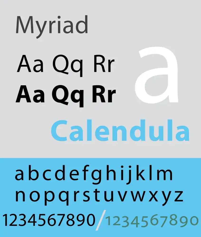
Myriad Pro, used by brands like Apple and Walmart, offers versatile and diverse usage options with its identifiable quirks. Its use in iconic brand logos has made it a popular choice among top brands.
One of the unique features of Myriad is the slant in its letter design, particularly noticeable in the ‘y’ and ‘e’. This gives it a distinctive look that sets it apart from other fonts.
The versatility of Myriad makes it well-suited for logo design, allowing designers to create impactful and memorable visuals. Its impact on modern logo typography cannot be overstated, as it has become synonymous with contemporary design aesthetics.
Whether you’re aiming for simplicity or sophistication, Myriad can adapt to your needs and elevate your branding efforts.
10. Open Sans
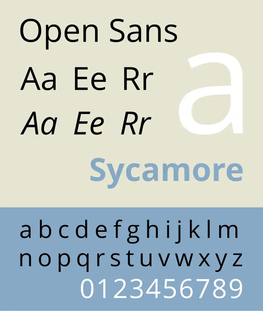
When it comes to choosing the best logo fonts, Open Sans is definitely a top contender. With its sublime legibility and variable weights, this humanist sans serif typeface offers versatility and style for any branding project.
In recent years, logo font trends have embraced the clean and modern appeal of Open Sans. It has been adopted by renowned brands like Google, IKEA, and WordPress for their logos. The friendly and open nature of Open Sans makes it perfect for contemporary brands looking to establish a strong visual identity.
If you’re considering using Open Sans for your logo design or branding, rest assured that you’re making a wise choice. However, if you want to explore alternatives to Open Sans, there are plenty of other excellent options available in the vast world of typography.
11. Akzidenz-Grotesk
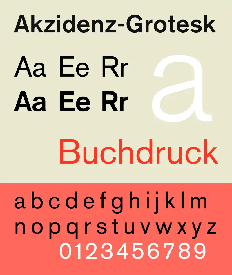
If you’re looking for a versatile and internationally recognized font, Akzidenz-Grotesk is definitely worth considering.
With its historical significance in graphic design, Akzidenz-Grotesk has paved the way for geometric sans serif fonts.
Compared to other fonts of its kind, Akzidenz-Grotesk stands out with its bold and assertive presence.
Its influence on contemporary logo design is undeniable, as it has been used in iconic logos such as the New York subway signage.
The versatility of Akzidenz-Grotesk shines through in various design contexts, from posters to branding materials.
When using Akzidenz-Grotesk in logo design, keep in mind that simplicity is key.
Its clean lines and balanced proportions make it an effective choice for creating memorable and timeless logos.
12. Univers
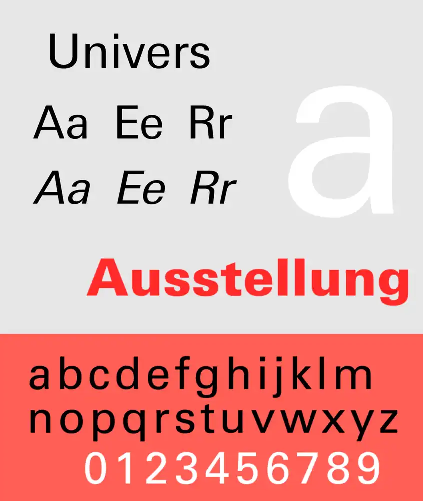
Univers, released in 1957 by Adrian Frutiger, revolutionized font families with its comprehensive range of weights and widths. This iconic typeface has stood the test of time and continues to be a timeless choice in logo design.
The versatility of Univers is unparalleled, making it suitable for both corporate and creative projects. Its sleek and modern letterforms strike the perfect balance between professionalism and uniqueness, allowing brands to establish a strong visual identity.
Univers has had a profound impact on brand identity, conveying trustworthiness and innovation across various industries. As we move into 2023, the role of Univers in design is evolving. It remains a staple choice for many designers but is also being combined with other typefaces to create more dynamic and personalized brand experiences.
13. Choplin
You can’t ignore the bold and unconventional messaging of Choplin, a geometric slab serif font with clean-cut serifs and smooth curves. Its unique features make it a standout choice for logo design.
The strong lines and distinct shapes of Choplin bring a modern yet timeless feel to any brand identity. The font’s versatility allows for effective use in various industries, from tech startups to fashion brands. Pairing Choplin with other fonts in logo design can create visual interest and balance.
Some successful logos that have incorporated Choplin include renowned companies like Adobe and Spotify. To incorporate Choplin into your own brand identity, consider using it as the primary font or as an accent to highlight specific elements. Experiment with different weights and sizes to find the perfect combination that captures your brand essence while maintaining legibility.
14. Montserrat
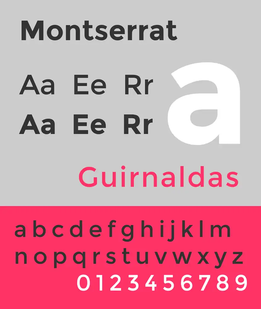
Montserrat, created by Julieta Ulanovski, is a versatile font that combines traditional and modern elements in a timeless way. In logo design, typography trends play a crucial role in conveying the brand’s identity. The choice of font can greatly impact how a brand is perceived by its audience.
When it comes to versatility, Montserrat stands out among other popular sans serif fonts. Its clean lines and balanced proportions make it suitable for various industries and design styles. Compared to other fonts, Montserrat offers a unique blend of classic elegance and contemporary flair.
Several case studies have showcased the success of logo designs using Montserrat font, demonstrating its ability to enhance brand recognition and create a strong visual identity. With its adaptability and aesthetic appeal, Montserrat continues to be a popular choice for designers seeking a timeless yet modern typeface for their logo projects.
15. Gill Sans
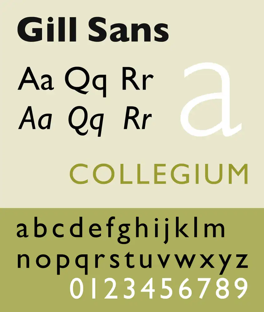
When it comes to selecting a timeless yet modern font for your brand, Gill Sans is a popular choice in the design industry. This font strikes the perfect balance between modernity and traditional lettering influences, making it an ideal option for brands that want to convey both a contemporary and classic aesthetic.
Here are four reasons why Gill Sans is a great choice for your brand:
- Gill Sans and its modernity: Designed in 1928, Gill Sans still feels fresh and relevant today due to its clean lines and minimalist style.
- The influence of traditional lettering on Gill Sans: Inspired by traditional letterforms, Gill Sans maintains a sense of elegance while embracing a more modern approach.
- The legibility of Gill Sans: With its spacious proportions and simple shapes, this font is highly legible across various mediums, ensuring your message is always clear.
- Gill Sans in digital branding: The latest rendition of Gill Sans focuses on digital legibility, making it perfect for websites, social media posts, and other digital platforms.
Incorporating Gill Sans into your brand’s visual identity will give you the best of both worlds – a font that embodies both modernity and tradition.
16. FF Blur
FF Blur, designed by Neville Brody in 1991, is a versatile font with a unique blurred-out look. It works well for headings, titles, branding, and packaging. Its innovative designs and distinctive appearance make it perfect for creative inspirations and modern logo trends.
With FF Blur, you can create logos that stand out from the crowd and leave a lasting impression. Its versatility in branding allows you to use it across different industries and applications. Whether you’re designing a sleek tech startup logo or an edgy fashion brand emblem, FF Blur adds a touch of uniqueness to your designs.
Its blurred-out look adds an element of mystery and style that captures attention instantly. Embrace FF Blur’s creative potential to elevate your branding game!
17. Cooper BT
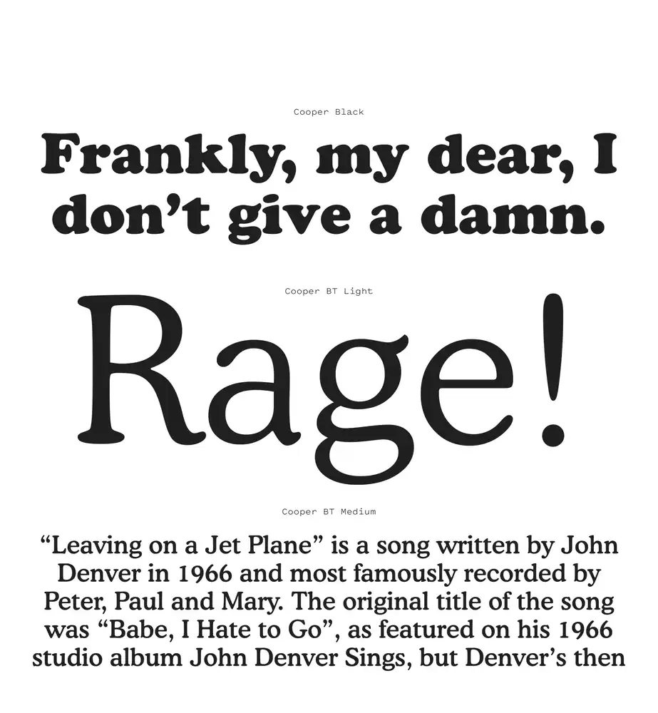
You can use Cooper BT as a friendly and bubbly font choice for your brand to give off a fun and human vibe. This unique font has several characteristics that make it stand out.
It has rounded edges and playful letterforms, which add a touch of whimsy to any design. Many successful brands have incorporated Cooper BT into their logos, such as Mailchimp, which is known for its playful and approachable branding.
When using Cooper BT in logo design, consider pairing it with bold colors or illustrations to enhance its cheerful nature. The versatility of Cooper BT allows it to be used in various industries, from tech startups to children’s brands.
In comparison to other popular serif fonts like Times New Roman or Garamond, Cooper BT offers a more modern and youthful aesthetic that appeals to younger audiences.
Contemporary and new logo fonts
For a fresh and modern look in your branding, consider exploring contemporary and new fonts for your logo.
18. TT Hoves
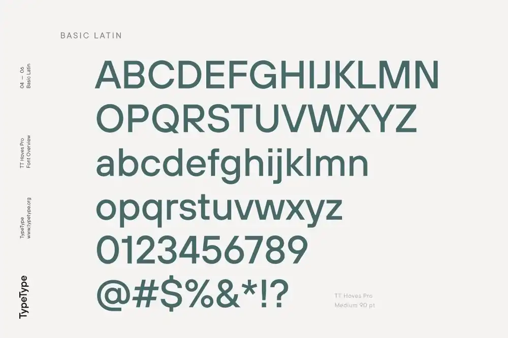
When choosing a font for your branding, consider TT Hoves Pro, a professional font that exudes clarity and reliability. TT Hoves has unique features that make it an excellent choice for logo design.
Its modern geometric sans serif style gives it a contemporary and clean look, perfect for digital branding in consultancies or tech industries.
Compared to other sans serif logo fonts, TT Hoves stands out with its distinct character shapes and balanced proportions. It captures attention while maintaining readability, making it suitable for various applications.
Several case studies have showcased successful logo designs using TT Hoves font. These designs have effectively communicated the brand’s values and created a memorable visual identity.
To incorporate TT Hoves into logo design effectively, keep these tips in mind: choose appropriate weights and styles based on your brand’s personality, experiment with different layouts and compositions to find the best arrangement, and ensure legibility across different sizes and mediums.
19. Gelica

Gelica is a fun and free-spirited logo font that brings a nostalgic 70s feel to your branding. With its unique characteristics, Gelica offers a vibrant and playful energy that is perfect for expressing the personality of your brand.
Here are some key features of the Gelica font:
- Bold and rounded letterforms
- Groovy curves and swashes
- Retro-inspired design elements
If you’re looking for alternatives to Gelica, consider fonts like Disco Fever or Funkytown, which also capture the essence of the 70s era. In terms of popularity, Gelica has gained traction in logo design due to its ability to evoke a sense of nostalgia while offering a contemporary twist.
When pairing Gelica with other fonts, try combining it with clean and modern typefaces such as Montserrat or Helvetica. This contrast will create an interesting visual balance in your branding.
Gelica finds applications across various industries, including fashion, music, and art. Its lively and expressive nature makes it suitable for brands seeking an energetic and retro aesthetic.
20. Goia
Goia is an artsy and abstract typeface that exudes a modern and edgy vibe. Its sharp edges and unique letter shapes make it perfect for branding online stores and creating design assets. However, when choosing a font for your logo, there are several considerations to keep in mind.
Different fonts evoke different emotions and perceptions. So, think about what message you want to convey through your logo and select a font that aligns with that vision. Whether you want to appear bold and cutting-edge or elegant and sophisticated, the right font choice can help bring your brand identity to life.
21. Quiche sans
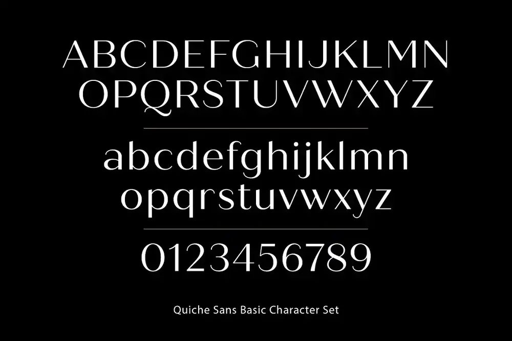
The Quiche sans font adds a touch of elegance and luxury to any logo design. Its unique features make it stand out among other serif fonts, making it a popular choice for designers. Here are some key points about Quiche Sans:
Unique features of Quiche Sans:
- Decadent curves and varying strokes that exude sophistication.
- Traditional twist on modern serif font, creating a timeless look.
Applications of Quiche Sans in logo design:
- Perfect for professional logo design in various industries.
- Especially suited for consulting firms, restaurants, and personal branding.
Comparing Quiche Sans with other serif fonts:
- Stands out with its distinct elegance compared to other serif fonts.
- Adds a touch of luxury and sophistication that sets it apart.
Quiche Sans in branding for restaurants:
- Enhances the brand identity by evoking an upscale dining experience.
- Perfectly complements elegant restaurant logos and menus.
The impact of Quiche Sans on personal branding:
- Elevates personal brands with its luxurious aesthetic.
- Creates a memorable impression that reflects professionalism and style.
22. Cenzo Flare
You’ll love the retro appeal and slightly curved edges of the Cenzo Flare font. When it comes to logo design, this font can add a touch of nostalgia and personality to your brand.
One way to use Cenzo Flare in logo design is by incorporating it into the typography of your logo. Its mid-century modern flare gives off a vintage vibe that works well for businesses in industries like fashion, music, and entertainment. Take inspiration from famous logos that have used Cenzo Flare, such as retro-inspired clothing brands or classic rock bands.
When incorporating Cenzo Flare into your branding, consider pairing it with complementary fonts and colors that enhance its vintage aesthetic. The history and evolution of Cenzo Flare in design also make it a unique choice for creating a standout logo that captures attention.
Explore the versatility of Cenzo Flare in different industries to see how it can elevate your brand identity.
23. Neulis
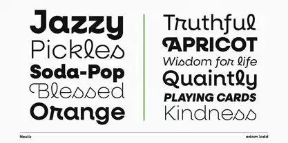
Explore the versatility of Neulis in different industries to see how it can elevate your brand identity. This creative logo font, designed by Adam Ladd, combines the best of both sans serif and script fonts, making it perfect for various design purposes.
When it comes to logo design, typography trends play a crucial role in capturing attention and conveying your brand message effectively. The font choice you make has a significant impact on your brand identity as it sets the tone and personality of your business. With Neulis, you can strike the right balance between uniqueness and legibility in your logo fonts, ensuring that they stand out while remaining easily readable.
By exploring the psychology behind font selection, you can create logos that evoke specific emotions and resonate with your target audience. Moreover, Neulis allows customization for a personalized logo design that truly represents your brand’s essence.
24. Belleza
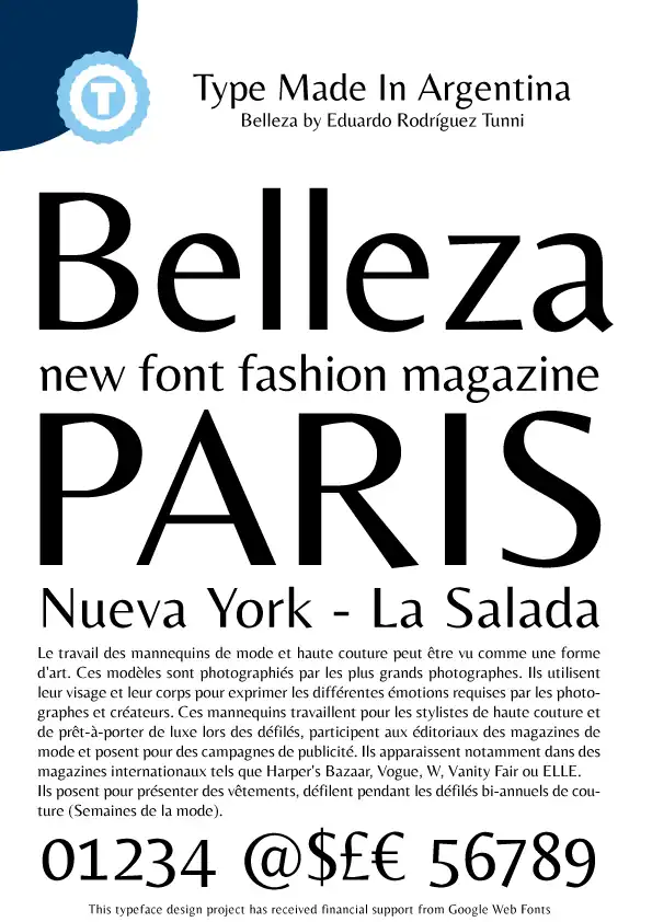
Belleza is a versatile font family that adds a unique and abstract touch to any digital project.
When it comes to logo design, the impact of using unique fonts cannot be underestimated. Fonts have the power to evoke certain emotions and convey messages subconsciously. The psychology behind font selection plays a crucial role in creating an effective logo that resonates with your target audience.
Font pairing is also important as it helps create visual harmony and balance in a logo design. The right combination of fonts can enhance the overall aesthetic appeal and readability of the logo.
Furthermore, font style has a significant influence on brand identity. Different styles can convey different brand personalities, whether it’s modern, elegant, or playful.
As for future trends in logo design, fonts will continue to evolve and adapt to new aesthetics and technology advancements, allowing designers more creative options for crafting impactful logos.
25. Cocosignum
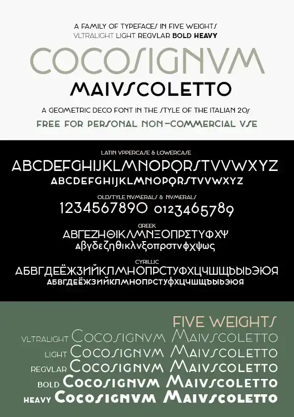
To add a touch of retro charm and uniqueness to your branding, consider incorporating the mid-century modern sans serif font, Cocosignum. This font has unique characteristics that make it stand out from the crowd.
Its inspiration from the Italian thirties gives it a vintage feel, making it perfect for creating logos in more traditional industries or branding handmade products. One creative way to incorporate Cocosignum in logo design is by stacking it on top of bold shapes for maximum impact.
What’s great about this font is its versatility – it can be used across different industries and still bring that retro charm to your brand. When pairing Cocosignum with other logo fonts, consider using complementary typefaces that enhance its unique qualities.
Take inspiration from successful logos like those of vintage boutiques or artisanal cafes that have successfully used Cocosignum to create a distinct brand identity.
26. Mohr
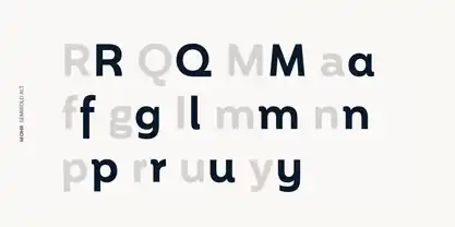
Mohr is a bold sans serif font that perfectly aligns with the current logo design trends of minimalism and simplicity. Its versatile design elements and structured look make it an excellent choice for creating impactful logos.
To enhance the visual appeal of your logo even further, consider using font pairing tips to combine Mohr with complementary typefaces. And don’t forget about font customization techniques! Experimenting with different weights, sizes, and styles can add uniqueness to your logo and make it truly stand out from the crowd.
27. Albra
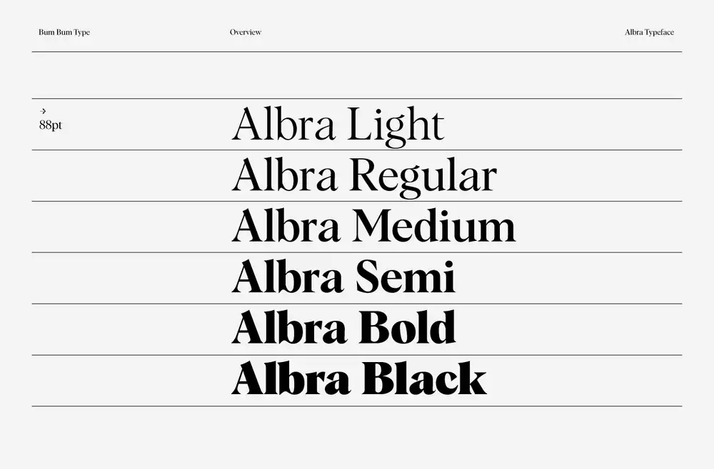
Albra is a versatile serif font that adds a unique touch to logos in traditional industries. Its unique quirks and distinguishing features make it stand out among other typefaces.
One of its great strengths is its compatibility with script font styles, allowing for elegant combinations in logo design.
Albra’s suitability for logo design in traditional industries cannot be overstated. It brings a sense of sophistication and timelessness to fashion brands, which explains its popularity in the industry.
Moreover, Albra is also widely used in gastronomy-related logo designs, as it conveys a sense of tradition and craftsmanship that resonates with food lovers.
So whether you’re designing a fashion brand or creating a logo for a restaurant, Albra is definitely worth considering for its versatility and ability to add that special touch to your designs.
28. Organetto
You’ll love the bold retro look and geometric letters of Organetto, making it perfect for creating eye-catching business logos.
When it comes to retro inspired logos, Organetto is a top choice. Its art deco influences bring a touch of vintage charm to logo designs, capturing the essence of the era with its sleek and stylized aesthetic.
The bold and commanding nature of Organetto adds impact and authority to any logo design, making it stand out among other fonts. Its geometric characteristics make it not only suitable for vintage designs but also for modern logo designs that aim for simplicity and sophistication.
With its standout logo typography, Organetto has the potential to create memorable brand identities that leave a lasting impression on viewers.
29. Bolkit
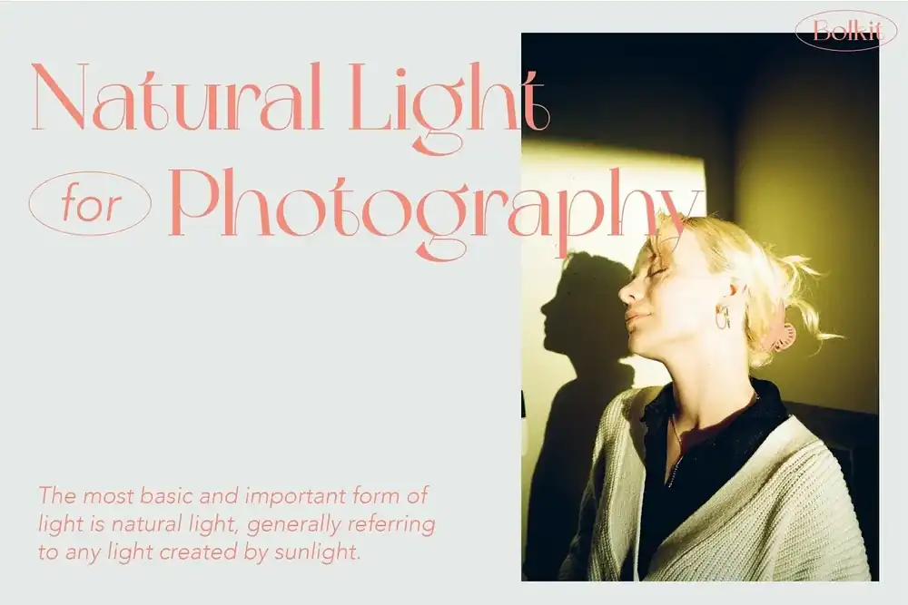
With its whimsical style and elegant geometric serifs, Bolkit brings a touch of psychedelic charm to your designs. This font has an impact on logo design by incorporating bold typography that catches the eye and leaves a lasting impression.
The use of negative space in logo fonts is explored with Bolkit, as it strategically creates empty spaces within the letterforms, adding depth and visual interest. The influence of psychedelic elements in contemporary logo design can be seen through Bolkit’s playful and unconventional shapes, breaking away from traditional norms.
30. Taberna
Taberna is a font that captures the essence of Wes Anderson’s style with its decorative, retro, and bold design.
Vintage inspired typography has a charm that brings back the nostalgia of bygone eras. Retro fonts evoke a sense of nostalgia and can add a unique touch to any logo design.
Bold typefaces have a significant impact on logo design as they make a strong visual statement and command attention. Taberna font stands out with its unique characteristics, combining vintage elements with boldness to create an eye-catching aesthetic.
By incorporating Wes Anderson aesthetics in logo typography, brands can achieve a distinct look that reflects his signature style.
The versatility of Taberna font allows designers to experiment with different layouts and styles, making it suitable for various industries and brand identities.
31. Centrio 2023
With its limitless serif customizations, Centrio is set to be one of the upcoming font trends.
Fonts play a crucial role in shaping a brand’s identity. When it comes to logos, they can evoke emotions and convey messages with just a few letters.
Custom logo fonts like Centrio allow brands to stand out and create a unique visual representation of their values and personality.
Additionally, font consistency is vital for brand recognition and recall. Using the same font across different platforms and marketing materials helps reinforce your brand’s image and build trust with your audience.
So keep an eye out for Centrio 2023 – it may just be the perfect typeface for your next logo design project!
32. Gopher
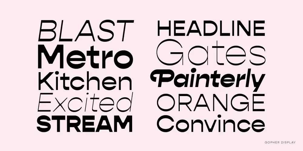
You’ll be amazed by the unique horizontal apertures and quirky strokes of Gopher, a geometric sans font with tons of personality.
When exploring Gopher’s unique features, you’ll discover that it offers divine legibility mixed with a touch of playfulness. This makes it an excellent choice for logo design in various industries.
Gopher has made quite an impact on logo design trends, thanks to its modern and eye-catching aesthetic. Its versatility allows it to work well with different fonts, making it easy to create visually appealing and cohesive designs.
As for the future of Gopher in logo design, we can expect it to continue gaining popularity as more designers recognize its potential and embrace its distinctive charm.
33. Grayson
Grayson’s retro and modern characteristics make it a versatile choice for design projects in any industry. Whether you’re aiming for a futuristic design or looking to create a sense of nostalgia with retro branding, Grayson has got you covered. It seamlessly blends the best of both worlds, making it suitable for logo design in both modern and traditional industries.
With its sleek lines and contemporary feel, Grayson will give your brand a fresh and cutting-edge look. On the other hand, if you want to evoke a sense of history and timelessness, Grayson can do that too.
So why limit yourself? Let Grayson by hip fonts be your go-to typeface for all your design needs.
34. Saveur sans
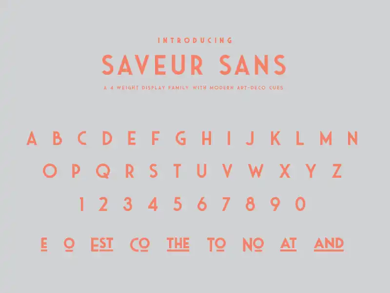
Saveur sans is a font that combines bold geometry and monospaced lettering, making it suitable for traditional industries and design projects.
When it comes to logo design, typography trends play a crucial role in creating a memorable brand identity. The impact of font choice on brand identity cannot be overstated, as it sets the tone and personality of the logo.
Saveur sans offers versatility in its design, allowing designers to experiment with different styles while maintaining a timeless appeal. To design a memorable logo using Saveur sans, consider incorporating unique elements such as negative space or creative letterforms.
Several case studies have shown the success of logos using Saveur sans, proving its effectiveness in capturing attention and leaving a lasting impression on consumers.
35. Otterco
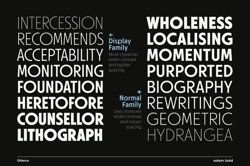
Otterco is a versatile font that offers a unique and modern look for designing logos in various industries. Its bold sans display style, with geometric lettering and close kerning between letters, aligns perfectly with current typography trends in logo design.
The font’s single width strokes create a uniform appearance that adds to its appeal. Additionally, Otterco understands the impact of color in logo fonts, allowing designers to experiment and enhance their branding with vibrant hues or subtle shades.
Font consistency holds immense importance in branding as it creates coherence across different touchpoints. Furthermore, Otterco encourages designers to explore unique font pairings for logos, enabling them to create visually stunning combinations that stand out from the crowd.
Lastly, the psychology of fonts plays a significant role in logo design, and Otterco’s modern yet approachable style can evoke feelings of trustworthiness and professionalism while maintaining an element of creativity.
36. Yoshida
When choosing a font for your logo, Yoshida’s commanding simplicity and unique rounded lettering can make a powerful impact. The impact of Yoshida font on logo design is undeniable. Its elongated bold letters and rounded lettering give it a distinct look that sets it apart from other fonts.
One of the unique features of Yoshida font is its ability to stand out as a stand-alone element in logo designs. However, it also pairs well with various other fonts to create visually appealing and dynamic logos. This versatility makes Yoshida font a game changer in logo typography.
Its striking presence and ability to convey the essence of a brand make it an excellent choice for creating memorable and impactful logos.
Logo font takeaways
Consider the personality of your brand and connect with your target audience when choosing a font for your logo. The font you choose has a significant impact on how your brand is perceived. Here are some key takeaways to keep in mind when selecting a logo font:
- Importance of Font Pairing: Pairing fonts that complement each other adds visual interest and enhances the overall design of your logo.
- Impact of Font Weight on Logo Design: The weight of a font can convey different emotions and attitudes. Choose a bold, heavy-weight font for a strong and impactful look, or opt for a lighter-weight font for elegance and sophistication.
- Best Logo Fonts for Luxury Brands: Luxury brands often use serif fonts like Baskerville or Bodoni to communicate prestige and refinement.
- Choosing a Font that Reflects Your Industry: Consider the nature of your business when selecting a font. A tech company may benefit from using modern, sleek fonts, while an organic food brand might opt for handwritten or rustic fonts.
- Incorporating Custom Fonts in Logo Design: Custom fonts allow you to create a unique identity that sets you apart from competitors. Consider creating or commissioning custom lettering specifically tailored to your brand’s personality.
Frequently Asked Questions
What Is the History and Evolution of Logo Fonts?
Are There Any Specific Fonts That Should Be Avoided for Logo Design?
Avoid fonts that clash with your brand’s color psychology, as it can impact consumer perception. Stay updated on typography trends for logo design while maintaining font consistency to build a strong brand identity. Experiment with unconventional fonts, but ensure readability and uniqueness are balanced.
Can I Use a Mix of Serif and Sans-Serif Fonts in a Logo?
Yes, you can use a mix of serif and sans-serif fonts in a logo. The pros include adding visual interest and conveying different brand qualities. Examples like Nike and FedEx show successful combinations. Choose a balance that complements each other, create harmony, and consider the psychological impact on your audience.
How Can I Ensure That the Chosen Logo Font Is Readable and Legible Across Different Sizes and Mediums?
To ensure your logo font is readable and legible across sizes and mediums, consider font weight and spacing. Test fonts on various devices and resolutions. Choose a versatile font that works for print and digital formats, incorporating typography trends while balancing uniqueness with readability.
Are There Any Copyright or Licensing Considerations When Using Certain Logo Fonts?
When considering logo fonts, it’s important to think about how your font selection impacts your brand identity. You should also be aware of the legal implications of using copyrighted fonts and the importance of font licensing for logo designs. Consider alternatives to popular fonts to avoid copyright issues while still maintaining creativity and legality in your font selection