Are you tired of your design looking like a bland bowl of oatmeal?
Well, buckle up because we’ve got the perfect solution for you!
In this article, we’re going to show you the best Google Fonts that will take your design from plain to extraordinary.
These fonts are like a breath of fresh air in a stuffy room, injecting life and personality into your projects.
So get ready to elevate your design game in 2023 with our top picks!
Why Use Google Fonts?
There are several reasons why it’s beneficial to use Google Fonts for your design in 2023.
The advantages of using Google Fonts have a significant impact on the overall user experience.
Firstly, Google Fonts offer a wide range of customization options, allowing you to find the perfect font that aligns with your design vision. Whether you’re looking for a bold and modern font or a classic and elegant one, Google Fonts has got you covered.
Additionally, these fonts seamlessly integrate with different platforms, making it effortless to add them to your website or any other design project.
With their curated selection of high-quality fonts and no convoluted licensing restrictions, Google Fonts surpass web-safe fonts and elevate the visual appeal of your designs in 2023.
What to Look For in a Google Font?
When choosing a font, make sure to consider its readability and how it aligns with the mood and intent of your design. The impact of font choices on user engagement cannot be underestimated.
Font legibility is of utmost importance in web design as it directly affects the user’s ability to read and comprehend your content. The psychology behind font selection is intriguing, as different fonts can evoke different emotions and convey specific messages.
Factors to consider when choosing a font for a specific brand identity include the target audience, industry, and overall brand personality. Typography plays a significant role in enhancing website aesthetics by adding visual interest and creating hierarchy within the text.
The 10 Best Google Fonts in 2023
When it comes to choosing the best Google fonts for your design, you might want to consider Roboto, Open Sans, Lato, Montserrat, and Oswald.
These fonts have gained popularity among designers for their versatility and readability.
With a wide range of styles and weights available, they can be used in various design projects to enhance the overall visual appeal.
1. Roboto
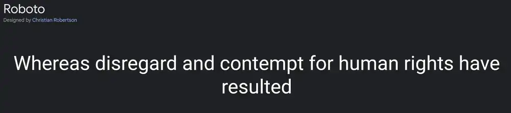
One of the most popular fonts for modern design is Roboto, known for its clean and minimalist look. In 2023, typography trends continue to emphasize simplicity and readability, making Roboto an ideal choice. The impact of font choice on user experience cannot be underestimated. Studies have shown that the right font can enhance comprehension and engagement with content. The psychology of font selection plays a crucial role in conveying specific emotions or messages. Customizing fonts for branding purposes allows businesses to create a unique identity and stand out from competitors. Additionally, the importance of font pairing in design should not be overlooked. Combining different fonts can add depth and visual interest to your designs.
2. Open Sans
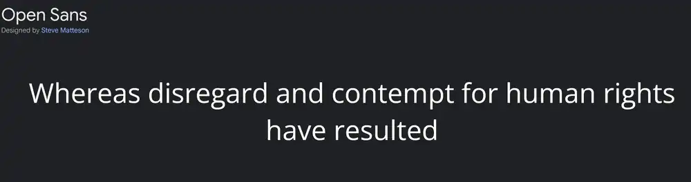
Open Sans is a versatile font that can be used in various design projects to create a clean and modern aesthetic. It is one of the most popular fonts for web and mobile designs, thanks to its readability on screens of all sizes. Here’s why you should consider using Open Sans for your next project:
- Typography trends: Open Sans offers a wide range of font styles, making it perfect for exploring different typographic trends.
- The impact of font choice on user experience: With its legible and easy-to-read characters, Open Sans ensures a smooth reading experience for users.
- Using font pairings to enhance your design: Open Sans pairs well with other fonts, allowing you to create visually appealing combinations that enhance the overall design.
- Customizing fonts for branding purposes: Open Sans can be customized by adjusting letter spacing or choosing different weights, enabling you to create unique brand identities.
- The psychology of fonts: Font selection affects perception, and Open Sans conveys professionalism and reliability, making it suitable for various industries.
Consider adding Open Sans to your typography arsenal and elevate the visual appeal and user experience of your designs.
3. Lato

Now that we’ve looked at the legibility and user experience of Open Sans, let’s explore another fantastic Google font: Lato.
When it comes to font choice, legibility is crucial as it directly impacts how easily users can read your content. Lato excels in this aspect with its clean and well-designed characters.
Beyond legibility, the style of a font also plays a significant role in user experience. Lato’s modern and versatile design allows it to be used in various contexts, making it an excellent choice for brands looking for flexibility.
The psychology behind font choice cannot be underestimated either. Different fonts evoke different emotions and convey different messages to your audience. It’s essential to choose a font that aligns with your brand values and personality.
To enhance the typography in your design using Lato or any other font, pay attention to factors like hierarchy, spacing, and contrast. These elements can elevate the overall visual impact of your text.
So when choosing a font for your brand, consider the importance of legibility, the impact on user experience, the psychology behind fonts, and ways to enhance typography in your design.
4. Montserrat
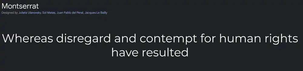
When it comes to font choices, you’ll find Montserrat to be a versatile option with its modern and geometric design. This font is not only visually appealing but also aligns with the typography trends for 2023.
The impact of font choice on user experience cannot be underestimated. Montserrat has a clean and legible look that enhances readability, making it an excellent choice for websites and digital platforms.
Additionally, the psychology of fonts in design plays a crucial role in creating the desired brand image. With Montserrat’s sleek and professional appearance, you can easily customize it to reflect your brand identity.
Moreover, using this font allows you to create visual hierarchy by utilizing different weights and styles within the typeface itself.
Overall, Montserrat offers endless possibilities for elevating your design in 2023.
5. Oswald
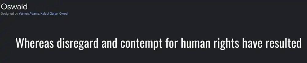
If you’re looking for a font that exudes boldness and versatility, Oswald is an excellent choice. Its strong and geometric design instantly grabs attention and adds a modern touch to any project. The impact of font choice on user experience cannot be overstated. Oswald’s clean lines and easy readability enhance the overall user experience by ensuring content can be easily consumed.
Additionally, font pairing is crucial in design to create visual harmony and hierarchy. Oswald pairs well with both serif and sans-serif fonts, allowing designers to create balanced compositions. When it comes to the psychology of fonts, Oswald evokes feelings of confidence, strength, and professionalism.
Lastly, customizing Oswald to match brand identity is effortless due to its versatility in weight options and styles. Whether you need a headline or body text that conveys authority or playfulness, Oswald has got you covered.
6. Source Sans
Source Sans, with its clean and modern design, is a versatile font that adds a touch of elegance to any project.
Font consistency is important because it helps establish a cohesive visual identity across different platforms and materials. The font choice has a significant impact on user experience as it affects readability and perception of the content.
The psychology of font selection plays a role in conveying emotions and messages through typography. Customizing font styles allows for branding purposes by creating a unique look that aligns with the brand’s personality.
When pairing Source Sans with other fonts, consider contrasting styles to create visual interest while maintaining readability. For example, pairing it with a serif font can create an elegant combination, while pairing it with a script or handwritten font can add playfulness or informality to the design.
7. Slabo 27px/13px
Now that you’ve learned about the versatility of Source Sans Pro, let’s explore another top pick for Google Fonts in 2023: Slabo 27px/13px. Typography trends are constantly evolving, and this font is a perfect example of what’s popular right now.
Font choice plays a significant role in user experience. Different fonts evoke different emotions and can impact how users perceive your design. The psychology behind font selection shouldn’t be underestimated.
If you’re considering using slab serif fonts like Slabo 27px/13px, here are some tips to keep in mind. First, ensure proper contrast between the text and background to enhance readability. Second, experiment with different weights and sizes to create visual hierarchy.
Slab serif fonts have a bold and confident appearance that makes them suitable for various design styles – from modern to vintage. Their versatility allows you to use them in headlines, body copy, or even logos.
8. Raleway
To add a touch of elegance to your design, consider using Raleway as a sleek and modern font choice. Raleway offers a variety of customization options that allow you to tailor the font to your specific design needs. Whether you’re looking for a bold and impactful display font or a clean and minimalistic option for body text, Raleway has got you covered.
In terms of use cases, Raleway is versatile and can be used in various design projects. Its clean lines and contemporary feel make it perfect for website headers, logos, and branding materials. Additionally, its readability makes it suitable for longer blocks of text such as blogs or articles.
When comparing Raleway with other popular sans serif Google fonts like Open Sans or Montserrat, each font has its own unique characteristics. While Open Sans is more neutral and versatile, Montserrat has a bolder presence. However, Raleway strikes the perfect balance between elegance and modernity.
To create visually appealing designs with Raleway, consider pairing it with other Google fonts such as Lato or Roboto. These combinations can help create contrast and hierarchy within your design while maintaining visual harmony.
If you’re looking for alternatives to Raleway that offer a similar style, fonts like Gotham or Proxima Nova are worth considering. These fonts share the same sleek aesthetic but provide their own distinct personalities that can give your design a unique flair.
9. PT Sans
If you’re looking for a versatile and readable font option, PT Sans is worth considering for your design projects. PT Sans is one of the best font choices when it comes to readability, making it suitable for various types of content.
Whether you need a font for website headers or body text, PT Sans delivers excellent legibility on any screen size.
Font pairing is also effortless with PT Sans. It complements well with many other fonts, allowing you to create visually appealing typography combinations. The best part is that PT Sans is available as a Google Font alternative, making it easily accessible and free to use in your designs.
10. Merriweather
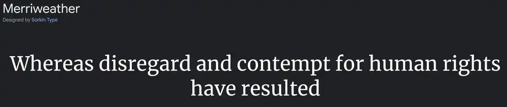
When you want a font that exudes elegance and professionalism, Merriweather is an excellent choice for your design projects. In the world of typography trends in 2023, this serif font stands out with its classic yet contemporary appeal.
The impact of font choice on user experience cannot be underestimated. Merriweather’s clean lines and readability make it a perfect fit for websites, branding materials, and print designs alike.
The psychology of font selection also plays a role in choosing Merriweather. Its timeless aesthetic evokes trustworthiness and reliability, making it ideal for businesses looking to establish credibility.
Exploring the history of Merriweather reveals its development by Eben Sorkin as a typeface designed specifically for on-screen reading. When compared to other serif fonts like Times New Roman or Georgia, Merriweather shines with its unique character shapes and enhanced legibility at smaller sizes.
Bonus Fonts + Up-And-Comers
11. Noto Sans
To elevate your design in 2023, you should consider using Noto Sans. This font choice has several benefits that can enhance your overall design and user experience.
- Importance of font legibility: Noto Sans prioritizes legibility, ensuring that your content is easily readable for users.
- Impact of font choice on user experience: The right font can greatly impact how users interact with your website or app, influencing their perception and overall satisfaction.
- The psychology behind font selection: Different fonts evoke different emotions and associations, allowing you to convey a specific brand personality or aesthetic.
- Typography trends in 2023: Noto Sans aligns with the clean and minimalistic typography trends that are expected to dominate the design landscape in 2023.
- How different fonts convey different brand personalities: Noto Sans offers versatility, enabling you to adapt it to various brand personalities while maintaining consistency and professionalism.
12. Nunito Sans
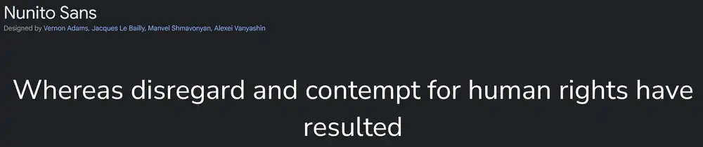
Consider incorporating Nunito Sans into your design for a modern and sleek typography choice. Typography trends have shown a growing popularity of sans serif fonts, and Nunito Sans is no exception.
This font has a clean and minimalist look that can enhance the overall user experience on your website or brand materials. The impact of font choice on user experience should not be underestimated, as it can affect readability and convey specific emotions to your audience.
When choosing the right font for your brand identity, consider the psychology behind font selection. Different fonts can evoke different feelings and associations, so choose one that aligns with your brand message.
Lastly, don’t be afraid to customize fonts to add personal flair to your designs. Play around with sizes, spacing, or even letterforms to make it unique to your brand.
13. Concert One
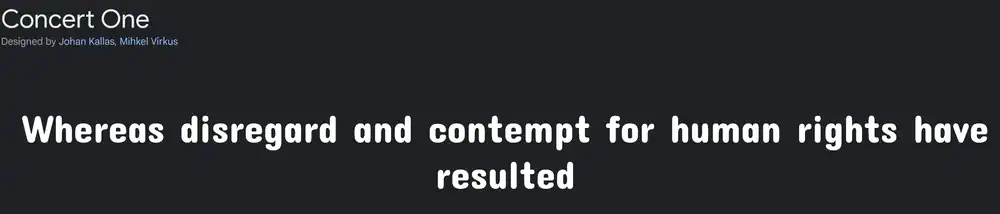
The Concert One font is a versatile choice for adding a touch of elegance to your designs. It brings a sense of sophistication and style that is perfect for concert-related content. Whether you’re designing concert tickets, promotional materials, or marketing strategies, Concert One can elevate the overall look and feel of your work.
14. Prompt
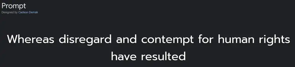
By incorporating the Concert One font into your designs, you can create visually captivating materials that stand out from the competition.
Google Fonts have had a significant impact on user experience, offering a wide range of fonts that were previously inaccessible to web designers. Compared to traditional web fonts, Google Fonts provide greater variety and flexibility in terms of style and design possibilities.
The psychology of font selection plays a crucial role in design as different fonts evoke different emotions and convey distinct brand personalities.
Furthermore, Google Fonts have been optimized for website loading speed, ensuring that your content loads quickly and efficiently for a seamless user experience.
When choosing the right font for your brand’s personality, consider factors such as readability, legibility, and alignment with your overall branding strategy.
15. Work Sans
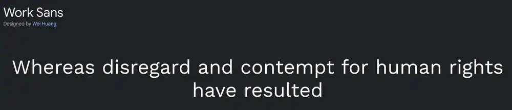
When choosing a font for your designs, incorporating Work Sans can add a modern and sleek touch. Work Sans is a versatile sans-serif typeface that offers clean lines and excellent legibility.
Here are some characteristics of Work Sans:
- It has a wide range of weights, from Thin to Black, allowing for flexibility in design.
- The rounded terminals give it a friendly and approachable feel.
- The popularity of Work Sans continues to grow due to its simplicity and contemporary style.
Compared to other Google fonts, Work Sans stands out with its unique blend of elegance and readability. Its minimalist design makes it suitable for various design styles, such as minimalistic, modern, or even corporate designs.
Whether you’re designing a website or creating branding materials, consider using Work Sans to enhance the overall aesthetic appeal and maintain readability in your designs.
How to Create The Best Google Fonts Combinations?
Want to create the best Google Fonts combinations for your design? Font hierarchy is crucial in design as it helps establish visual hierarchy and guides readers through content. Pairing serif and sans-serif fonts effectively adds contrast and enhances readability. Google Fonts offer a wide range of options, making it easy to maintain branding consistency across platforms. Additionally, exploring custom font combinations allows you to create unique designs that stand out. To optimize readability with Google Fonts, consider factors such as font size, line spacing, and letter spacing. Remember to test different combinations and adjust accordingly based on user feedback. By following these tips, you can elevate your design with the perfect Google Fonts combinations.
Best Practices for Using Google Fonts on WordPress
Limit The Number of Font Weights You Use
To elevate your design, try using fewer font weights. Limiting the number of font weights you use can have a significant impact on your website’s loading speed. By reducing the variety of font weights, you decrease the amount of data that needs to be loaded when someone visits your site. This not only improves loading times but also enhances user experience.
The psychology behind font weight choices in design is crucial. Different font weights evoke different emotions and convey different messages. For example, bold fonts often signify strength and importance, while light fonts create a delicate and elegant impression.
Tips for effectively pairing different font weights include choosing fonts that complement each other and creating contrast between headings and body text. When selecting fonts, consider their visual hierarchy and ensure that they work well together to establish a cohesive design.
Common mistakes to avoid when using multiple font weights include overusing too many different styles or mixing incompatible fonts that clash with each other. It’s important to find a balance between consistency and variety.
Font weights play a vital role in creating visual hierarchy in your design. By utilizing various weights strategically, you can guide users’ attention to important elements on your website and highlight key information effectively.
Consider Hosting Google Fonts Locally
Consider hosting the Google fonts locally to optimize your website’s performance. There are both pros and cons to hosting Google fonts locally.
On the positive side, hosting them locally reduces dependency on external servers, resulting in faster load times and improved user experience. It also gives you more control over font customization and allows for offline accessibility.
However, there are some drawbacks as well. Hosting fonts locally can increase server load and consume more bandwidth, potentially impacting website performance if not managed properly.
When it comes to comparing the performance of locally hosted Google fonts versus using Google’s server, local hosting generally offers better load times due to reduced network requests. To host Google fonts locally on different platforms such as WordPress or HTML/CSS, you need to download the font files and upload them to your server or CDN (Content Delivery Network). You can then link these files in your website code.
It is important to consider security implications when hosting Google fonts locally. Make sure that you obtain the font files from a reputable source and regularly update them to prevent any vulnerabilities.
Pick a Font That Will Get Updates
Choosing a font that’ll receive regular updates is important for staying up to date with improvements and ensuring optimal performance. Regular font updates play a crucial role in maintaining design relevance and keeping up with current trends. Popular fonts are more likely to receive attention, making them influential in shaping design choices. When selecting a font for regular updates, there are several factors to consider. Firstly, look for fonts that have a history of consistent updates and improvements. Additionally, consider the reputation and reliability of the font designer or foundry. By choosing fonts that receive regular updates, you future-proof your design choices and ensure they remain relevant in the ever-changing world of design.
Don’t Forget About Accessibility
When choosing a font for your design, it’s important to consider accessibility. With 253 million people living with vision impairment, designing with accessibility in mind can make a huge difference.
One key aspect is color contrast, as it plays a critical role in ensuring readability for all users. To create accessible typography, follow best practices such as using clear and legible fonts, adequate spacing between letters and lines, and appropriate font sizes.
For visually impaired users, the impact of font size on readability cannot be underestimated. Integrating assistive technologies with Google Fonts can further enhance accessibility by providing options like screen readers or magnification tools.
When designing accessible websites with Google Fonts, here are some tips and tricks to keep in mind:
- Choose fonts with good legibility
- Use proper color contrast ratios
- Optimize font sizes for different devices
- Provide alternative text for non-text elements
- Test your designs using assistive technologies
How to Add Google Fonts to WordPress?
To add Google Fonts to your WordPress site, you have a few options.
First, you can install a plugin or use the Google Fonts API. There are several plugins available that make it easy to customize Google Fonts in WordPress. These plugins offer features like adjusting font size, font weights, and even adding custom fonts to your theme.
If you prefer a more manual approach, you can download and host the font files yourself. This gives you complete control over how the fonts are loaded and allows for optimization for speed.
If you’re using a child theme in WordPress, you can integrate Google Fonts by adding the necessary code to your theme’s stylesheet.
Lastly, if you’re using a page builder plugin like Elementor or Beaver Builder, they usually have built-in integration with Google Fonts, making it simple to use them within your designs.