
In the realm of modern web design, grids stand as the unsung heroes, providing the foundational structure that brings visual harmony and order to our digital experiences. These intricate systems, often invisible to the end user, are the backbone of our websites, ensuring that content is presented in a manner that’s both aesthetically pleasing and functionally effective.
Understanding The Basics And Essence of Grids
At its core, a website grid is a structured framework used in web design to organize content, images, and other elements in a coherent and harmonious manner. It’s akin to the underlying blueprint of a building, often unseen but crucial in ensuring everything fits and functions as it should. The grid’s primary purpose is to provide a clear structure, ensuring that the design is both visually appealing and user-friendly.
Often referred to as the backbone or skeleton of design, grids offer a foundational support system. Just as our bones give our bodies shape and structure, grids give form and function to our web designs. They ensure that elements don’t just float aimlessly but have a designated place and purpose.
Beyond mere organization, grids play a pivotal role in establishing a clear hierarchy and alignment within the design. They guide the viewer’s eyes, emphasizing key pieces of information while ensuring that the overall design remains balanced and cohesive. By organizing content and creating alignment, grids help designers craft web pages that are not only aesthetically pleasing but also intuitive and user-centric. In essence, they are the silent architects of the digital world, shaping our online experiences in subtle yet significant ways.
Historical Context And Evolution of Grids
The story of grids begins in the hallowed halls of the publishing business. Before the digital pixels we’re familiar with today, grids were the guiding force behind the layout of newspapers, magazines, and books. These early grids ensured that text and images were organized in a manner that was both aesthetically pleasing and easy for readers to navigate. Manuscripts, with their handwritten texts, relied on these grids to maintain consistency and structure, setting the stage for the design principles we uphold today.
As we moved away from handcrafted manuscripts and into the age of print, the design landscape began to shift. The Industrial Revolution brought about significant advancements in printing technology, leading to a surge in publications and a need for more standardized design systems. This era saw the transition from traditional manuscript layouts to more sophisticated and systematic grid structures, tailored for the mass production of printed materials.
The 20th century, with its rapid technological advancements, further revolutionized the world of design. As the century progressed, the introduction of new grid systems reflected the evolving needs of designers and audiences alike. These modern grids, adaptable and dynamic, were crafted to cater to the burgeoning world of digital design, setting the foundation for the responsive and interactive web designs we encounter today. Through each phase of its evolution, the grid has remained a testament to the enduring principles of design, bridging the gap between history and innovation.
Website Grid Elements And Components
Diving into the intricate world of web design grids, we first encounter the foundational building blocks known as units. These units, much like the individual pieces of a jigsaw puzzle, come together to form the complete picture of a website. They provide the structure and consistency that underpin every well-designed webpage.
The anatomy of a grid is both complex and beautifully simple. Columns stand tall, providing vertical divisions that help organize content. Rows run horizontally, further segmenting the space and offering a clear path for the viewer’s eyes to follow. Modules, the rectangular cells formed by the intersection of columns and rows, become the homes for content blocks, images, and other design elements. Gutters, the spaces that run between these columns and rows, offer breathing room, ensuring that the design doesn’t feel cramped. Margins, on the other hand, act as the protective buffer between the grid and the edge of the screen, framing the content and providing a sense of space.
In the digital age, where screens come in all shapes and sizes, the concept of breakpoints has become paramount. Breakpoints are the specific points at which a website’s content layout changes to provide the best viewing experience on different screen sizes. This adaptability is the essence of responsive design. As we delve deeper into the realm of responsiveness, we encounter two primary grid types: fixed and fluid. Fixed grids remain constant regardless of the screen size, offering a consistent look but sometimes sacrificing adaptability. Fluid grids, in contrast, adjust and flow based on the viewer’s screen size, ensuring that the design looks optimal on everything from a desktop monitor to a smartphone screen.
Importance And Benefits of Grids in Web Design
In the vast digital landscape, where users are inundated with information, the importance of usability and readability cannot be overstated. Grids play a pivotal role in this, meticulously organizing content in a manner that’s intuitive and easy to digest. They streamline the visual flow, guiding the viewer’s eyes and making it easier to locate and process information. This enhancement in usability directly translates to an improved user experience, ensuring that visitors not only find what they’re looking for but also enjoy the journey.
Consistency is a cornerstone of good design, and grids are its champions. As users switch between devices, from desktops to tablets to smartphones, they expect a level of uniformity. Grids ensure that this visual structure remains consistent, offering a familiar layout that users can navigate with ease, irrespective of the device they’re on. This consistency eliminates confusion and builds trust, making users more likely to engage with the content and return for future visits.
Beyond the user’s perspective, grids offer tangible benefits to designers as well. They introduce an element of efficiency into the design process. Instead of starting with a blank canvas each time, designers have a tried-and-tested framework to build upon. This not only speeds up the design process but also ensures a higher standard of output. Furthermore, grids offer unparalleled flexibility in content presentation. Whether it’s a text-heavy article, a photo gallery, or a mix of various elements, grids can adapt and present content in the most visually appealing manner. In essence, they are the silent workhorses of web design, working behind the scenes to elevate both the design process and the end result.
Types of Grids And Their Applications
Column Grid
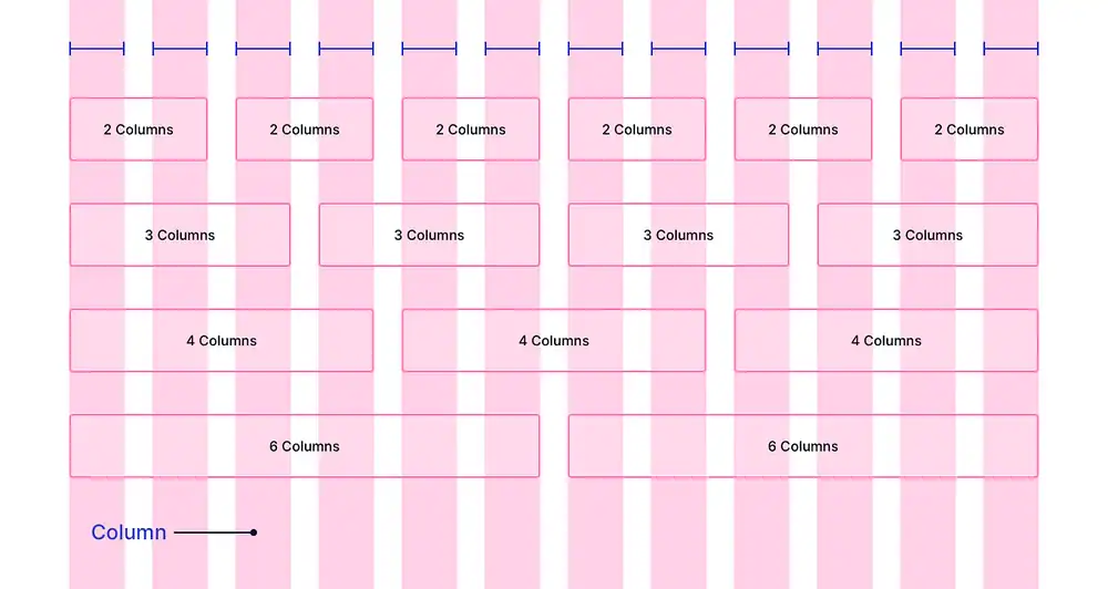
The world of web design is replete with various grid systems, each tailored to specific needs and content types. Among the most prevalent is the Column Grid. As its name suggests, this grid organizes content into vertical columns, providing a structured layout that’s especially useful for websites with diverse content types. These columns are separated by spaces known as gutters, which introduce the concept of white space. This white space is crucial, ensuring that the design doesn’t feel cluttered and offering a visual break that enhances readability.
Hierarchical And Manuscript Grid
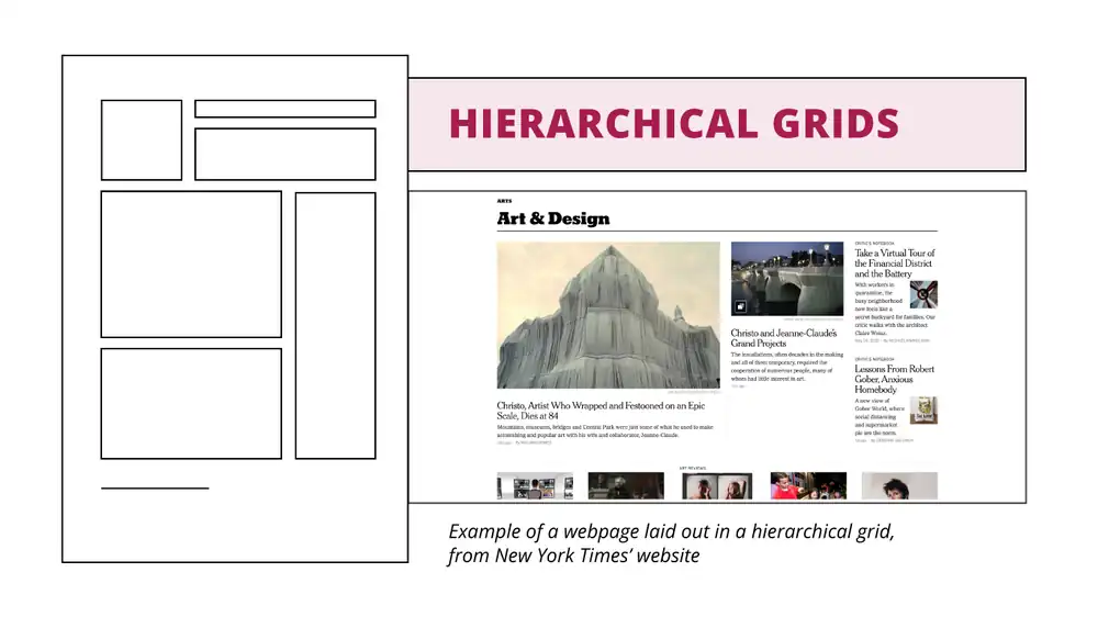
This grid system is all about prioritization. It allows designers to arrange content based on its importance, ensuring that key information captures the viewer’s attention. The manuscript aspect of this grid is particularly beneficial for text-heavy designs, such as blogs or news websites, offering a clear and coherent structure that makes long-form content more digestible.
Baseline Grid
The Baseline Grid is the unsung hero when it comes to text-based content. At its core, it’s a series of horizontal lines that ensure consistent spacing between lines of text. This consistency is pivotal in ensuring text legibility, especially in designs where typography plays a central role. By maintaining uniform line heights, the baseline grid ensures that readers can easily flow from one line to the next, enhancing the overall reading experience.
Modular Grid
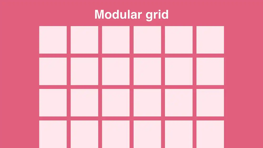
The Modular Grid is the Swiss Army knife of grid systems. It’s a versatile grid that combines columns, rows, and sometimes even other grid types to create a layout that’s tailored for maximum visual impact. Whether it’s a product showcase, a photo gallery, or a complex infographic, the modular grid offers the flexibility to present content in a manner that’s both organized and visually striking.
In essence, each grid type serves a unique purpose, catering to different design needs. By understanding their individual strengths and applications, designers can harness their power to create web designs that are both functional and aesthetically pleasing.
Creating And Implementing a Website Grid
In the modern era of web design, designers are equipped with a plethora of tools that come with built-in grid layouts, streamlining the design process. Among the frontrunners in this domain are Figma and Adobe XD. Figma, a cloud-based design tool, offers a collaborative environment where designers can easily set up and manipulate grids, making real-time adjustments that are instantly viewable by team members. Adobe XD, on the other hand, is a powerhouse in the design world, providing a robust platform with intuitive grid setup options, ensuring that designers can craft pixel-perfect layouts with ease.
Once a tool is chosen, the journey of setting up the grid system begins. This process involves defining the number of columns, the width of gutters, and the overall layout based on the content’s requirements. Customization is key here. While these tools offer preset grid options, the true magic happens when designers tweak and tailor these grids to fit the specific needs of their projects. Whether it’s adjusting for a unique visual element or ensuring that a particular piece of content stands out, the ability to customize grids ensures that the design remains both functional and visually captivating.
In today’s multi-device world, responsiveness isn’t just a luxury; it’s a necessity. Enter tools like JetGridBuilder. This powerful plugin for WordPress allows designers to craft responsive grid layouts with ease. With its intuitive drag-and-drop functionality, designers can resize and reposition content to ensure that it looks impeccable on all devices, from desktops to smartphones. The era of pinching and zooming is long gone; with JetGridBuilder, content gracefully adapts to screen sizes, ensuring a seamless user experience.
Golden Rules And Best Practices For Grid Design
In the intricate dance of web design, grids serve as the choreography, guiding each element to its rightful place on the stage. One of the first steps in this dance is Choosing The Right Grid Layout. The layout you select should resonate with the website’s purpose, the nature of its content, and its complexity. For instance, a minimalist portfolio might benefit from a simple column grid, while a content-rich news site might require a more intricate modular grid. The key is to ensure that the grid complements the content, enhancing its presentation rather than overshadowing it.
As we navigate the digital age, Responsive Design Principles have become paramount. With a myriad of devices at our disposal, from desktops to smartwatches, it’s essential that web designs adapt gracefully. Grids play a pivotal role in this adaptability, ensuring that content is presented optimally across varying screen sizes. This means that while a design might have four columns on a desktop, it could gracefully transition to two or even one column on a mobile device, ensuring legibility and user engagement.
Diving deeper into the aesthetics of grid design, certain Visual Principles stand out. The Golden Ratio, a mathematical proportion found in nature and art, can be a guiding light, ensuring that designs are balanced and harmonious. The Rule of Thirds, borrowed from photography, aids in the strategic placement of key elements, ensuring they capture the viewer’s attention. Lastly, the 8pt Grid System, a principle rooted in typography, ensures consistent spacing and alignment, making designs more coherent and visually appealing.
However, like any art form, grid design comes with its pitfalls. Some Common Mistakes to Avoid include an over-reliance on pre-built grid systems. While these can be a great starting point, they might not cater to the unique needs of every project. Misalignment, where elements don’t adhere to the grid, can lead to a chaotic design. Overcomplication, where too many columns or intricate layouts are used without clear purpose, can confuse and deter users. The key is to strike a balance, harnessing the power of grids while ensuring that the design remains user-centric.