Are you struggling to find the perfect color combination for your brand’s logo? Look no further! We’ve got you covered with our guide on the best logo color combinations to elevate your brand.
Picture this: a vibrant, eye-catching logo that instantly captivates your audience and leaves a lasting impression. With our expert tips and tricks, you’ll learn how to create complementary, analogous, triadic, and dominant color combinations that will take your brand to new heights.
Get ready to make a statement with colors that truly represent your unique identity.
Complementary Color Combinations
You should consider using complementary color combinations to make your brand’s logo visually striking. Complementary colors are pairs of colors that are opposite each other on the color wheel, creating a vibrant and dynamic effect.
One option is warm and cool color combinations, such as pairing red with green or orange with blue. These combinations create a sense of balance and contrast in your logo design.
Another option is earth tone color combinations, like combining brown with green or beige with deep red. Earth tones evoke feelings of nature and stability, making them perfect for brands focused on sustainability or natural products.
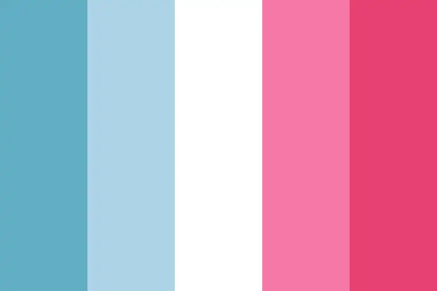
Pastel color combinations, such as light pink with soft blue or pale yellow with mint green, create a delicate and calming aesthetic for your logo design.
Metallic color combinations add an element of luxury and sophistication to your brand’s logo, like pairing gold with deep purple or silver with navy blue.
Lastly, monochromatic color combinations involve using different shades and tints of the same color to create depth and visual interest in your logo design.
Experimenting with these various complementary color combinations can help you create a visually appealing and impactful logo for your brand.
Analogous Color Combinations
To create a visually appealing logo, consider using analogous color combinations for your brand. Analogous colors are those that sit next to each other on the color wheel and share similar undertones. They create a harmonious and balanced look, making them perfect for logos.
Here are five types of analogous color combinations you can use:
- Warm and cool analogous color combinations: Pairing warm tones like red and orange with cool tones like blue and green creates an eye-catching contrast.
- Earthy and natural analogous color combinations: Combining earthy tones such as brown, green, and yellow brings a sense of nature and calmness to your logo.
- Bold and vibrant analogous color combinations: Using bright colors like purple, pink, and orange together adds energy and excitement to your brand.
- Pastel and soft analogous color combinations: Soft hues like baby blue, light pink, and lavender create a gentle and soothing vibe for your logo.
- Monochromatic analogous color combinations: Sticking to one color family but using different shades can add depth while maintaining a cohesive look.
Experiment with these analogous color combinations to find the perfect fit for your brand’s logo!
Triadic Color Combinations

The triadic color combinations on the color wheel create a vibrant and dynamic look for any logo. By using three colors that are equidistant from each other, you can achieve an eye-catching design that grabs attention. Triadic color schemes not only provide visual impact but also allow for balance in your logo design. When exploring different triadic color harmonies, consider the psychology of colors and how they evoke certain emotions in your audience. For example, combining warm colors like red, yellow, and blue can create a sense of energy and excitement. To incorporate triadic colors into your brand identity effectively, keep these tips in mind: use one dominant color and two accent colors, experiment with different shades and tones within your chosen triad, and ensure that the overall composition remains visually harmonious.
| Color 1 | Color 2 | Color 3 |
|---|---|---|
| Red | Yellow | Blue |
| Orange | Green | Purple |
| Pink | Turquoise | Brown |
| Teal | Indigo | Lime |
| Maroon | Olive | Cyan |
Remember to choose colors that align with your brand’s personality and messaging to create a cohesive visual representation of who you are.
Understanding Color Relationships
Understanding color relationships can greatly impact the overall aesthetic and effectiveness of your logo design. Color psychology plays a significant role in branding, as different colors evoke specific emotions and associations. In marketing and advertising, the use of color is crucial for attracting attention, creating brand recognition, and influencing consumer behavior.
When creating a cohesive color palette for your brand, consider the emotional connections that different color combinations can create. Certain colors like red may convey excitement and urgency, while blue evokes trust and professionalism. By utilizing color theory effectively, you can enhance brand recognition and recall among consumers.
Consistency in using your chosen colors across various platforms will help establish a strong visual identity for your brand, making it easily recognizable to your target audience.
Yellow and Red Color Combination
Using a yellow and red color combination can create a vibrant and energetic aesthetic for your brand. The symbolism of yellow and red in branding is powerful, as they both evoke feelings of excitement, passion, and optimism. The psychology behind this color combination suggests that it captures attention and stimulates appetite, making it ideal for food or entertainment industries.
Culturally, yellow represents joy and happiness in many Asian cultures, while red signifies luck and prosperity. When used in logo design, the impact of yellow and red on brand visibility is undeniable. To effectively incorporate these colors, consider using them sparingly as accents to avoid overwhelming your audience. Experiment with different shades to find the perfect balance that aligns with your brand’s message and personality.
Black and Yellow Color Combination

Now let’s dive into the world of black and yellow color combination. When it comes to branding, the psychological impact of this duo is undeniable. Black represents sophistication and power, while yellow symbolizes energy and optimism. Together, they create a sense of urgency that can grab attention instantly.
This striking combination has a rich history and symbolism. In many cultures, black symbolizes mystery and authority, while yellow represents happiness and warmth. By incorporating these meanings into your logo design trends, you can evoke certain emotions in your audience.
To use black and yellow effectively in branding, consider these tips. Keep your design simple to maintain a clean and modern aesthetic. Use black as the primary color with yellow accents for maximum impact. Experiment with different shades to find the right balance between boldness and subtlety.
Purple and Pink Color Combination
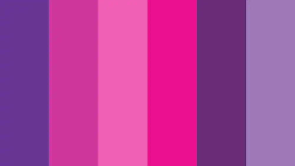
When incorporating a purple and pink color combination into your branding, don’t be afraid to play with different shades to create a visually captivating experience.
Purple is often associated with royalty, luxury, and creativity, while pink symbolizes femininity, love, and compassion. The psychology behind this color combination suggests that it can evoke feelings of warmth, youthfulness, and sophistication.
To use purple and pink in logo design, consider using gradients or complementary hues to add depth and dimension. Successful brands like Barbie and Cadbury have effectively used this color combination in their logos to convey their brand values.
When incorporating purple and pink into your brand’s visual identity, keep in mind the target audience and the message you want to communicate. Consider using these colors strategically in your logo, website design, packaging materials, or marketing collateral to create a strong brand presence that resonates with your customers.
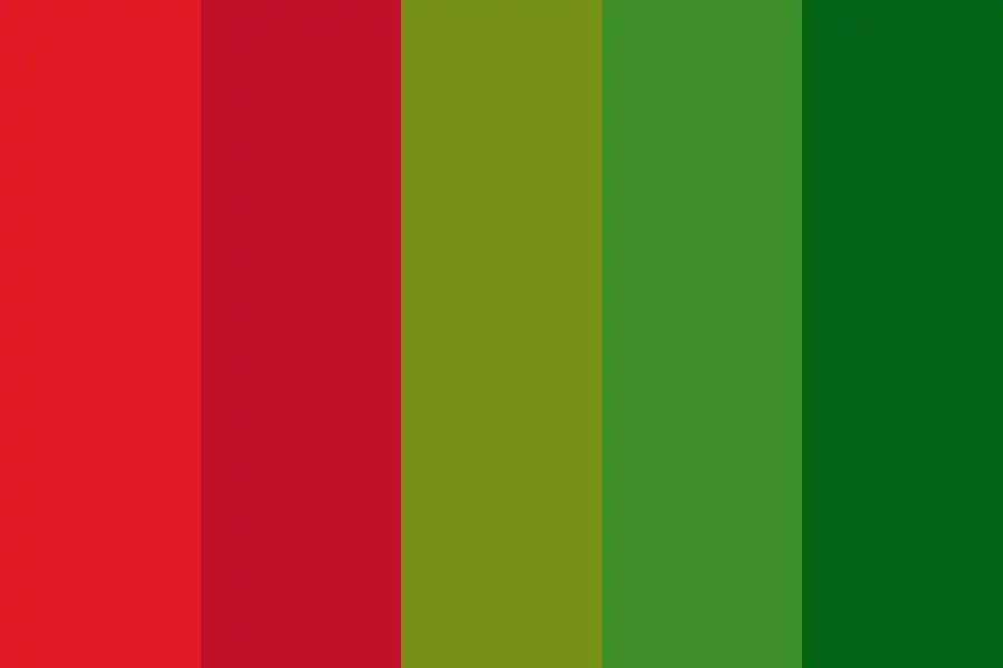
Blue and Green Color Combination

The blue and green color combination can create a sense of tranquility and harmony in your branding. These colors have deep symbolism and psychological effects, making them an ideal choice for your logo.
- Blue symbolizes trust, reliability, and calmness. It is associated with the sky, water, and depth. Historically, blue was considered a royal color.
- Green represents growth, renewal, and nature. It is linked to health, freshness, and sustainability. Culturally, green is often associated with luck or fertility.
Many popular brands utilize the blue and green color combination to convey their brand values effectively. For example:
- Starbucks uses a vibrant green paired with white to represent their commitment to sustainability.
- Twitter incorporates a light blue bird icon that conveys openness and communication.
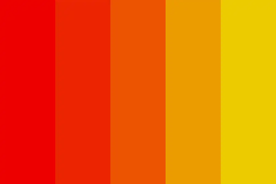
Orange and Purple Color Combination
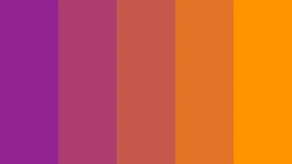
The orange and purple color combination can create a bold and energetic look for your branding strategy. These two contrasting colors evoke strong emotions and have psychological effects on viewers. Orange is associated with enthusiasm, creativity, and warmth, while purple represents luxury, wisdom, and spirituality. By incorporating orange and purple in your branding, you can convey a sense of vibrancy, uniqueness, and sophistication.
In logo design, orange and purple can be used to create eye-catching visuals that capture attention. Whether you use these colors as the main elements or as accents in your logo design, they will help you stand out from the competition. The key to creating a visually appealing orange and purple color scheme is finding the right balance between the two colors. You can use the table below as a guide to explore different shades of orange and purple that work well together:
| Orange Shades | Purple Shades |
|---|---|
| Tangerine | Lavender |
| Burnt Orange | Plum |
| Coral | Violet |
Experiment with different combinations until you find one that best represents your brand’s personality and values while captivating your target audience.
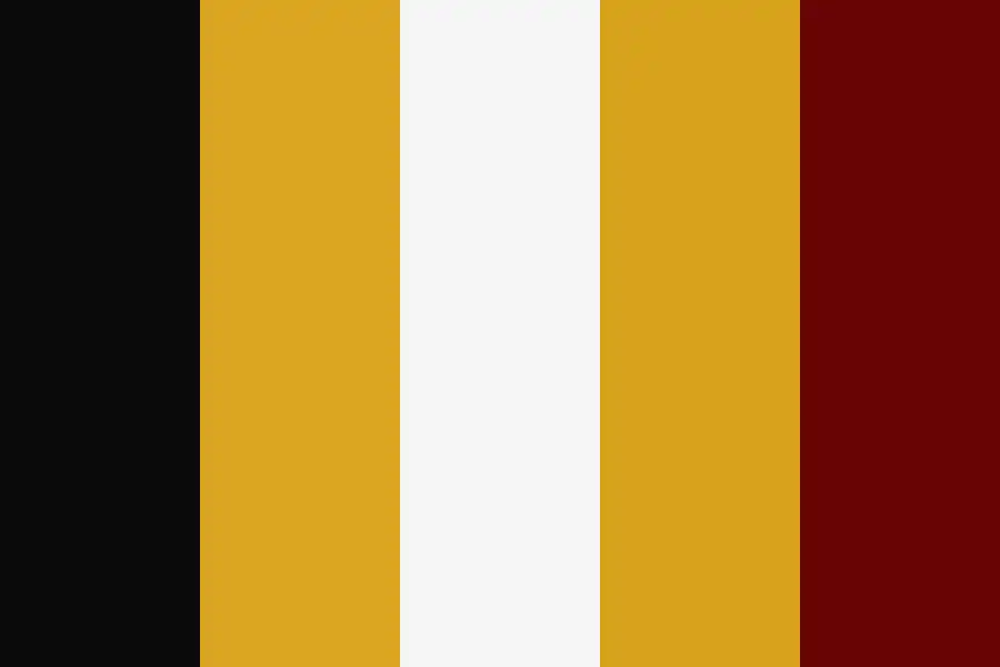
Red, Navy, and Yellow Color Combination
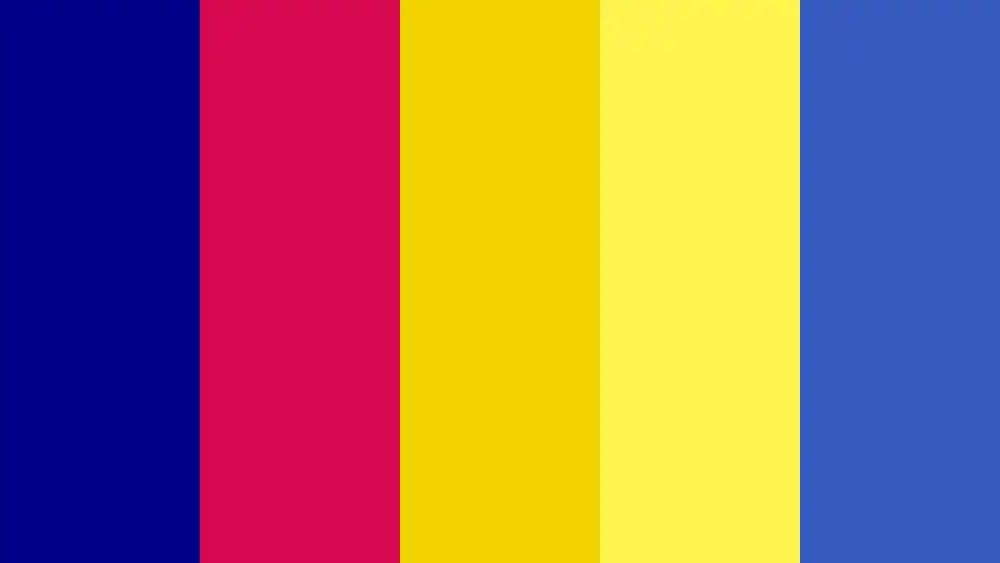
Using a combination of red, navy, and yellow colors can create a bold and vibrant visual impact for your brand. Red and navy logo designs evoke feelings of strength, power, and professionalism. The psychology behind red suggests urgency, excitement, and passion – perfect for grabbing attention.
Navy brings a sense of trustworthiness and reliability to your brand. Creating contrast with these two colors will make your logo stand out even more. Incorporating yellow accents in branding adds a touch of energy, optimism, and creativity. Yellow is often associated with happiness and warmth.
When used strategically in logo designs, it can enhance the overall impact while still maintaining balance. So don’t be afraid to experiment with this color combination to elevate your brand’s presence!
Purple and Yellow Color Combination
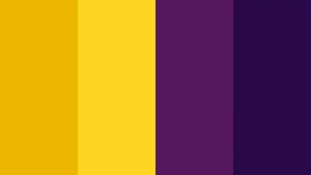
Now that we’ve explored the powerful red, navy, and yellow color combination, let’s dive into another captivating pairing: purple and yellow. This bold duo is sure to make your brand stand out with its vibrant and striking appearance.
Purple exudes luxury, creativity, and royalty. It is often associated with elegance and sophistication. On the other hand, yellow represents happiness, optimism, and energy. This combination creates a unique contrast that catches the eye and leaves a lasting impression on consumers.
In terms of psychology, purple can evoke feelings of creativity and imagination while yellow stimulates joy and positivity. Incorporating these colors into your branding can enhance your marketing efforts by communicating a sense of innovation and excitement.
So if you’re looking to make a memorable statement with your brand identity, consider using the dynamic purple and yellow color combination for an impactful visual presence.
Pink and Blue Color Combination
If you’re aiming for a soft and soothing color combination, consider incorporating the pink and blue duo into your branding. Pink and blue have their own unique color symbolism that can add depth to your brand’s message.
Pink is often associated with femininity, love, and tenderness, while blue represents calmness, trust, and reliability. This combination can have a psychological impact on your audience by creating feelings of comfort and harmony. Many successful brands have utilized this color pairing in their branding examples.
Furthermore, pink and blue are commonly used in gender marketing to signify traditional associations with girls and boys respectively. In interior design, pink and blue can be incorporated to create a serene atmosphere in spaces like bedrooms or nurseries.
Overall, the pink and blue color combination offers versatility in its applications across different industries.
Black and Red Color Combination
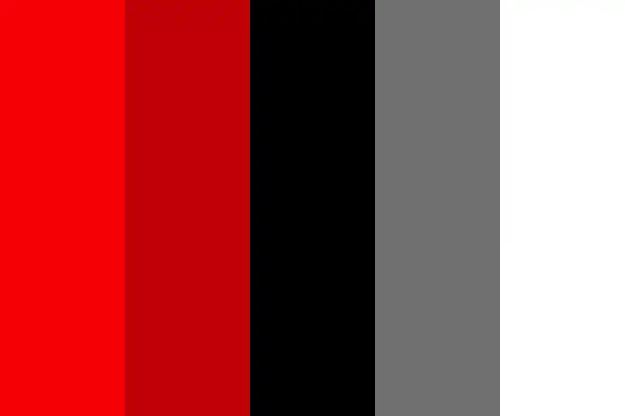
The black and red color combination creates a bold and striking visual impact that can evoke feelings of power and intensity. When it comes to color psychology, black represents elegance, sophistication, and authority, while red symbolizes passion, energy, and excitement.
This powerful combination has been successfully utilized in various industries to create memorable branding experiences. For example, sports teams often incorporate black and red into their logos to convey strength and determination. In the automotive industry, luxury car brands use this color scheme to emphasize their high-performance capabilities.
If you’re considering using black and red in your logo design, here are some tips: make sure the contrast is balanced for readability; consider the emotional associations of each color; experiment with different shades for a unique effect.
Harness the power of black and red to elevate your brand’s visual presence.
Charcoal Grey and Taupe Color Combination
Combining charcoal grey and taupe creates a sophisticated and timeless color palette that exudes elegance. These neutral tones have a significant impact on your brand’s image and can greatly enhance its visual appeal.
Color psychology plays a crucial role in branding, as different colors evoke specific emotions and perceptions in people’s minds. Charcoal grey, being associated with stability and professionalism, instills confidence and reliability in your audience. Taupe, on the other hand, represents warmth and approachability, making your brand more relatable to customers.
The harmony between these colors creates a balanced and cohesive look for your logo design. By using the charcoal grey taupe combination effectively, you can elevate your brand’s identity to new heights of sophistication while leaving a lasting impression on potential customers.
Beige and Red Color Combination
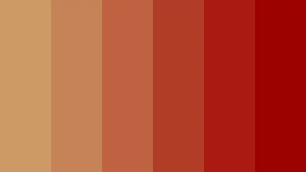
To create a visually striking design, consider incorporating a beige with red gradient combination. This color pairing is versatile and can be used in various design styles to evoke different emotions and messages. Here are five reasons why you should consider using beige and red in your logo or brand design:
- Beige and red in minimalist design: The simplicity of beige combined with the boldness of red creates a clean and modern look that is perfect for minimalist designs.
- The psychology behind beige and red pairing: Red is associated with passion, energy, and excitement, while beige represents calmness and neutrality. Combining these two colors can create a balance between intensity and tranquility.
- Beige and red for a vintage inspired brand: The warmth of beige paired with the richness of red can give your brand an elegant vintage feel that resonates with nostalgia.
- Creating a warm and inviting brand with beige and red: These colors evoke feelings of comfort, homeliness, and friendliness. Using them together can help create a welcoming aura around your brand.
- Beige and red for a modern and chic logo design: When used in sleek, contemporary designs, the combination of beige with gradients of vibrant red can result in an eye-catching logo that exudes sophistication.
Incorporating this color combination into your branding strategy can help elevate your brand’s visual appeal while conveying specific emotions or characteristics.
Light Purple, Mint, and Butter Color Combination

When incorporating the light purple, mint, and butter combination into your design, you can create a fresh and vibrant color palette that exudes creativity.
The lavender and mint combination brings together soothing pastel tones with a touch of freshness. This pairing works well for brands that want to convey a sense of calmness while still being innovative.
On the other hand, the pastel purple and butter combination adds warmth and playfulness to your logo design. It evokes a sense of nostalgia while maintaining a modern aesthetic.
If you’re looking for something more delicate, the lilac and mint combination offers a subtle yet elegant look. For a softer approach, consider using the pale purple and butter combination – it gives off an airy and dreamy vibe.
Lastly, the violet and mint combination creates an energetic contrast that is perfect for brands aiming for a bold statement. Whether you choose one or mix them up, these combinations will surely make your logo stand out with their unique blend of colors.
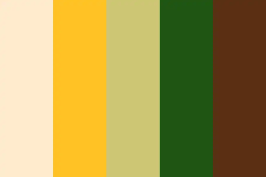
Grey and Green Color Combination

Now that you’ve explored the captivating combination of light purple, mint, and butter, let’s dive into another visually pleasing logo color combination: the grey green gradient.
This fusion of cool grey tones and earthy green hues creates a serene gradient effect that instantly elevates your brand. Here are four reasons why this stylish grey green fusion should be on your radar:
- Cool Grey Tones: The understated elegance of cool greys adds a touch of sophistication to your logo.
- Earthy Green Hues: By incorporating earthy greens, you infuse your brand with a sense of nature and tranquility.
- Serene Gradient Effects: The gradual transition from grey to green creates a calming visual impact that is hard to ignore.
- Harmonious Natural Palette: This combination effortlessly blends together, resulting in a harmonious natural palette that resonates with your audience.
Consider experimenting with the grey green gradient for a logo that exudes both style and serenity.
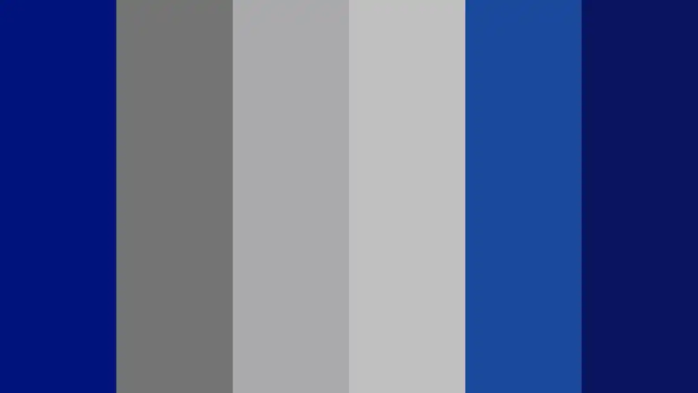
Royal Blue and Pale Yellow Color Combination

The royal blue pale yellow combination creates a bold and vibrant contrast that catches the eye. When it comes to branding, incorporating navy blue and soft yellow color combination can make your logo design stand out. This color scheme is not only visually appealing but also carries a deeper meaning. The psychology behind royal blue and pale yellow in branding is intriguing. Royal blue represents trust, reliability, and professionalism, while pale yellow symbolizes optimism, creativity, and happiness. By using these colors in your brand identity, you can evoke emotions of trustworthiness and positivity in your audience. To effectively use royal blue and pale yellow in your logo design, consider the following tips: balance the colors to create harmony, experiment with different shades to find the right combination for your brand’s personality, keep the design simple yet impactful. Explore the versatility of this color combination to create a memorable logo that truly represents your brand.
Sophisticated Color Combinations

Incorporating rich and refined color schemes can give your brand an elegant and polished look. To achieve a sleek and modern aesthetic, consider using sophisticated color combinations. Opt for hues that are elegant and refined, such as deep navy blue paired with accents of gold or silver.
These timeless and sophisticated colors will elevate the overall appearance of your brand, making it appear chic and minimalistic. Another option to consider is a bold and luxurious combination like black and rose gold, which exudes confidence and sophistication.
Playful Color Combinations
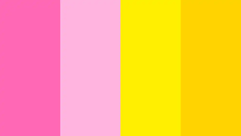
For a fun and lively aesthetic, consider playful color combinations like vibrant pink and sunny yellow. These colors evoke feelings of happiness and energy, making them perfect for brands that want to create a cheerful and upbeat image. According to color psychology, pink is often associated with love, compassion, and femininity, while yellow represents joy, optimism, and creativity. By combining these two hues, you can create a visually striking logo that instantly catches the eye.
Creating contrast is another important aspect of color theory when it comes to designing logos. Playful color combinations allow you to experiment with contrasting shades that make your brand stand out. For example:
| Pink | Yellow |
|---|---|
| Coral | Lemon |
| Fuchsia | Sunshine |
| Bubblegum | Mustard |
| Raspberry | Buttercup |
These combinations not only add visual interest but also reflect your brand’s personality through color symbolism. So go ahead and embrace the playfulness of vibrant pink and sunny yellow in your logo design!
Classy Color Combinations
Now that you’ve seen the power of bold color combinations, let’s explore a more refined approach to logo design: classy color combinations.
These elegant color palettes are perfect for brands looking to convey sophistication and timelessness. Consider incorporating these luxurious color pairings into your logo:
- Black and gold – This timeless combination exudes luxury and elegance, making it ideal for high-end brands.
- Navy blue and silver – The contrast between these shades creates a sleek and polished look, perfect for professional services.
- Cream and rose gold – This understated color blend evokes a sense of femininity and refinement, making it suitable for beauty or fashion brands.
Professional Color Combinations
The contrast between these shades creates a sleek and polished look, perfect for professional services.
When it comes to choosing the right color combinations for your brand, elegant and minimalist color palettes are always a safe bet. Timeless color combinations like black and white or navy blue and silver convey professionalism and sophistication. These classic choices never go out of style and can give your brand a timeless appeal.
On the other hand, modern color choices can also make a bold statement. Consider using bold and impactful colors like deep purple paired with gold or vibrant red combined with charcoal gray. These unexpected pairings can add a contemporary touch to your brand while still maintaining a professional image.
Choose wisely, as the right color combination can elevate your brand to new heights in the professional world.
Frequently Asked Questions
How Can Color Combinations Affect Brand Perception and Recognition?
Color combinations have a significant impact on how consumers perceive and recognize your brand. Cultural influences play a role in color perception, while color psychology affects brand recognition. Choose harmonious logo colors and use contrasting ones to make your brand stand out.
Are There Any Specific Color Combinations That Work Best for Certain Industries or Sectors?
For certain industries or sectors, there are specific color combinations that work best. Consider the impact of color combinations on consumer preferences and the role of color psychology in branding. Additionally, think about choosing color combinations for technology, healthcare, wellness brands, and cultural influences on logo colors.
Are There Any Psychological or Emotional Effects Associated With Different Color Combinations?
Different color combinations can evoke various psychological and emotional effects. Cultural influences, color contrast, psychology in decision making, color theory in design, and brand personality all play a role in how colors impact your brand.
What Are Some Common Mistakes to Avoid When Choosing Logo Color Combinations for a Brand?
When choosing logo colors, avoid these common mistakes: 1) Not reflecting brand values; 2) Ignoring color psychology and brand perception; 3) Falling for misconceptions about color combinations; 4) Neglecting the impact of contrast and harmony on visibility and memorability. Consider unconventional combinations for uniqueness.