In the fast-paced world of mobile apps, a stellar user interface design is indispensable for standing out from the competition. With global consumer spending in mobile apps skyrocketing to a record $111 billion in 2022, users expect seamless, visually-appealing experiences.
As a mobile app creator, you know the stakes are high. Buggy interfaces and confusing layouts lead to plummeting usage and negative reviews. On the other hand, intuitive navigation and aesthetically pleasing visuals have been proven to boost engagement and conversions.
So how do you craft the ultimate UI that delights users and takes your app revenues to the next level? This comprehensive guide has you covered. You’ll discover the top mobile UI trends that are reshaping app experiences in 2023. From dark mode to 3D graphics, neumorphism and beyond, you’ll get actionable tips to implement these cutting-edge yet accessible designs.
With 10 striking examples from innovative apps across industries, you’ll find endless inspiration to elevate your mobile UI. Expert perspectives provide insider advice to overcome challenges. And you’ll learn research-backed principles to continually enhance your app’s visual appeal and usability.
By the end, you’ll have a robust UI design playbook to develop mobile interfaces that engage users and support your app’s success. Are you ready to create the next big thing in mobile UX? Let’s get started!
Key Mobile UI Design Trends in 2023
When it comes to mobile UI design, trends may come and go but a few key ones have real staying power. As a mobile designer in 2023, being aware of these trends allows you to create cutting-edge experiences that delight users.
- Dark mode interfaces continue their meteoric rise, with over 80% of users enabling the feature for comfort and aesthetics. Implementing a seamless dark theme reduces eye strain while allowing brighter colors to stand out.
- 3D graphics and animations are also gaining traction by adding depth and visual interest. From parallax scrolling to 3D product models, subtle yet immersive 3D elements can transport users to another world.
- Neumorphism is back in a big way in 2023, with its signature soft, rounded shapes and muted colors. When combined with floating effects and gentle shadows, neumorphic designs feel fresh and futuristic.
- Vibrant, even neon bright colors are being embraced by youthful, energetic brands. Vivid palettes paired with bold graphics catch the eye while conveying brand identities.
- Gesture controls and voice assistants are on the rise as users seek touchless, efficient interfaces. Swipe navigation, voice commands and predictive suggestions can boost convenience.
- Lastly, minimalism continues its influence, with stripped-down layouts and ample negative space guiding users’ eyes to the most important elements. Simple can be powerful.
By combining these top trends in innovative ways, you can craft interfaces that feel both cutting-edge and intuitive for your users. The trends offer springboards for creativity rather than rigid rules, so don’t be afraid to experiment!
UI Design Principles and Best Practices
While staying on top of the latest trends is crucial, effective mobile UI design also relies on timeless best practices and principles. Keep these guidelines in mind for interfaces that engage users across devices:
- Focus on user experience above all else. Obsess over your users at every stage, from planning to testing. Design the UI to adapt to their needs, not the other way around.
- Follow platform guidelines and leverage native UI elements. Users expect a consistent experience on iOS versus Android, for example.
- Ensure visual hierarchy through strategic use of fonts, colors and negative space. Guide users to take the desired actions by making key elements prominent.
- Use spacing and white space liberally. Clutter overwhelms mobile users. Prioritize only the most critical content.
- Choose typography and color schemes intentionally. Pair easy-to-read fonts with high contrast colors that align with your brand.
- Maintain consistency across screens and components. Familiarity builds trust while unpredictable designs frustrate users.
While balancing user needs with business goals can be tricky, keeping these best practices in mind will pay dividends in the form of satisfied users who keep coming back.
10 Examples of Innovative Mobile UI Designs from 2023
Watering Tracker App
![]()
This app uses fresh background photos of plants to remind users to water their plants and track watering stats. Its color scheme and buttons align with the green plant theme.
Night Owl Coffee
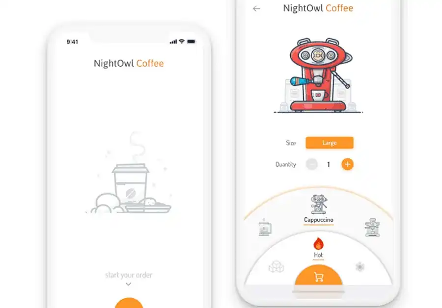
This coffee ordering app features a unique geometric illustration style for its machine graphics. It uses simple gray and yellow elements for a clean, minimalist look.
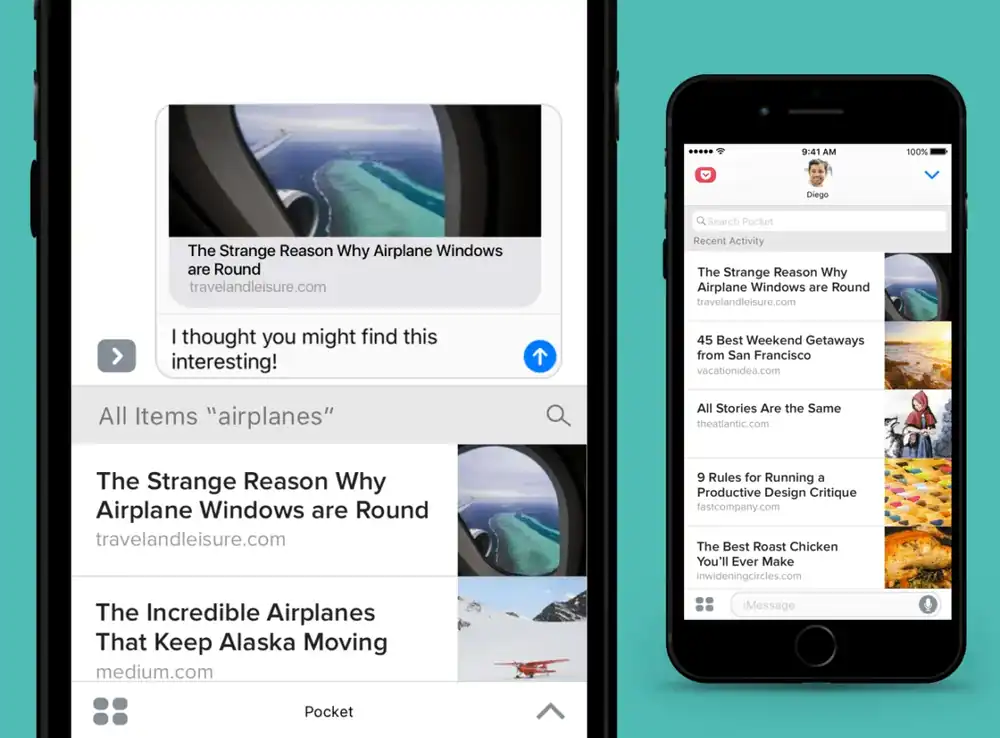
This reading app won recognition for its user experience design. Its simple interface was refined based on new user feedback to enable easy saving and accessing of articles/videos.
Instacart
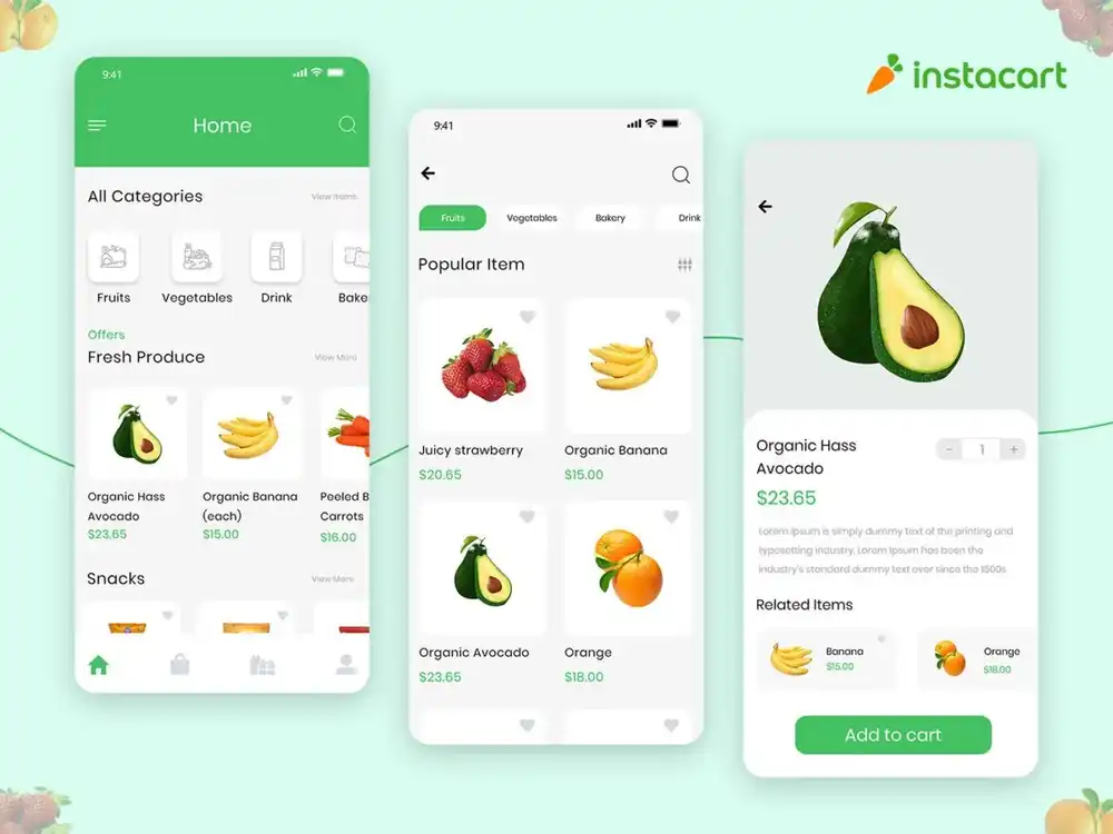
This grocery delivery app provides contextual tapping to reveal item details instead of separate pages. Product images transition smoothly to maintain context from previous views.
Smart Pharmacy
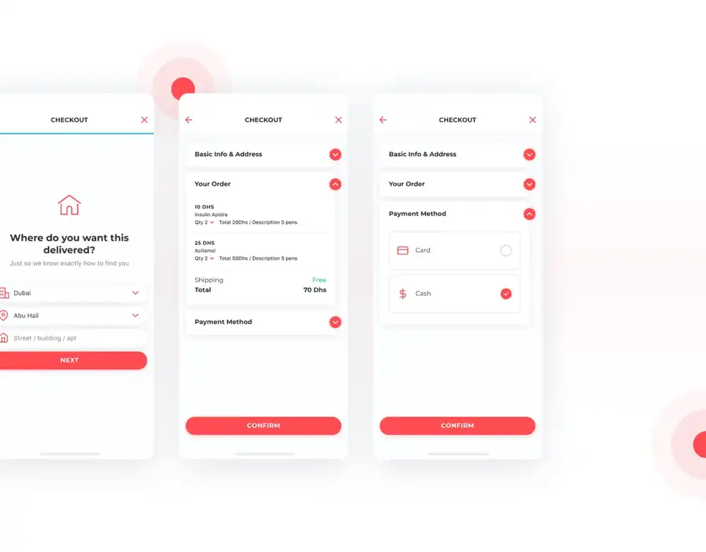
This medicine delivery app enables easy ordering from local pharmacies. Its checkout process is streamlined by storing user information to simplify reordering.
Uber
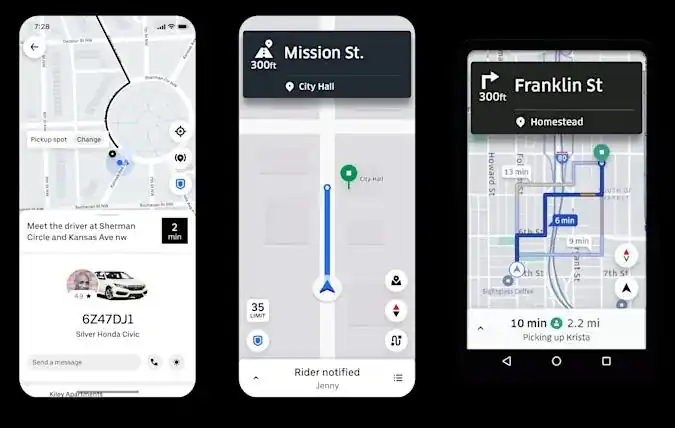
This ridesharing app became popular for its simple 3-step hailing process. Its interface displays your location on a map with available nearby taxis for a seamless experience.
Starbucks
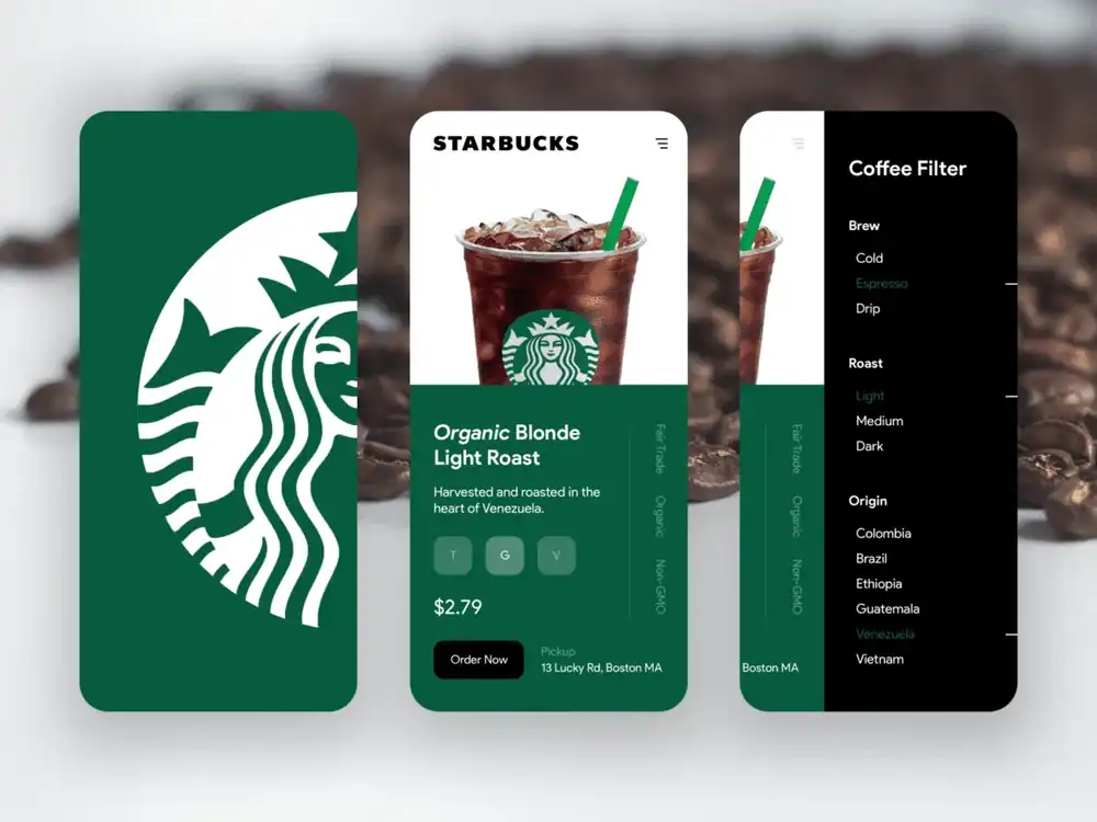
This coffeehouse app uses brand-matching colors and enables remote ordering and customization. It stores order history to enable rewards collection and streamlined reordering.
Calm
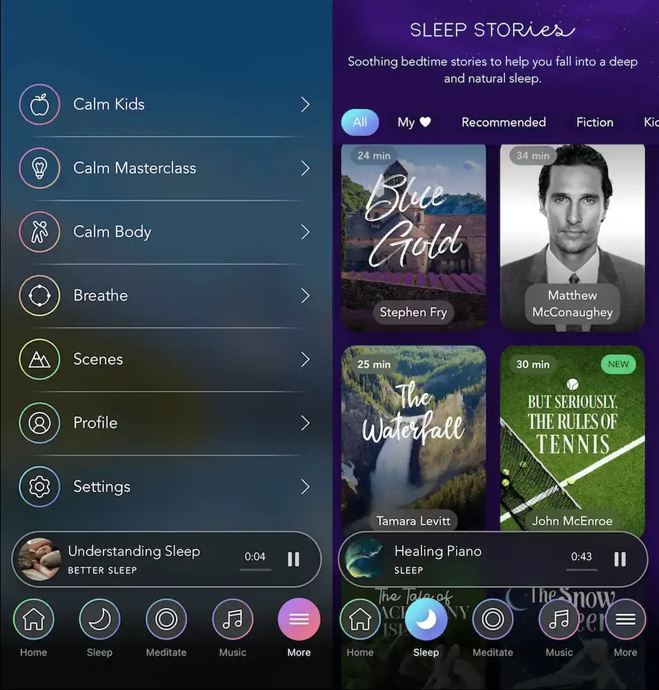
This meditation app welcomes users with serene nature imagery. Its simple interface prioritizes these calming backgrounds over prominent buttons.
Duolingo
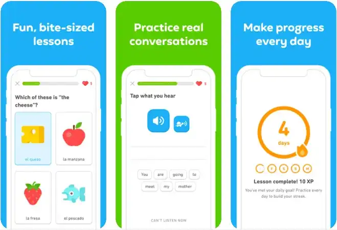
This language learning app uses colorful icons to display student progress. Its dashboard provides an easy overview of lesson performance.
Runtastic
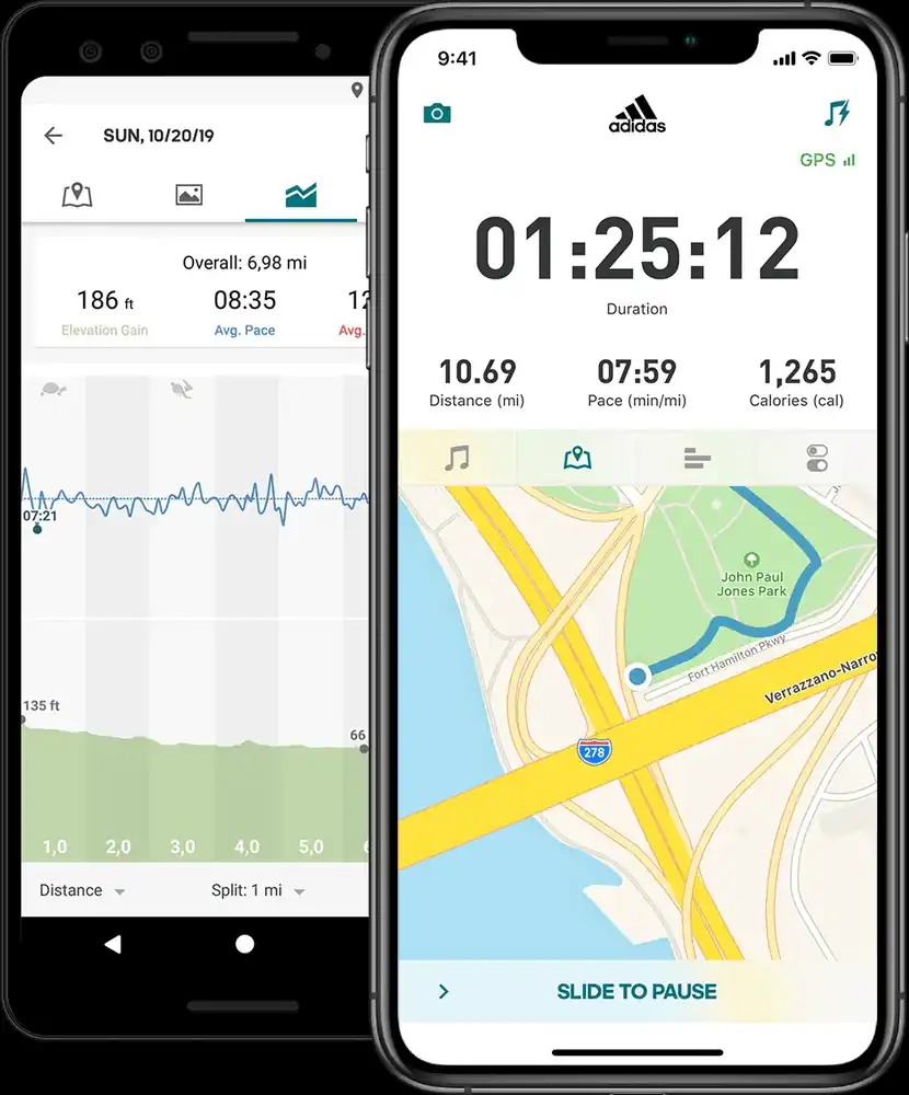
This fitness app offers diverse workout plans with exercise previews. Its videos include voice guidance and instructions for each workout.
Key Takeaways for Mobile UI Design in 2023
With mobile app usage continuing to surge, 2023 is the perfect time to level up your UI design skills. Here are some key tips to create stunning, effective interfaces:
- Focus on core user needs and friction points: Conduct research, surveys and testing to deeply understand your users. Design to simplify and solve their pain points.
- Implement bold new trends judiciously: While dark mode and neumorphism are hot, tread carefully. Evaluate if they align with your brand and users’ expectations.
- Simplify, simplify, simplify: Remove all unnecessary elements and clutter. Every pixel should have a purpose in guiding users. Master the art of minimalism.
- Test your UI extensively: Conduct moderated tests with a diverse set of real users early and often. Iteratively improve based on feedback.
- Make visual hierarchy and information flow intuitive: Use layout, color and fonts to direct attention to key actions. Group related elements.
- Ensure accessibility for all: Follow WCAG guidelines and test with users of different abilities. Good design is inclusive.
- Craft delightful microinteractions: Surprise and delight users with subtle details like hover effects, toggles and loading animations.
- Adapt UI to mobile gestures: Swipes, taps and pinches should feel natural. Test on real devices early.
As technology evolves in 2023, keeping these tips in mind will help you meet users’ needs. Focus on simplicity, functionality and delight to create the next-generation of mobile experiences.


