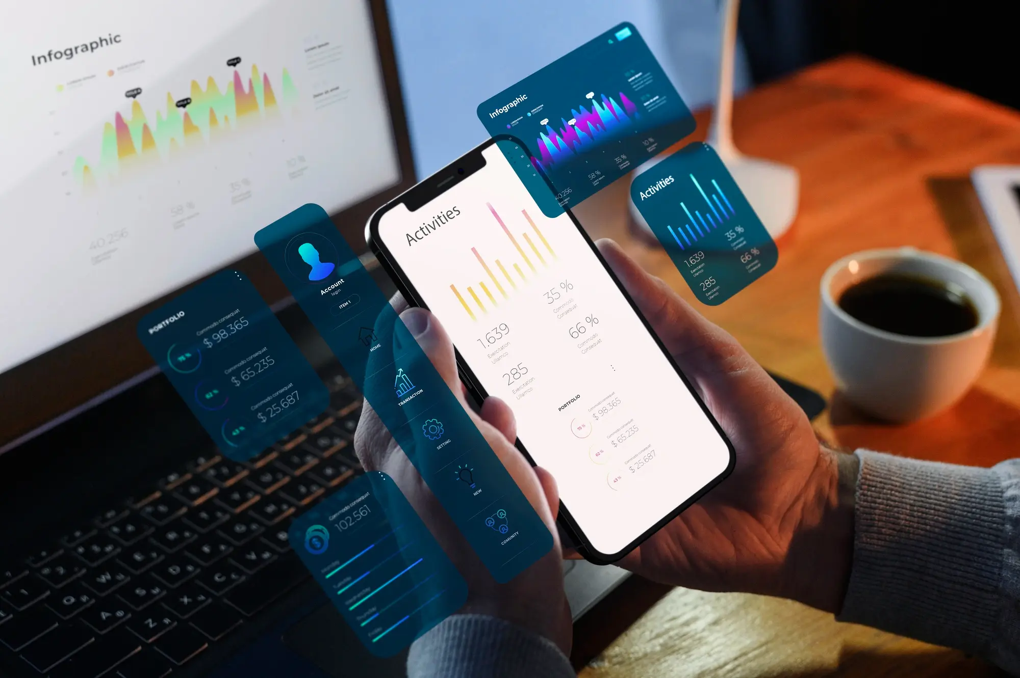
In today’s digital landscape, a web application’s user interface design is one of the most critical elements for success. With users’ expectations higher than ever, apps must deliver intuitive, seamless experiences that align with their needs. Even minor UI issues can deter engagement and conversions.
Crafting an optimized UI design requires strategic planning and adherence to best practices. This guide aims to provide comprehensive guidelines and expert tips for designing clean, modern, user-centered interfaces for web applications.
We will cover fundamental UI design principles including simplicity, clarity, consistency, responsiveness, and more. You’ll learn the core elements that make up effective web app UIs as well as patterns for key pages and workflows. We’ll also explore important processes like gathering user feedback, A/B testing variations, and incrementally improving the UI over time.
Along the way, we’ll look at case studies and examples of real-world web app UIs that get it right. You’ll finish this article equipped with actionable takeaways you can apply immediately to improve your own web application’s user experience. The goal is to arm you with the knowledge to craft optimal UIs that drive results.
UI Design Principles And Best Practices
When designing a web application UI, certain principles and practices have proven most effective for creating positive user experiences. Let’s examine some of the core UI design tenets.
Simplicity and Clarity
Eliminate any unnecessary elements and distractions. Streamline workflows and minimize choices when possible. Use clear, succinct language. These techniques all enhance comprehension and usability.
Consistency and Cohesiveness
Maintain consistent UI patterns, terminology, styles, and behaviors across all app pages and components. This strengthens intuitiveness through unified visual cues.
Intuitive Navigation and Hierarchy
Organize menus, links, and page content in order of importance. More critical items should be most prominent. Group related items logically. This facilitates easy exploration and information discovery.
Responsiveness Across Devices
With varied screen sizes, your UI must intelligently adapt. Resize elements proportionally, adjust layouts for vertical/horizontal orientations, and simplify navigation for smaller views.
Performance Focus
Optimize images, remove unnecessary code, and compress files to maximize page load speeds. Faster performance directly impacts user sentiment.
Visual Appeal
Thoughtfully incorporate white space, color, typography, and imagery to create attractive aesthetics that align to your brand.
Clear Calls-to-Action
Prominently display clickable actions like buttons and links. Use visual contrast, strategic placement, and action-oriented language to indicate how users should proceed.
Elements of Effective Web App UI
Now let’s examine the core components that comprise a compelling web application UI.
Clean Layout – Avoid Clutter
Prioritize simplicity. Only display essential info and remove any distracting/redundant elements. Use plenty of negative space.
Strong Visual Hierarchy
Establish a clear ranking of visual prominence, from headers to body text. Draw attention to key actions. This guides the user’s eye.
Readable Typography
Limit font varieties. Choose easy-to-read typefaces and sizes. Use ample line-height. This enhances scannability.
Quality Images/Icons
Assets should clearly communicate meaning. Ensure proper resolution and compression. Icons in particular add intuitive visual cues.
Strategic White Space Use
Whitespace reduces cognitive load and creates visual breathing room. Leverage it to direct focus and group related items.
Visual Interaction Indicators
Use subtle animations, color changes, and microinteractions to provide feedback and guide users.
Balanced Composition
Distribute visual weight evenly across the canvas. Align items appropriately. This creates organized, aesthetically pleasing layouts.
Optimizing for Specific Pages/Workflows
While UI design principles broadly apply, we must also tailor interfaces to support users’ goals on specific pages.
Homepage UI
Introduce core features/benefits. Use a hero banner with strong CTA. Emphasize easy signup/login. Guide exploration.
Product Pages
Showcase product visually. Communicate details clearly. Facilitate purchases with prominent CTAs.
Shopping Cart/Checkout
Highlight selected items. Display costs transparently. Streamline form inputs. Add trust indicators like security badges.
User Profiles/Accounts
Personalize with user data and history. Provide easy access points for key account functions.
Search and Results
Include natural language and advanced search options. List results clearly. Let users refine.
Error Pages
Politely explain the problem. Provide an actionable next step to resolve the error.
FAQ and Support
Structure topics/questions logically. Make self-service experience friendly. Link to direct contact options.
Web App UI Patterns and Components
In addition to broader principles, web apps utilize common interface patterns and components that boost usability.
Navigation Menus
Menus anchoring the header or sidebar provide app-wide access and hierarchy. Use clear labels and structure.
Action-Oriented Buttons
Buttons trigger key actions. Use contrasting colors, descriptive verbs (“Download”, “Buy Now”), and strategic placement.
Input Forms/Fields
Minimize required fields. Validate inputs and provide helpful error messages. Chunk longer forms into logical sections.
Accordions and Tabs
Hide/reveal additional content areas. Useful for condensing extensive sections. Clearly label tabs.
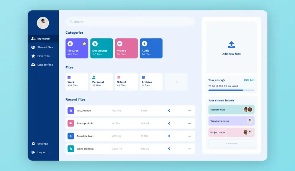
Cards and Tiles
Contain and organize repeatable content snippets. Allow glancing at a high level. Lead users deeper with CTAs.
Notifications and Popups
Communicate brief timely messages. Reserve for important alerts only. Allow easy dismissal.
Loaders and Progress Bars
Indicate activity during delays. Convey timeline expectations. Accompany with messaging.
Testing and Iterating On UI
The work does not end after initial UI design. To achieve ongoing optimization, systematically test and refine the interface.
Gather User Feedback
Leverage surveys, interviews, and observation studies to understand pain points and gather improvement ideas.
A/B Test Variations
Set up controlled tests comparing tweaked UI elements. Analyze which variants better engage users.
Analyze Usage Data and Metrics
Look at click maps, heat maps, session duration, funnel drops. Identify usability bottlenecks.
Prioritize Incremental Improvements
Tackle high-impact, quick-win issues first. Focus on optimizing key tasks and workflows.
The goal is to continually evaluate the UI, implement targeted enhancements, and monitor the impact on engagement and conversions over time. Even subtle tweaks can add up to meaningful improvement.
Case Study Examples of Excellent Web App UI
Jambb
Jambb is a social platform where creators reward fans for engagement. The team at Finna Wang conducted initial research and created an MVP mobile app. They were tasked with redesigning a responsive web platform focused on the fan experience.
Process
- Observed usability test of existing MVP
- Interviewed stakeholders
- Created user flows
- Sketched wireframes and sitemaps
- Designed style guide and components
- Iterated on key pages like Discover
- Conducted moderated usability tests
Insights
- Simplify navigation and content discovery
- Highlight imagery
- Clarify meaning of “Jambb score”
Deliverables
- High-fidelity interactive prototype
- Revised problem statement
- Recommendations like onboarding tutorial
The case study walks through the team’s design process and how research and testing informed their solutions for Jambb’s web platform UI and UX. Key details like stakeholder goals, iterative design, and usability testing insights are covered.
Memento
Memento Media allows people to record oral histories to preserve family stories. The team at Masha Keyhani conducted competitor analysis, user interviews, and usability testing to identify issues with the initial prototype.
Process
- Competitor analysis of similar products
- Created interview guide and tested 5 users
- Synthesized findings into affinity map and empathy map
- Identified issues like unclear recording functionality
- Iterated on user flow and screens focused on the recording process
- Developed new information architecture, wireframes, and hi-fidelity interactive prototype
Insights
- Simplify and reduce onboarding text
- Enhance visual design for emotional appeal
- Clarify recording controls and session completion
- Allow saving, editing, re-recording of stories
Deliverables
- Revised user flows
- New wireframes, style guide, and clickable prototype
- Recommendations for additional features to build out
The case study demonstrates how research into competitors and hands-on user testing revealed UX flaws, guiding the redesign of Memento’s product. The new prototype better supports the core goal of capturing oral histories.
Perfect Recipes
The team at Tubik designed a mobile app for cooking recipes and grocery shopping. Key features include a recipe database, pantry management, and shopping lists.
Process
- Conducted UX analysis on diverse functionality
- Prioritized key user scenarios
- Designed simple, accessible UI for broad audience
- Incorporated personalization features like diet goals, disliked ingredients, recipe filters
- Created mouthwatering visuals with custom photos/videos
- Added related e-commerce functionality
Insights
- Personalized recipe recommendations increase relevance
- Photos and videos make recipes attractive and clear
- Syncing with grocery services simplifies shopping
- Indicators of missing ingredients helpful
- Clean layout with good navigation enhances usability
Deliverables
- User flows
- Custom illustrations, recipe cards, recipe screens
- Interactive clickable prototype
The case study shows how UX considerations like personalization and visual appeal were combined with utility like shopping lists for a recipe app that engages users.
Key Takeaways
- Follow foundational UI design principles like clarity, consistency, visual hierarchy, and performance optimization. These form the basis of a positive user experience.
- Carefully craft key elements like typography, color, imagery, microinteractions, and composition to create aesthetically pleasing and purposeful designs.
- Tailor UI to support user goals on critical pages and workflows. Meet expectations for common flows like signup and checkout.
- Leverage common patterns like navigation menus, cards, and notifications that boost usability given user familiarity.
- Continuously test with users, gather feedback, A/B test, and incrementally improve the interface over time. Refinement is an ongoing process.