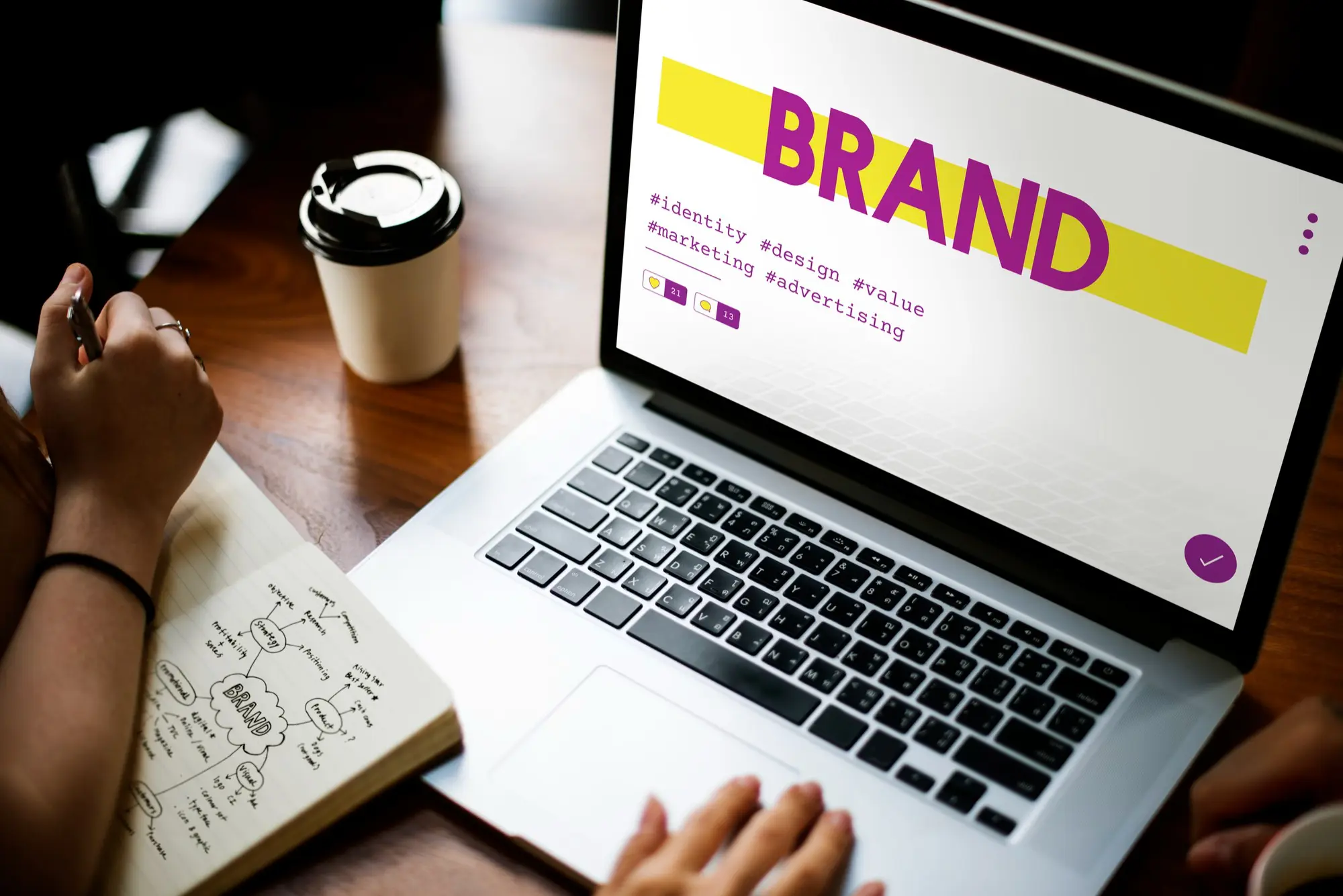
A website layout isn’t just about aesthetics; it’s the blueprint of your online presence. Think of it as the architecture of a building. Just as architects design spaces to optimize flow and functionality, a website layout is crafted to make your digital space user-friendly. It’s the strategic arrangement of elements on your web page, ensuring that visitors find what they’re looking for effortlessly.
Why Does Layout Matter?
You might wonder, with all the flashy animations and graphics available today, does layout still hold that much weight? Absolutely. In the digital realm, where attention spans are fleeting, the layout can make or break a user’s experience. A well-structured site ensures that information is easily accessible, reducing the chances of visitors bouncing off due to frustration.
The Role of Layout in Structuring Information
Imagine visiting a library where books are scattered everywhere, with no clear sections or order. Overwhelming, right? Similarly, a website without a clear layout is a maze for users. A strategic layout structures content in a way that guides visitors, whether they’re potential clients looking for services or readers searching for information. It provides clear paths for navigation, ensuring that the most crucial elements are front and center.
The Symbiotic Relationship Between Layout And User Experience
User experience (UX) is a buzzword you’ve probably heard countless times. But at its core, UX is about understanding and catering to the user’s needs. And guess what plays a pivotal role in this? Yes, the layout. A seamless layout ensures that users can navigate your site intuitively, enhancing their overall experience. When users can find what they’re looking for without hassle, they’re more likely to engage with your content, be it making a purchase, signing up for a newsletter, or simply spending more time on your site.
Evolving Web Design: Staying Ahead of The Curve
The digital landscape is ever-evolving. What was trendy a year ago might be obsolete today. As business professionals, it’s crucial to stay updated with the latest in web design. But amidst these changes, the importance of a solid layout remains unwavering. While design trends come and go, the need for an effective layout that prioritizes user experience is a constant. It’s not just about jumping on the latest design bandwagon; it’s about understanding the timeless principles of web design and ensuring your website is always optimized for your users.
The Psychology Behind Layouts
Ever wondered why certain elements on a webpage grab your attention more than others? That’s visual weight at play. Visual weight determines the prominence of an element. Elements with higher visual weight stand out, guiding users to focus on them. This can be achieved through size, color, texture, or even positioning. For instance, a bold, colorful call-to-action button naturally draws more attention than a subdued background image.
The Art of Negative Space
Negative space, often referred to as white space, is the unoccupied area around and between the elements of a design. But don’t let the term “negative” fool you. This space is anything but redundant. It plays a pivotal role in enhancing readability and highlighting crucial elements. A cluttered webpage can overwhelm users, but with the strategic use of negative space, you can guide their attention precisely where you want it.
Decoding The Gestalt Law of Closure
Diving a bit into psychology, the Gestalt law of closure is a fascinating principle that web designers often employ. It suggests that humans have an innate tendency to see closed shapes even if they aren’t complete. For instance, if a logo is partially obscured but suggests a familiar shape, our brains fill in the gaps. By leveraging this principle, designers can create intriguing, memorable visuals that resonate with users, even if they’re not entirely complete.
Scanning Patterns: The Z and F Routes
Now, let’s talk about how users typically scan web pages. Two common patterns have been identified: the Z-letter and F-letter patterns.
In the Z-letter pattern, the user’s gaze starts at the top left, moves horizontally to the top right, then diagonally down to the bottom left, and finally, horizontally again to the bottom right. This pattern is often seen on less text-heavy pages, like landing pages or advertisements.
On the other hand, the F-letter pattern is prevalent on content-rich pages, like blogs or news sites. Here, users scan horizontally at the top, then move down a bit and scan a shorter horizontal line, and finally, scan vertically down the left side of the content, creating an F-shape.
Understanding these patterns is crucial. By aligning the most vital elements of your webpage with these natural scanning routes, you ensure that key messages aren’t overlooked.
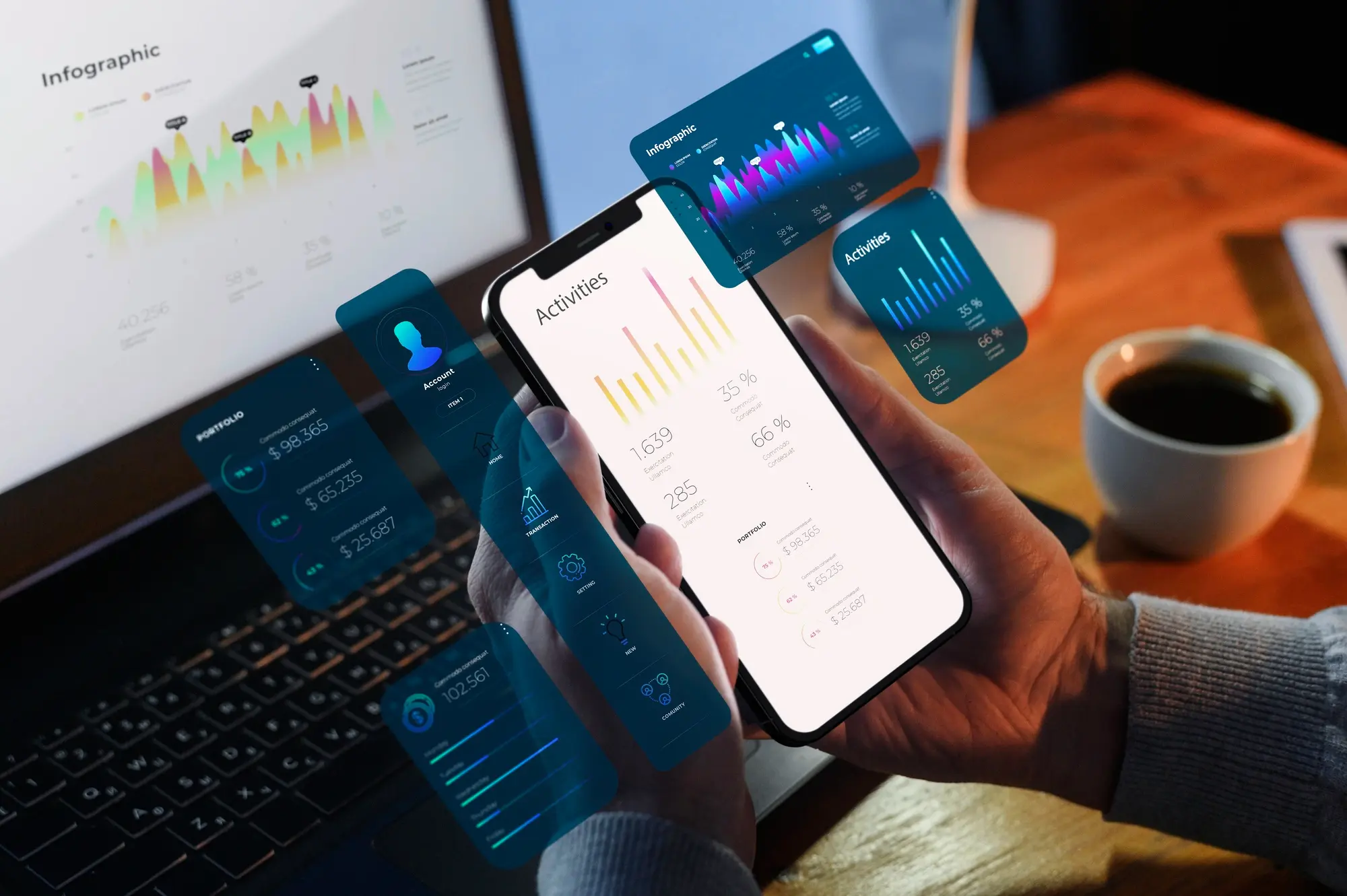
Key Components of Effective Layouts
In today’s digital age, users crave engagement. They don’t just want to passively scroll; they want to interact. Incorporating elements like sliders, hover effects, and interactive infographics can transform a static page into an engaging experience. These elements not only captivate users but also encourage them to spend more time exploring your content.
Visual Hierarchy: Guiding the User’s Gaze
Visual hierarchy isn’t about making a page look pretty; it’s about guiding the user’s attention. By strategically placing, sizing, and coloring elements, you can direct users to the most crucial parts of your content. Whether it’s a call-to-action, a key message, or a brand logo, visual hierarchy ensures it doesn’t get lost in the shuffle.
Responsiveness: Catering to Every Device
Did you know that over half of global website traffic comes from mobile devices? That’s a stat you can’t ignore. Responsiveness ensures your website looks and functions flawlessly, regardless of the device. From desktops and tablets to smartphones, your content should be accessible and visually appealing. Mobile optimization isn’t just a bonus; in today’s world, it’s a necessity.
User-Friendly Navigation: The Unsung Hero of Web Design
Ever visited a website and felt lost? That’s the result of poor navigation. A user-friendly navigation system acts as a roadmap, guiding users to the information they seek. Whether it’s a sticky header, a hamburger menu, or a footer with quick links, navigation should be intuitive. Remember, a user who can easily find what they’re looking for is a user who’s more likely to engage with your content.
Popular and Effective Website Layouts
Zig-Zag Layout
- Pros: The Zig-Zag layout, often seen in e-commerce sites, guides the user’s eyes in a zig-zag pattern, alternating between text and images. It’s visually engaging and ensures that both textual and visual content get equal attention.
- Cons: If not executed correctly, it can appear cluttered. It’s essential to maintain balance and ensure that the design doesn’t overwhelm the user.
F Layout
- Pros: Mimicking the natural reading pattern of users in the Western world, the F Layout places the most crucial content at the top left, making it highly effective for content-rich pages.
- Cons: It can become monotonous if overused. It’s also essential to ensure that valuable content isn’t placed in areas typically ignored in the F-pattern, like the right side of the page.
Full-Screen Photo Layout
- Pros: Perfect for portfolios or showcasing products, this layout uses a captivating full-screen image to immediately engage users. It’s visually striking and can create a strong first impression.
- Cons: The main challenge is ensuring that the image is of high quality. Also, it’s crucial to ensure that essential navigation elements or CTAs aren’t lost against the image backdrop.
Grid Layout
- Pros: Highly organized and clean, the grid layout is versatile and can be used for a variety of content types, from portfolios to blogs. It provides a structured look, making content easily digestible.
- Cons: Without variation, grids can appear repetitive. It’s essential to break the monotony with varied content or visual elements.
One-Column Layout
- Pros: Simplicity at its best, the one-column layout is perfect for long-form content, ensuring distraction-free reading. It’s mobile-friendly and offers a linear, straightforward user experience.
- Cons: It might not be suitable for websites that rely heavily on visuals or those that want to present multiple pieces of content simultaneously.
Emerging Trends in Website Layout Design
The digital landscape is ever-evolving, and with it, the trends in website layout design. Here are some of the innovative layouts that are making waves:
- Asymmetrical Layouts: Breaking away from the traditional grid, asymmetrical designs offer a fresh and dynamic look. They’re perfect for brands looking to stand out and showcase their creativity.
- Parallax Scrolling: This technique creates an illusion of depth by making the background move slower than the foreground. It offers an immersive experience, drawing users into the site’s narrative.
- Split Content Design: Dividing the screen into distinct parts, this layout allows multiple messaging or content types to coexist harmoniously, perfect for sites that cater to diverse user needs.
- Overlapping Layers and Elements: By breaking the boundaries between different sections, overlapping designs create a sense of depth and dynamism, making the content pop.
- Micro-Interactions: These are subtle animations or design quirks that activate when users perform a specific action, enhancing user engagement and offering delightful surprises.
The Imperative of Trend Awareness
Staying updated with design trends isn’t about mindlessly hopping onto every new fad. It’s about understanding the shifting preferences of users and the innovations in technology. As business professionals, being aware of these trends ensures that your website remains relevant, engaging, and ahead of the curve.
Moreover, trends often emerge from broader shifts in user behavior or technological advancements. By keeping a finger on the pulse of the industry, you’re better equipped to anticipate future changes and adapt accordingly.
Practical Tips for Choosing the Right Layout
Choosing the right layout isn’t a one-size-fits-all endeavor. It’s a strategic decision that should align with your website’s core objectives. Here’s what to consider:
- Website’s Purpose: Is your site an e-commerce platform, a portfolio, a blog, or an informational page? An online store might benefit from a grid layout showcasing products, while a personal portfolio might shine with a full-screen photo layout.
- Target Audience: Understand your audience’s preferences and browsing habits. If targeting a younger demographic, they might appreciate dynamic layouts with interactive elements. On the other hand, a professional audience might prefer straightforward, clean designs.
- Content Type: If your site is heavy on articles and blogs, a one-column or F-layout ensures readability. For image-centric sites, layouts that prioritize visuals would be more apt.
The Cycle of Testing and Iteration
Once you’ve chosen a layout, the work isn’t over. Here’s where the real magic happens:
- User Testing: Before fully committing to a design, gather feedback. Tools like heatmaps can show you where users are focusing, while A/B testing can help determine which layout version performs better.
- Iterate Based on Feedback: If users find navigation confusing or some content gets overlooked, it’s time to tweak the design. Remember, the goal is optimal user experience, and sometimes that requires going back to the drawing board.
- Continuous Monitoring: User behaviors and preferences evolve. Regularly review site analytics, and be ready to adapt your layout to changing user needs or emerging trends.
Choosing the right layout is both an art and a science. It requires a deep understanding of your objectives, audience, and content, coupled with a willingness to test, learn, and evolve. By staying attuned to feedback and being flexible in your approach, you ensure that your website remains a dynamic space that resonates with users, today and tomorrow.