
In the vast realm of web design, the layout stands as the backbone, shaping the user’s experience, guiding their journey, and often determining the success of a website. It’s more than just a design choice; it’s a strategic decision that can make or break the user’s interaction with the site.
In this article, we’ll delve deeper into the various types of website layouts, understanding their nuances, and exploring which ones are best suited for different purposes. Whether you’re a budding web designer or a business owner looking to revamp your online presence, this guide will offer insights to help you make informed decisions.
Definition of a Website Layout
At its core, a website layout is the structure that defines a website’s visual appearance and its functional aspects. It encompasses the placement of headers, footers, sidebars, content areas, and other interactive elements. This structure ensures that when a user visits a website, they can easily find and interact with the information they seek.
Imagine reading a book without a table of contents, chapters, headings, or even paragraphs. It would be challenging to understand or even navigate through the content. Similarly, a website without a well-defined layout would be chaotic and confusing for its users.
Role in Enhancing User Experience and Navigation
- Guided Navigation: A well-structured layout provides users with a clear path to navigate through the website. Whether it’s moving from the homepage to a product page or finding the contact information, a good layout ensures that users can find what they’re looking for with ease.
- Visual Appeal: First impressions matter. When a user lands on a website, the layout plays a pivotal role in capturing their attention. A clean, organized layout can make a website look professional and trustworthy.
- Optimized User Flow: A strategic layout can guide users through a journey, from introducing them to key information to leading them towards a call-to-action, such as making a purchase or signing up for a newsletter.
- Reduced Bounce Rate: Users are likely to leave a website if they find it confusing or challenging to navigate. A clear layout ensures that users can easily access the information they need, reducing the chances of them leaving prematurely.
- Consistency Across Pages: A consistent layout across different pages of a website provides a cohesive browsing experience. It ensures that users don’t feel lost or disoriented when moving from one page to another.
- Adaptability: With the rise of various devices like tablets, smartphones, and desktops, a flexible layout ensures that the website looks and functions optimally across all platforms.
Essential Elements of a Website Layout
Every website, regardless of its purpose or design, is built upon a foundational structure composed of key elements. These elements not only define the visual appearance of the site but also its functionality and user experience. Let’s delve into these essential components and understand their significance.
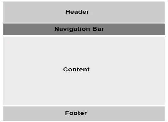
Header: Importance And Components
The header is often the first thing users see when they visit a website. It sets the tone, establishes brand identity, and provides initial navigation cues.
Components:
- Logo: Represents the brand and often links back to the homepage.
- Navigation Bar: A set of primary links guiding users to major sections of the site.
- Contact Information: Quick access to phone numbers or chat features.
- Search Bar: Allows users to quickly search for specific content or products.
- Call-to-Action (CTA): Prominent buttons or links driving users to take specific actions like “Sign Up” or “Shop Now.”
Navigation Menu: Types And Best Practices
- Types:
- Horizontal Menu: Typically found at the top, listing primary sections of the site.
- Vertical/Sidebar Menu: Positioned on the side, often used for in-depth navigation or sub-categories.
- Dropdown Menu: Provides a hierarchical view, showing sub-sections under main categories.
- Hamburger Menu: A collapsible menu, often used in mobile layouts.
- Mega Menu: A large dropdown menu showcasing multiple options, often with images or icons.
- Best Practices:
- Keep It Simple: Avoid overwhelming users with too many options.
- Prioritize Items: Place the most important sections at the beginning or center.
- Use Clear Labels: Ensure menu items are descriptive and straightforward.
- Ensure Responsiveness: Make sure the menu adapts well to various screen sizes.
Content Body: How to Structure Information
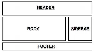
The content body is where the main information, products, or services are showcased. It’s the heart of the website and plays a pivotal role in user engagement.
Structuring Information:
- Hierarchy: Present information in a logical order, with headings and subheadings.
- Whitespace: Use space effectively to separate different sections and improve readability.
- Grid System: Organize content in columns and rows for a clean look.
- Visual Elements: Incorporate images, videos, and infographics to break up text and enhance understanding.
- CTAs: Strategically place CTAs within the content to guide user actions.
Footer: What to Include And Why
The footer anchors the website, offering final navigation options, additional information, and reinforcing brand identity.
Components:
- Navigation Links: Quick links to primary sections or important pages.
- Contact Information: Address, phone number, email, and other contact details.
- Social Media Icons: Links to the brand’s social media profiles.
- Newsletter Signup: An option for users to subscribe to updates or newsletters.
- Legal Information: Links to terms of service, privacy policy, and other legal pages.
- Site Map: A comprehensive map of all the website’s pages.
Characteristics of an Effective Website Layout
An effective website layout is more than just a visually appealing design. It’s a harmonious blend of aesthetics, functionality, and psychology, all working together to provide a seamless user experience. Let’s explore the key characteristics that set apart a truly effective layout.
Clarity And Simplicity
In the vast digital landscape, users often have limited time and patience. A clear and simple layout ensures that they can quickly find what they’re looking for without feeling overwhelmed.
Implementation:
- Consistent Design: Maintain a consistent design language throughout the site, from fonts to color schemes.
- Intuitive Navigation: Ensure that the navigation menu is straightforward, with clearly labeled sections.
- Avoid Clutter: Minimize the use of excessive elements or information that doesn’t add value. Whitespace can be a powerful tool to enhance clarity.
- Direct CTAs: Use direct and concise call-to-actions that guide users on what to do next.
User Engagement
Engaging users is crucial for any website’s success, whether the goal is to sell products, provide information, or entertain.
Implementation:
- Interactive Elements: Incorporate interactive features like sliders, hover effects, or animations that respond to user actions.
- Visual Hierarchy: Use design elements to guide users’ attention to the most important information or sections.
- Feedback Mechanisms: Provide feedback to users through subtle animations or messages, like a button changing color when clicked.
- Fresh Content: Regularly update content to keep users coming back. This could be through blog posts, news updates, or new product listings.
Psychological Considerations in Design
Understanding the psychological aspects of design can significantly enhance user experience and engagement. It’s about tapping into the subconscious cues that influence how users perceive and interact with a website.
- Gestalt Principles: These are a set of design principles based on the idea that the human brain perceives visual elements in relation to each other, not in isolation. Some key principles include:
- Proximity: Elements that are close together are perceived as related or grouped.
- Similarity: Similar elements are seen as part of the same group.
- Closure: The human eye tends to complete shapes or forms even if they are partially obscured.
- Continuation: The eye is drawn along paths, lines, or curves, preferring to see them as continuing along an established direction.
- Implementation:
- Grouping Elements: Use proximity and similarity to group related content or features, enhancing the user’s ability to process information.
- Guiding Attention: Utilize the principles of continuation and closure to guide users’ attention to key areas or CTAs.
- Creating Balance: Ensure that the layout feels balanced and harmonious, considering factors like symmetry, alignment, and contrast.
Top Website Layout Types
The digital realm offers a plethora of design possibilities, allowing web designers to craft unique experiences tailored to their audience’s needs. Among these, certain layout types have stood the test of time due to their effectiveness and adaptability. Let’s explore these popular website layout types in detail.
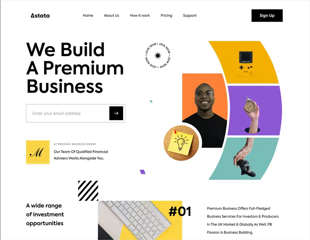
Single-Column Layout
This layout features a single, centered column of content, providing a linear reading experience. It’s clean, straightforward, and particularly effective for mobile responsiveness.
Use Cases:
- Personal blogs
- News articles
- Mobile versions of websites
- Minimalistic websites
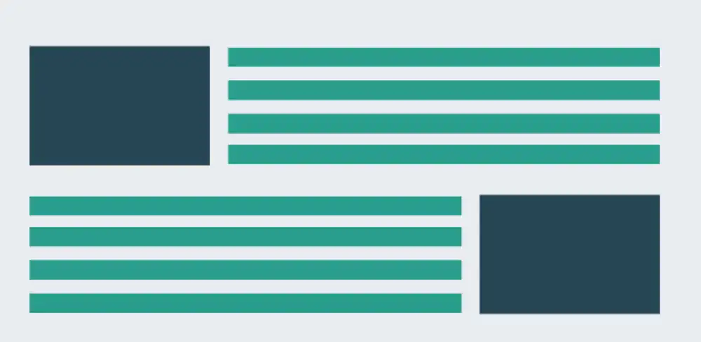
Split-Screen Layout
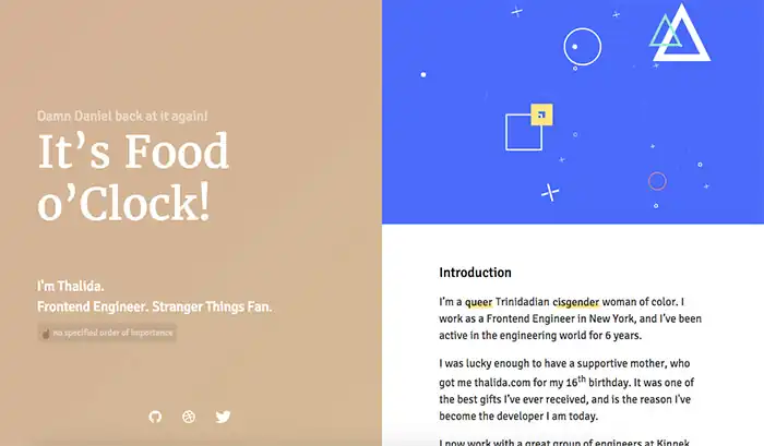
The screen is divided into two distinct sections, each dedicated to a different piece of content or functionality. It allows for a dual focus, guiding users to choose between two primary areas.
Subtypes:
- Vertical Split: The screen is divided vertically, with content side by side.
- Horizontal Split: The division is horizontal, stacking content on top of each other.
Use Cases:
- Portfolio websites showcasing dual expertise
- Product websites with two primary offerings
- Landing pages with two primary CTAs
Asymmetrical Layout
This layout breaks away from the traditional grid, using uneven elements to create dynamic visual interest. It’s a balance of negative space with content, creating a unique flow.
Use Cases:
- Creative agencies or artist portfolios
- Brands aiming for a distinctive, modern web presence
- Magazines or editorial websites
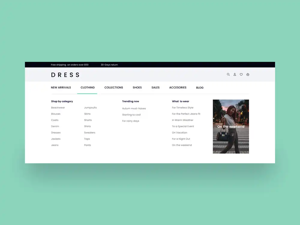
Modular Grid Layout
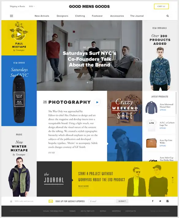
Content is organized into modular blocks or grids, often of the same size. Each module can contain text, images, or other content, offering a structured yet flexible design.
Use Cases:
- Image-heavy websites like photography portfolios
- E-commerce sites showcasing products
- News or magazine websites
Zigzag Layout
This layout alternates content and images in a zigzag pattern, guiding the user’s eyes in a zigzag motion down the page. It’s often combined with parallax scrolling effects for added dynamism.
Use Cases:
- Product or service websites with features/benefits sections
- Storytelling or timeline-based content
- Any website aiming for a rhythmic content flow
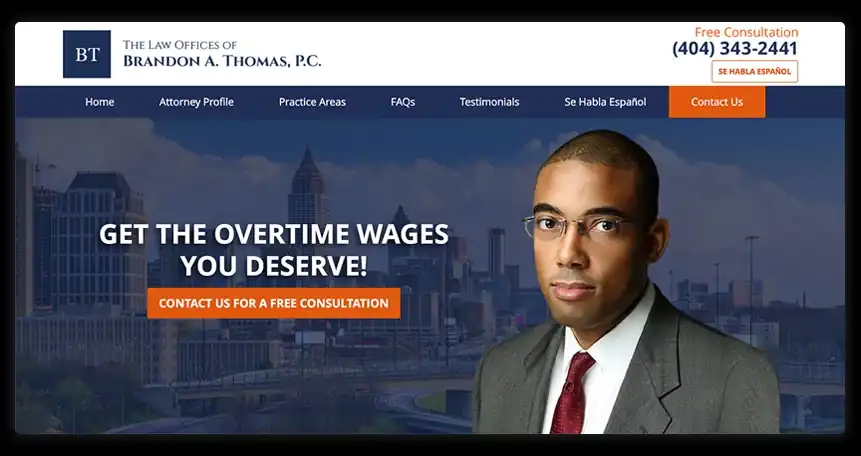
Full-Screen Media Layout
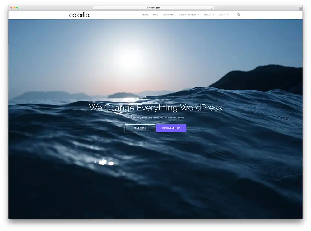
The layout predominantly features full-screen media, be it images, videos, or animations, often paired with minimal text. It offers a visually immersive experience.
Use Cases:
- Websites for filmmakers, photographers, or artists
- Brands aiming for a strong visual impact
- Landing pages for campaigns or product launches
The Role of Technology in Shaping Layouts
The digital landscape is in a constant state of evolution, driven by technological advancements and changing user behaviors. As technology continues to push boundaries, website layouts adapt to harness these new capabilities, ensuring that users receive the best possible experience. Let’s delve into how technology, both current and emerging, is shaping the world of web design.
Mobile Responsiveness And Its Influence on Layouts
- The Rise of Mobile: With the proliferation of smartphones and tablets, more users are accessing the web from mobile devices than ever before. This shift has necessitated a rethinking of traditional website designs to cater to smaller screens and touch-based navigation.
- Fluid Design: Mobile responsiveness has given birth to fluid layouts that adapt and restructure based on the device’s screen size. Elements resize, stack, or even hide to ensure optimal viewing and interaction.
- Prioritizing Essential Content: On smaller screens, there’s limited real estate. This has led designers to prioritize essential content, ensuring that users can access key information without endless scrolling or navigation.
- Touch-Friendly Design: With touchscreens being the primary mode of interaction on mobile devices, layouts have evolved to incorporate larger buttons, swipe gestures, and touch-friendly sliders.
The Emergence of VR (Virtual Reality) and AR (Augmented Reality) And Their Potential Impact
- Beyond The 2D Plane: VR and AR technologies break free from the traditional two-dimensional plane of websites. They offer immersive 3D experiences, allowing users to interact with content in entirely new ways.
- Spatial Web Design: With VR, web design takes on a spatial dimension. Websites could be experienced as virtual spaces or rooms, where users can “walk” from one section to another, interacting with content as they would in the physical world.
- Augmented Web Experiences: AR can overlay digital information on the real world. Imagine shopping websites where users can virtually “try on” clothes or accessories using their device’s camera, or educational sites where historical events come to life in one’s living room.
- New Interaction Paradigms: Traditional elements like buttons or sliders might evolve or be replaced by gestures, voice commands, or even eye movements in VR and AR environments.
- Challenges And Considerations: While these technologies offer exciting possibilities, they also come with challenges. Designers need to consider factors like user comfort, accessibility, and ensuring that these immersive experiences are intuitive and user-friendly.
Tips For Choosing The Right Layout
Selecting the right layout for a website is akin to choosing the foundation for a building. The choice will influence the site’s aesthetics, functionality, and user experience. With a myriad of layout options available, how can one ensure the best choice for a specific project? Let’s explore some guiding principles.
Factors to Consider Based on Website Goals
- Purpose of The Website: Is it an e-commerce platform, a personal blog, a portfolio, or an informational site? Each purpose has layouts that best showcase its content. For instance, an e-commerce site might benefit from a grid layout to display products, while a personal blog might opt for a single-column layout for readability.
- Target Audience: Understanding the preferences and behaviors of the target demographic can guide layout choices. A younger audience might appreciate dynamic, unconventional layouts, while a professional audience might prefer structured, straightforward designs.
- Content Type And Volume: A website rich in visuals might opt for a gallery or portfolio layout, while one heavy on text might choose a layout that prioritizes readability.
- User Journey: Consider the path you want users to take. If guiding them through a specific process, like a sales funnel, the layout should facilitate this journey seamlessly.
- Scalability: Think about the future. If the website will grow, adding more sections or content, the layout should be adaptable to accommodate these changes without compromising user experience.
Importance of User Feedback And A/B Testing
- Direct Insights: While designers might have assumptions about what works best, real users interacting with the site provide invaluable feedback. They can highlight areas of confusion, elements they love, or features they feel are lacking.
- A/B Testing: This involves creating two versions of a webpage (A and B) with different layouts and seeing which performs better in terms of user engagement, conversion rates, or other metrics. It’s a data-driven approach to refine and optimize the layout.
- For instance, testing two different homepage layouts can reveal which one results in more users signing up for a newsletter or making a purchase.
- Iterative Design: Based on feedback and testing results, the design can be iteratively refined. This ensures that the layout remains aligned with user preferences and behaviors, leading to better engagement and conversion rates.
- Avoiding Common Pitfalls: User feedback can help identify and rectify common design pitfalls, such as confusing navigation or overwhelming content, ensuring a more user-friendly experience.
Common Mistakes to Avoid
Every craft has its pitfalls, and web design is no exception. While the digital realm offers endless possibilities, it’s easy to fall into common traps that can compromise a website’s effectiveness and user experience. Let’s explore some frequent mistakes in layout design and how to sidestep or rectify them.
Overloading The Homepage
- Pitfall: In an attempt to provide as much information as possible, many websites cram their homepage with content, making it cluttered and overwhelming for users.
- Solution: Adopt a minimalist approach. Prioritize essential content and use whitespace effectively. Guide users deeper into the site for detailed information rather than trying to present everything upfront.
Inconsistent Design Elements
- Pitfall: Using different fonts, colors, or design styles across pages can disorient users and harm brand consistency.
- Solution: Establish a design guideline or style guide. Ensure that all pages adhere to this guide, maintaining consistency in fonts, colors, and other design elements.
Ignoring Mobile Responsiveness
- Pitfall: With a significant portion of users accessing websites via mobile devices, ignoring mobile responsiveness can lead to a subpar user experience.
- Solution: Adopt a mobile-first design approach. Ensure that the website layout adapts seamlessly across devices, from desktops to tablets to smartphones.
Poor Navigation Structure
- Pitfall: A confusing or overly complex navigation menu can frustrate users, making it hard for them to find the information they seek.
- Solution: Simplify and streamline the navigation menu. Group related items together, use clear labels, and ensure that the most crucial sections are easily accessible.
Overuse of Trendy Elements
- Pitfall: While it’s tempting to incorporate the latest design trends, overdoing it can make the website feel gimmicky or even reduce usability.
- Solution: Use design trends judiciously. Ensure that any trendy element added enhances the user experience and aligns with the website’s goals.
Slow Loading Times
- Pitfall: Heavy images, excessive scripts, or unoptimized content can slow down a website, leading to user frustration and increased bounce rates.
- Solution: Optimize images, use lazy loading, and minimize the use of heavy scripts. Regularly test website speed and make necessary adjustments.
Lack of Clear CTAs (Call-to-Actions)
- Pitfall: Without clear and compelling CTAs, users might be unsure about the next steps, leading to missed conversion opportunities.
- Solution: Ensure that CTAs are prominently placed, using contrasting colors and clear, action-oriented language.
Future Trends in Website Layouts
The digital realm is ever-evolving, with new technologies and user behaviors continuously shaping the landscape of web design. As we look to the horizon, several emerging trends hint at the future of website layouts. Let’s delve into these prospective shifts and explore how they might redefine our online experiences.
Emerging Layout Designs
- 3D Elements And Immersive Experiences: With advancements in web graphics and rendering, we’re seeing a rise in 3D elements integrated into websites. These elements, from 3D product previews to immersive animations, offer a depth and realism that 2D designs can’t match.
- Neumorphism: A design trend that’s gaining traction, neumorphism is characterized by soft UI, subtle shadows, and semi-flat colors. It offers a tactile and multi-dimensional aesthetic, bridging the gap between skeuomorphism and flat design.
- Scroll-Triggered Animations: As users scroll, animations or transitions are triggered, making the browsing experience more interactive and engaging.
- Dark Mode And Color Themes: More websites are offering dark mode options, not just for aesthetics but also for user comfort, especially in low-light conditions. Additionally, allowing users to choose color themes or palettes personalizes the browsing experience.
How User Behavior And Technology Might Shape Future Trends
- Voice User Interface (VUI): As voice assistants like Alexa, Siri, and Google Assistant become ubiquitous, we might see website layouts adapting to voice commands, with designs optimized for auditory feedback and voice navigation.
- Adaptive And Predictive Design: Leveraging AI and machine learning, future websites might adapt their layouts in real-time based on user behavior. For instance, if a user frequently visits the blog section, that section might be highlighted or made more accessible during subsequent visits.
- Increased Focus on Accessibility: As the digital world becomes more inclusive, website layouts will prioritize accessibility, ensuring that content is easily navigable and consumable for everyone, including those with disabilities.
- Gesture-Based Navigation: With the rise of touchscreens and gesture recognition technology, future layouts might move away from traditional click-based navigation to more intuitive gesture controls.
Interactive Quiz
Choosing the right layout for your website can be a daunting task, especially with the myriad of options available. This short interactive quiz is designed to guide you towards a layout that aligns with your website’s goals and content. Answer the following questions, and let’s determine the best layout for your needs!
1. What is the primary purpose of your website?
- Share personal stories or blogs.
- Showcase a portfolio or creative work.
- Sell products or services.
- Provide information or news.
2. How would you describe the volume of your content?
- Minimalistic with a focus on visuals.
- Heavy on text.
- A balanced mix of text and visuals.
- Dynamic content that frequently updates.
3. How important is mobile responsiveness for your website?
- Extremely important; most of my audience uses mobile.
- Somewhat important; I want a balance between desktop and mobile.
- Not a priority; my audience primarily uses desktop.
- I’m not sure.
4. How do you envision user interaction on your site?
- I want users to scroll and explore.
- I want clear navigation with distinct sections.
- I’m aiming for a dynamic, interactive experience.
- I want a straightforward, easy-to-navigate layout.
5. Which design aesthetic resonates with you the most?
- Modern and dynamic.
- Clean and minimalistic.
- Artistic and unconventional.
- Structured and professional.
Results:
- Mostly A’s: Consider a Single-column Layout or Full-screen Media Layout. These layouts are perfect for visual-heavy content and offer a seamless mobile experience.
- Mostly B’s: A Modular Grid Layout might be ideal. It’s structured, easy to navigate, and perfect for websites with a balance of text and visuals.
- Mostly C’s: Dive into the Zigzag Layout or Asymmetrical Layout. These are dynamic, interactive, and perfect for those aiming for a unique user experience.
- Mostly D’s: Opt for a Split-screen Layout or Modular Grid Layout. These are structured, professional, and great for information-heavy sites.
- Varied Answers: Your website might benefit from a combination of layouts. Consider consulting with a web design service like WebMaze to tailor a layout that fits all your needs.
Remember, while this quiz offers a starting point, the best layout for your website should align with your specific goals, audience preferences, and content type. Always be open to iterating and refining your design based on user feedback and performance metrics.