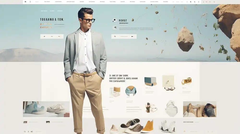
Are potential customers being turned off by your website layout? Find out if your design is driving them away or welcoming them in.
A well-crafted website layout can make all the difference in creating a positive user experience. Don’t let a poorly designed layout sabotage your business goals.
In this article, we’ll explore the impact of website layouts on user experience and provide key tips to optimize your design for maximum engagement.
The Impact of Website Layout on User Experience
A well-thought-out website design is often a reflection of the brand’s professionalism, establishing a trustworthy relationship with visitors. By presenting consistent and unified design elements, your brand’s message becomes clearer, and your brand image is reinforced in the minds of visitors. This positive impression not only strengthens your brand’s reputation but can also influence a spike in sales and revenue. In the digital age, where first impressions are increasingly made online, establishing trust through thoughtful design is a foundational step towards cultivating long-term relationships with your audience.
Capturing The Attention of The Audience
The first impression begins on the home page. A cluttered or poorly designed home page can create a sense of unease, potentially leading to higher bounce rates as visitors may quickly depart. Conversely, using appealing typography, captivating images, and a consistent color palette can instantly grab a visitor’s attention. Bright and eye-catching banners serve as a beacon, inviting the visitor to delve deeper into what the brand offers. Additionally, well-designed landing pages can act as powerful tools to pique visitors’ interest further, leading to effective lead generation.
Importance of Page Speed Optimization And Impact on Search Engine Ranking
Loading time isn’t just about user patience; it has a direct correlation with how search engines view your website. Slow-loading pages can deter visitors, costing potential conversions and sales. But beyond the immediate loss of visitors, slow page speed can impact your website’s SEO ranking. Many factors in web design, such as the use of high-resolution images, play a part in a site’s loading time. Designers can make strategic choices, like limiting the use of heavy multimedia elements or maximizing white space, to boost site speed. If ignored, a slow website speed can have detrimental effects, pushing your site lower on search engine results pages (SERPs), leading to diminished online visibility and credibility. Ultimately, for the visitor, quick access to information is paramount, and providing that ensures satisfaction and encourages longer engagement.
Common Mistakes in Website Layout Design
One of the most detrimental errors is a slow page load time, which can drive visitors away before they even see your content. Equally harmful is poor mobile responsiveness, given the vast number of users accessing sites from mobile devices. Other major pitfalls include unclear navigation, content overload that confuses visitors, and a lack of clear call-to-action (CTA), leaving visitors unsure of their next step.
Navigation And Search
A poorly configured navigation layout can disorient users, pushing them away from your site. Bad search functionality further compounds this issue, making it hard for visitors to find the information they’re seeking. Furthermore, ignoring accessibility features can alienate a portion of your audience, while unclear navigation menus can add to the confusion.
Performance Optimization
Performance optimization is crucial, yet many websites still suffer from slow page load times and lack cross-browser compatibility. Ensuring your website functions seamlessly across different browsers is essential to capture a wider audience.
Content Organization
A well-organized site ensures users can find information easily. However, some websites suffer from overloaded content or display information in a non-hierarchical manner, leaving users overwhelmed. Non-responsive design further detracts from the user experience, especially for mobile users.
Security And Accessibility
Security should never be an afterthought. Failing to prioritize a security-first approach exposes your site to potential threats. In addition, neglecting accessibility features can exclude potential visitors who rely on these functionalities.
Design Thinking And User Experience
Successful websites often employ a design thinking approach, focusing on user needs and behaviors. Not adhering to design basics like grids and columns, or ignoring trending web design templates, can lead to an incoherent user experience.
SEO And Keywords
A website’s visibility depends heavily on its search engine optimization. Not targeting niche keywords or using mismatched color schemes can affect your site’s searchability. Beyond design, not utilizing analytics means missing out on crucial insights into your website’s performance.
Image And Multimedia Design
Images enhance the user experience, but poorly designed or unoptimized visuals can slow down your site. Multimedia, while engaging, can be another culprit of design mistakes if not integrated thoughtfully.
Language And Localization
In a globalized world, it’s a missed opportunity not to cater to multiple languages or to ignore geolocation testing, which ensures regional relevance.
Conversion Optimization
Conversion is a key metric for any commercial site. However, some sites deter users by using irrelevant pop-ups or not integrating features that facilitate conversion.
Communication And Branding
Your website should effectively communicate your business’s purpose and value proposition. A lack of clear branding can lead to missed connections with potential customers.
User Engagement And Interaction
CTAs guide users towards desired actions. An unclear CTA, or neglecting features like custom 404 pages, can reduce engagement and interaction on your site.
Key Elements of an Effective Website Layout
Navigating a website should feel like a breeze. An effective website ensures that its menu items are not only easy to navigate but also accessible. Visitors should always have a clear indication of where they are within the site. Integrating a site map can further enhance navigation, providing an overview of the website’s structure. Striking the right balance between interactive elements and functional menus ensures users find what they need without getting overwhelmed.
Visual appeal can make or break the first impression. Employing appealing graphics can captivate visitors upon arrival. The visuals should exude professionalism, fostering trust among your audience. However, while it’s tempting to add dynamic elements, it’s wise to avoid excessive use of scrolling text, animations, or flash intros which can distract or even annoy visitors. Instead, visuals should be used strategically to emphasize important points and guide the user journey.
Content, the backbone of any website, should be informative, easily digestible, and concise. Its quality and relevance not only play a significant role in search engine placement but also in engaging visitors. When content is well-thought-out, it complements the design, enhancing the overall experience of the website.
Being web-friendly is non-negotiable in today’s diverse tech landscape. Websites must be compatible across all major browsers. Incorporating elements like meta tags, alt tags, and utilizing SEO techniques not only enhance search engine placement but also affect the overall visual appearance. Therefore, web designers should be proficient in ensuring web-friendliness in their designs.
A website’s interactive features can spell the difference between a brief visit and a conversion. It’s vital to engage visitors immediately, drawing them in and prompting them to take the next step, whether that’s making a purchase or contacting you. However, it’s crucial to find the right equilibrium; while interaction is essential, overdoing it can border on annoyance. A meticulously designed website naturally encourages visitors to interact, without being overbearing.
Accessibility of information is paramount. While some visitors might explore multiple pages, others might be searching for a specific piece of information. If they get frustrated in their search, they’re unlikely to stick around or come back. Hence, key details and offerings should always be in plain sight, enhancing the overall user experience.
The best websites are those that think ahead, anticipating the needs of their visitors. Intuitive designs arrange elements logically, ensuring users can find what they’re looking for effortlessly. Providing relevant landing pages for those coming from search engines is an added touch that streamlines the user experience.
Lastly, branding serves as the soul of your website. Every aspect, from visuals to content, should resonate with the business and brand identity. By creating a cohesive visual connection between logos, print materials, and even physical locations, businesses enhance their credibility. When executed effectively, memorable branding remains etched in the visitor’s mind, significantly contributing to a business’s long-term success.
Optimizing Your Website Layout for Mobile Users
The digital age has seen an astronomical rise in mobile browsing. Thus, mobile optimization is not just a luxury—it’s a necessity. A significant factor for search engine rankings, mobile friendliness ensures that users who access sites from their phones or tablets have an experience optimized for their device. And the numbers speak volumes. Over 53% of mobile users will abandon a site if it takes more than three seconds to load, and search engines are keenly aware, often prioritizing mobile-optimized sites in their rankings.
At the heart of mobile optimization is responsive design. This design strategy adapts your content to fit the device it’s viewed on, ensuring a seamless user experience, regardless of screen size or device orientation. Furthermore, responsive design goes hand-in-hand with improved search engine optimization (SEO) value, ensuring that your website remains functional and accessible under any circumstance.
It’s essential to consider the nuances of mobile browsing. One of these nuances is the way people hold their phones. For instance, many users, especially those using larger devices, may operate them with just one hand. As a result, clickable content needs to be within easy reach, ideally placed in areas that users can comfortably tap. This ensures that despite the increasing diversity in phone sizes, your website remains effortlessly navigable.
Navigation on mobile requires a certain simplicity. Given the compactness of mobile screens, a minimalist approach—like using a hamburger menu—can help declutter and prioritize essential navigation items. Such icons should be intuitively designed; for instance, a hamburger icon should transform into an ‘X’ when the menu is open, signaling users to close it.
Filling out forms on mobile devices can be a tedious task. Simplifying this process is crucial. By limiting the number of fields and asking only for vital information, you make it more user-friendly. Wherever possible, minimize the need for text entries. Opt for checkboxes and dropdowns instead, which are easier to navigate on mobile.
The positioning of Call-to-Actions (CTAs) on mobile platforms demands special attention. Given the importance of these clickable elements in navigating and converting users, their size and placement on mobile screens are paramount. Familiarize yourself with the Gutenberg Principle, which provides insights into content scanning habits, to guide the positioning of CTAs. For instance, primary CTAs often find their home at the bottom or the right side of screens for easy accessibility.
There’s nothing quite as disruptive on a mobile device as an intrusive pop-up, especially those that are difficult to close. Prioritize user experience by minimizing or altogether eliminating such interruptions, focusing instead on alternative, less invasive means to relay information.
Speed remains king on mobile. Enhance your mobile site’s performance by optimizing images and videos for quicker load times. Techniques such as caching and compression, coupled with limiting external scripts and plugins, can make a world of difference in your site’s loading speed.
In the realm of mobile readability, font choice can’t be overlooked. Fonts need to be clear, legible, and comfortably sized for smaller screens. Moreover, ensuring a stark contrast between your text and its background ensures readability across different devices and lighting conditions.
Finally, the vast array of mobile devices in the market means that testing and optimization become vital. Ensuring your website offers consistent functionality and appearance, regardless of the device, screen size, or browser, guarantees a quality experience for all users. Regular testing and tweaking, guided by responsive design principles, ensure your website remains ahead of the curve.


